16 New PaneFlow Templates: A Bold Typography Drop
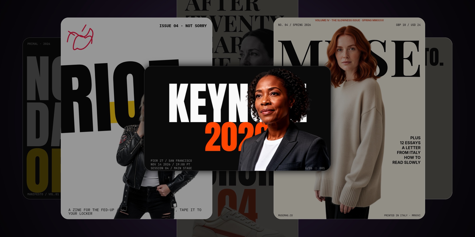
Sixteen new PaneFlow templates, all built around one move: oversized, screaming, magazine-grade display type paired with transparent-edge subject cutouts. The cutout sits in front of, behind, or piercing the type. The type is the canvas. The image is the punctuation.
This drop is not about covering more use cases - the previous 37 templates already did that. This drop is about the kind of frame people screenshot and share. Every template here uses bold typography as the primary visual move, with cutout subjects doing the heavy lifting on personality.
A few things worth knowing up front:
- Every cutout image is genuinely transparent at the edges - no white halos, no fragment glow.
- The compositional moves are explicit: cutout-pierces-type, image-in-letter, image-between-text sandwich, window type, image-as-punctuation, knockout. Each template uses two or three.
- The aesthetic spans from editorial restraint (Newsprint, Founder Letter) to pure chaos (Punk Zine). Same toolkit, very different voices.
#The Standouts
Six templates that show the range best. Click any to open the full template page.
#About Me - Cutout Portrait
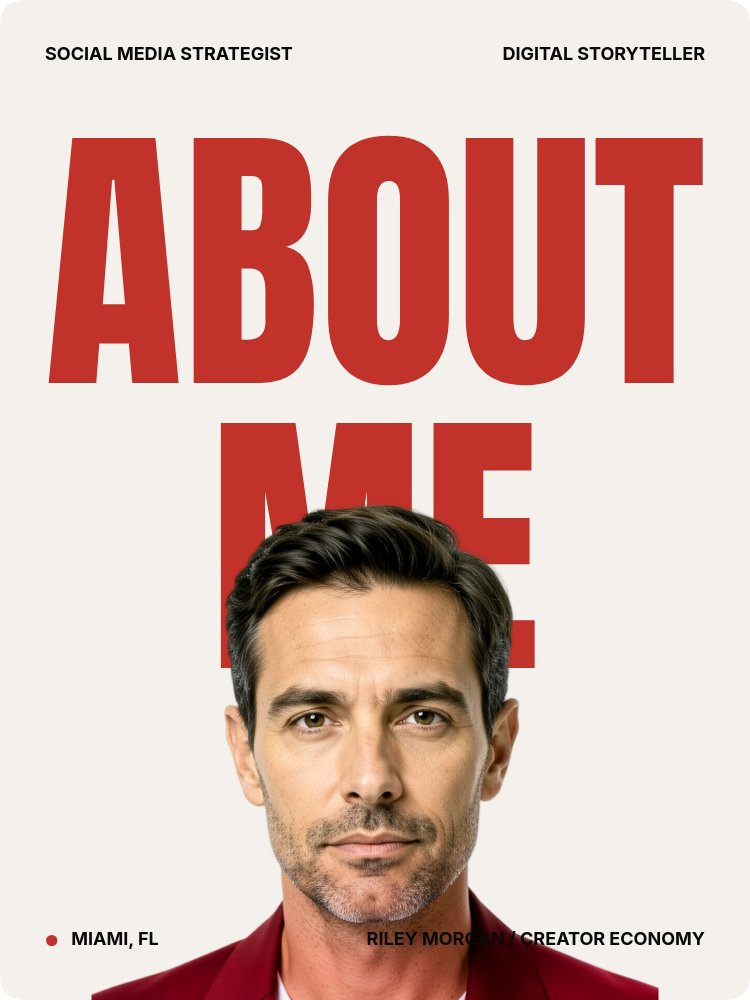
The signature template for this drop. A 3:4 personal intro built on cutout-pierces-type: your portrait layered in front of the giant ABOUT / ME wordmark so the type reads through you. Four panes, Anton display, a single hot accent. Made for creators, freelancers, and operators who want a "hi, here's me" page that actually lands.
#Keynote Speaker - Cinematic Bold
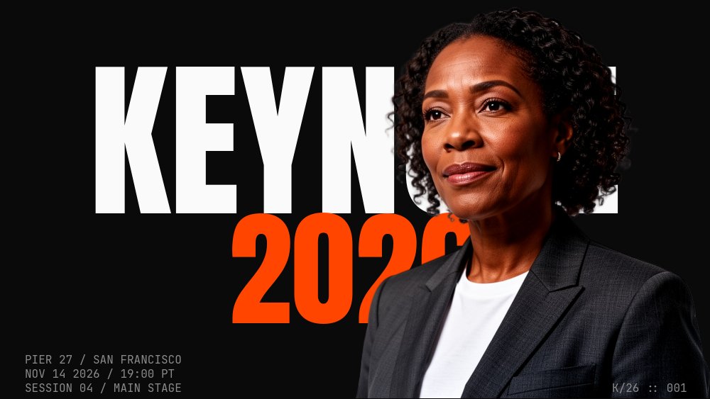
Brutalist screamer for conference speakers, fireside hosts, and podcast guests. Black canvas, white Anton at 35% pane height, incandescent orange accent, speaker cutout piercing the type. Seven panes that read like the lead-in slide before someone walks on stage.
#Punk Zine - Anti-Design Chaos
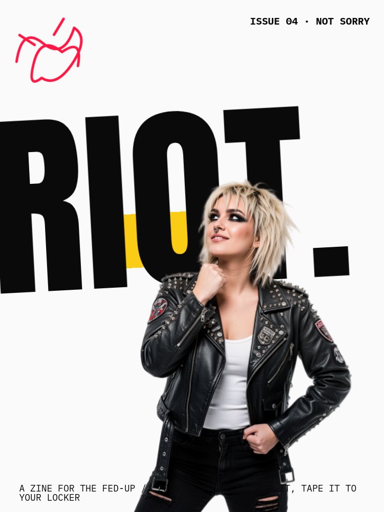
The opposite of restraint. Torn paper, halftone overlays, slashed type, intentionally misaligned grid, Permanent Marker scribble accents, stomp and twirl animations used on purpose. For zines, indie launches, music drops, and anything that needs to feel like it was photocopied at midnight.
#Magazine Cover - Editorial Mix
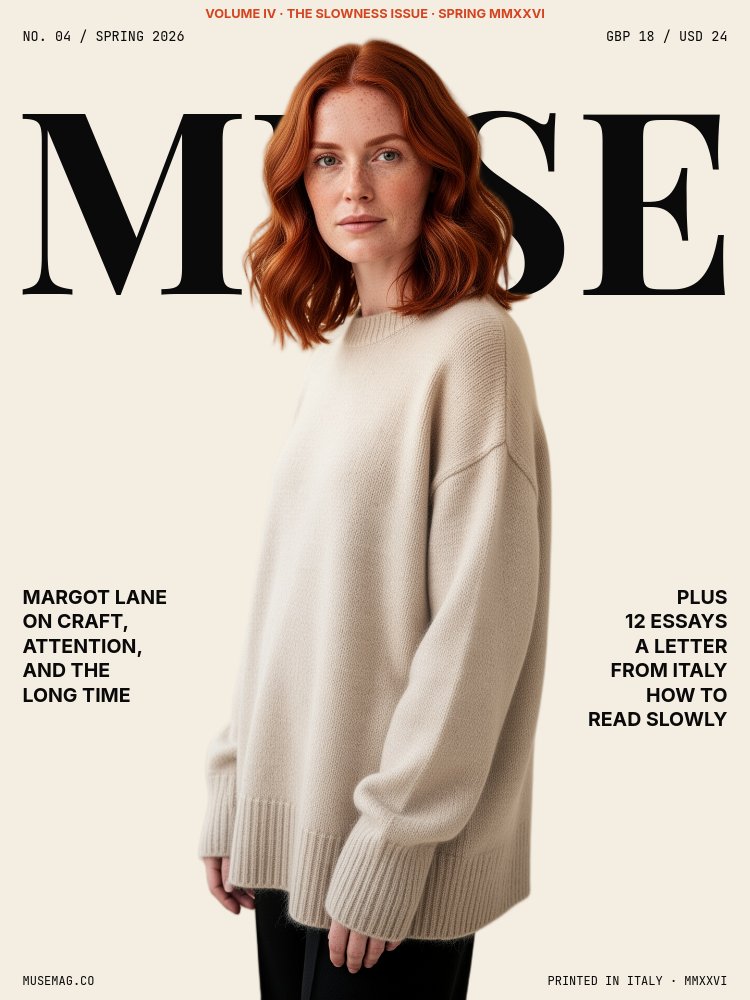
Vogue / Cherry Bombe / Wallpaper energy. Cream stock, Playfair Display masthead, sans micro-meta in the corners, a halftone-treated cutout portrait piercing the headline. Six panes that work as a magazine cover, a feature spread, or an editorial brand moment.
#Image in Letter - Glyph Swap
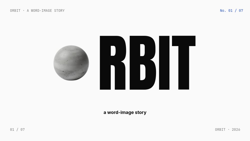
The cleverest compositional move in the drop. An image lives where a single letter should be: L[image]VE, M[image]ND, GR[image]W. Seven panes, four rotating accents, and a wordmark system you can adapt to almost any brand verb. Reads as design-savvy without trying too hard.
#Athlete Manifesto - Action Cutout
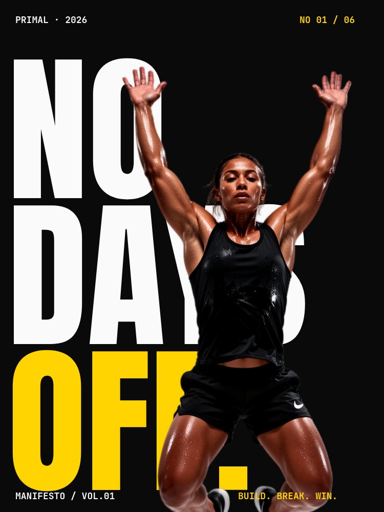
For sports brands, training studios, performance products, and any athlete page that needs to feel like a Nike short. Mid-action cutouts, two-word verbs at 50% pane height, electric yellow accent, stomp and drop animations. Six panes that hit like a manifesto reel.
#Browse the Full Drop
All 16 templates, grouped by use case.
#Personal Brand and Speaker Intros (2)
- About Me - Cutout Portrait - Cutout-pierces-type personal intro for creators, freelancers, and operators.
- Keynote Speaker - Cinematic Bold - Brutalist black-canvas speaker intro for conferences, fireside chats, and podcast guests.
#Founder and Business Storytelling (4)
- Founder Letter - Editorial Serif - Editorial founder letter with Playfair serif, drop cap, and a quiet portrait cutout. For year-end notes, milestone updates, and "from the desk of" posts.
- Stat Hero - Number Beside Cutout - Big-number stat template with a portrait cutout standing beside the figure. For impact reports, milestone posts, and growth recaps.
- Manifesto Declaration - Gesturing Cutout - Belief-statement template with a gesturing cutout punctuating each principle. For brand books, hiring pages, and values rollouts.
- Magazine Cover - Editorial Mix - Vogue / Wallpaper energy. Masthead, halftone cutout, editorial typography across six panes.
#Editorial Long-Form (2)
- Newsprint Editorial - Feature Story - NYT-Magazine-style feature with drop cap, mono body, and halftone photography. For PR features, founder profiles, and "how we did it" carousels.
- Quote Portrait - Pulled Word - Square testimonial template that pulls a single word from the quote and sets it as the design moment.
#Product and Drop Moments (2)
- Product Drop - Cutout Hero - Single-product drop with the bottle, tube, or hero SKU layered over wordmark type. Built for beauty, fragrance, and DTC launches.
- Diptych Split - Slab + Cutout - Hard 50/50 split: solid color slab holds manifesto type, image half holds the cutout. For brand launches and campaign reveals.
#Athlete and Action (2)
- Athlete Manifesto - Action Cutout - Mid-action cutouts paired with two-word verbs at 50% pane height. For sports brands and training programs.
- Marquee + Anchor - Ticker Behind - Drifting marquee text behind a stationary cutout figure. For drops, announcements, and any "tour energy" moment.
#Pure Typography Showcases (4)
- Window Type - Image-Masked Letters - Image clipped to the shape of letterforms. Type is the window.
- Triptych Film Cut - Three Words - WORD / image / WORD horizontal three-beat. Reads like a film cut.
- Punk Zine - Anti-Design Chaos - Torn paper, halftone, slashed type, scribble accents. Anti-design on purpose.
- Image in Letter - Glyph Swap - An image lives where a single letter should be. L[img]VE, M[img]ND, GR[img]W.
#Why This Drop Is Different
The first 37 templates were about coverage - one template per common use case. This drop is about expression. Every template here is a typography-forward showcase that exists to be screenshotted and shared, not just used.
The compositional vocabulary is the through-line. Every template uses two or three of: cutout-pierces-type, image-in-letter, window type, image-between-text sandwich, image-strip cuts across stacked text, marquee + anchored cutout, image-as-punctuation, knockout / negative-space, diptych color slab + cutout. Once you see the moves, you start spotting them everywhere - in editorial design, in Instagram covers, in album art.
What makes this practical in PaneFlow is the layering model. Drop a transparent-edge cutout in front of a giant type block, set its parallax depth higher than the type behind it, and the navigation between panes sells the depth on its own. No masking, no clipping passes, no Photoshop round-trips.
#How to Start
- Open the template gallery and pick one. The new templates sit at the top.
- Click "Use Template" to open it in the editor.
- Replace the cutout images with your own subjects, products, or portraits. If your source photo has a background, use the built-in AI background-removal to get a clean transparent cutout in one click.
- Swap your headline, accent color, and any micro-meta.
- Export as HTML, video, PDF, or publish to a CDN link.
#Related
- Browse all PaneFlow templates
- 37 New PaneFlow Templates: Previous Drop
- PaneFlow for Content Creators - social-ready animated content
- PaneFlow for Marketers - campaigns and brand moments
- PaneFlow vs Canva - detailed comparison
Don't Miss What's Next
Get updates, design tips, and sneak peeks at upcoming features delivered straight to your inbox.