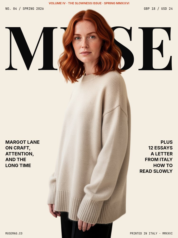
Magazine Cover - Editorial Mix Template
A personal brand intro styled as a printed magazine - the kind of cover that gets pinned to a moodboard and shared as a screenshot. Cream paper background, Playfair Display masthead at full pane width, JetBrains Mono micro-meta in every corner, a terracotta accent that lands like an ink-press color, and a cutout portrait that pierces the giant letterforms the way a real magazine cover subject sits in front of the title. Seven panes that walk the viewer from cover through table of contents, feature opener, two-column spread, pull-quote, and back cover.
#What Makes This Template Stand Out
The defining choice is treating a personal intro as if a magazine were being made about you. The masthead on pane 1 sits at the top quarter of the canvas in 34cqw Playfair Display Bold, the issue date and price ride in JetBrains Mono in opposite corners, and the cover lines flank the subject on both sides exactly the way Vogue or Cherry Bombe or Wallpaper composes a cover. The cutout portrait then layers in front of the masthead with parallax depth 3, so the type physically reads through the subject. That single move sells the whole conceit.
Pane 2 zooms into the issue number with a massive italic "04" set in Playfair at 88cqw, slowed to a 0.6 speed-scale letter-fade so the digits bloom in like ink hitting paper. Pane 3 is a table of contents with four feature rows stacked vertically, each row owning its own block with an image strip, italic feature title, and a page number in mono on the right. The five row blocks slide in alternating from left and right, which gives the TOC the page-turning rhythm of an actual print contents spread.
Animation discipline holds throughout. Every cutout enters with fade only, never bounce or drop, because the editorial tone demands stillness. Body text drifts in with subtle parallax. Letter-fade speed-scales are dialed down so the type behaves like print being set, not like a tech product reveal. The 5-second autoplay interval gives each spread room to breathe.
- Cream #f4ede1 paper background with #0a0a0a ink type and a #d4441f terracotta accent across all 7 panes
- Playfair Display Bold masthead at 34cqw paired with JetBrains Mono micro-meta in every corner
- Cutout portrait layered with parallax depth 3 in front of the cover masthead for the pierces-type composition
- Italic 88cqw issue-number pane with a 0.6 speed-scale letter-fade for ink-bloom pacing
- Five-row table of contents with alternating left/right slide-ins and per-feature image strips
- 7-pane arc - cover, issue number, TOC, feature opener, two-column spread, pull-quote, back cover
#Who Should Use This Template
- Newsletter creators and editors introducing a new issue, a guest contributor, or a year-in-review post. The masthead, page indicators, and back-cover sign-off slot directly into existing newsletter brand language.
- Podcast hosts and producers announcing a season launch, a featured-guest episode, or a behind-the-scenes spread. The two-column feature pane reads like an interview transcript with a pull-quote spread chaser.
- Authors, designers, and creative directors running a personal-brand About page that needs to feel curated rather than uploaded. The cutout-pierces-type cover and the pull-quote pane both screenshot beautifully for portfolio sites and social.
- Brand studios and agencies pitching editorial work who want a self-introduction that proves they know how a real magazine is composed - drop cap, masthead scale, italic feature titles, paper color.
#Best Use Cases
#Personal Brand Profile Pages
Embed the slideshow on the about page of a personal site or portfolio. The 5-second autoplay walks visitors from cover through to back cover without any clicks, and the page indicators in mono ("02 / 07 - MUSE") give viewers a sense of where they are in the spread. The cream paper background drops cleanly into most personal-site designs, and the cutout subject doing the pierces-type move on the cover is the screenshot people will share when they link back to you.
#Newsletter Issue Announcements
When a newsletter ships a new issue, the announcement post on LinkedIn, Twitter, or the newsletter homepage usually flattens into a static image. This template gives that announcement an animated cover, an issue-number reveal, and a TOC pane that names the four features. Export to MP4 and the same file works as an embed in the newsletter, a teaser on social, and a hero on the issue archive page.
#Podcast Season Trailers and Guest Features
The feature opener and two-column spread panes are built for the conversation: a full-bleed cutout of the guest, a Playfair italic "THE INTERVIEW" headline, a pull-quote in terracotta, and a 100-word excerpt with a drop cap on the spread pane. Export as a 30-second video to use as a podcast trailer on YouTube, Instagram, and inside the podcast player itself, with the back-cover URL signing off.
#How to Customize This Template
- Open PaneFlow and select "Magazine Cover - Editorial Mix" from the template gallery
- Replace the "MUSE" masthead with your magazine, newsletter, or brand name and update the issue meta in the top corners
- Swap the cover cutout PNG with your own background-removed portrait (transparent edges, plain background original)
- Edit the two cover-line blocks left and right of the subject with your name, the issue theme, and three plus-line teasers
- Change the giant "04" on pane 2 to your issue number and update the contributor name beside it
- Rewrite the four TOC rows on pane 3 - kicker, italic feature title, page number, and swap each row image
- Update the feature-opener headline, the two-column interview excerpt and drop cap on pane 5, and the 12-word pull quote on pane 6
- Replace the back-cover image grid and the sign-off URL on pane 7, then export to MP4, PDF, or publish as a live HTML page
#Related Templates
- About Me - Cutout Portrait - vertical personal intro that uses the same cutout-pierces-type move
- Founder Letter - Editorial Serif - 16:9 serif-led founder letter with similar editorial restraint
- Newsprint Editorial - Feature Story - cream and mono newsprint take on the same long-read aesthetic
- Creative Agency Deck - Magazine - established magazine-style deck for agency portfolios
#Related Resources
- PaneFlow for Content Creators - newsletter, podcast, and personal-brand animated intros
- PaneFlow for Designers - editorial and typography-led presentation templates
- PaneFlow vs Canva - why PaneFlow wins for animated magazine-style layouts
Start with Magazine Cover - Editorial Mix
Open this template in PaneFlow, customize it to match your brand, and export as HTML, React, Vue, or video.