Newsprint Editorial - Feature Story Template
A magazine feature story template for the long-form story that deserves more than a LinkedIn caption. Eight panes built on newsprint cream with ink black type, deep red used sparingly on a single quotation mark, Playfair Display at masthead and headline weight, IBM Plex Mono for the typewriter-feel body copy, and a halftone-treated portrait cutout that pierces the type on the cover only. Reads like a New York Times Magazine print feature lifted into a scroll.
#What Makes This Template Stand Out
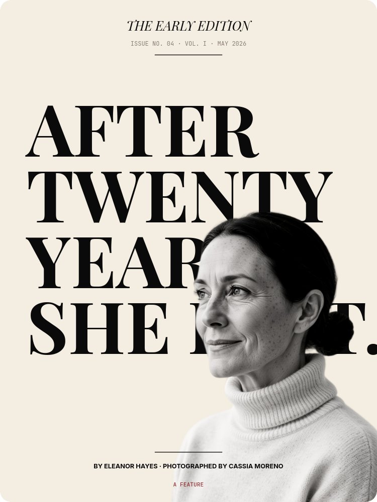
The defining choice is editorial restraint applied to a slideshow format. Most carousel templates compete for attention pane by pane. This one earns attention by withholding it. The cover masthead reads "THE EARLY EDITION" in small Playfair across the top, then a four-line stacked headline ("AFTER / TWENTY / YEARS, / SHE LEFT.") fills the pane, then a byline strip ("BY ELEANOR HAYES · PHOTOGRAPHED BY CASSIA MORENO") sits below the rule. The cutout portrait pierces the type from right-center, halftone-treated, three-quarter angle, contemplative. The whole pane reads as a print page that happens to be in motion.
The drop-cap opener (pane 3) is the technical centerpiece. A massive Playfair "O" at near-pane-height holds the first paragraph in two justified IBM Plex Mono columns. The chapter label ("CHAPTER ONE - THE DEPARTURE") sits above in JetBrains Mono caps. The pull-quote pane (pane 4) gives a single Playfair italic line ("HALVERSON HAS A WAY OF SPEAKING ABOUT HER OLD WORK...") with the opening quotation mark rendered in deep red - the only place color appears in body copy across the entire deck. Pane 6 stacks "BEFORE / [B&W cutout] / AFTER" as the transformation beat. Pane 7 cuts a halftone image strip across "MARCH 2025. / BROOKLYN. / EVERYTHING CHANGED."
Animation is the slowest in the catalog. letter-fade on Playfair headlines at speed scale 0.6. Body text drifts on drift-y with a 200ms succession stagger. Cutouts fade only - never bounce, never pop. Autoplay paces at 5 to 6 seconds per pane, which matches the rhythm of reading a printed feature.
- Newsprint cream background (#f4ede1) with ink black type and deep red accent used sparingly
- Playfair Display masthead and headlines paired with IBM Plex Mono body copy
- Drop-cap opener pane with massive Playfair "O" and two justified body columns
- Pull-quote pane with deep red opening quotation mark - the only color in the body
- Halftone-treated B&W cutout portraits across cover, pull quote, before/after, and inline
- 8-pane long-form arc with chapter labels and "[END OF FEATURE]" colophon close
#Who Should Use This Template
- PR and comms teams publishing founder profiles, origin stories, or "how we got here" features. The magazine register signals editorial credibility in a way press releases cannot.
- Long-form newsletter writers repurposing a feature as a swipeable carousel. The chapter labels and two-column layouts preserve the long-form rhythm in a social-first format.
- Founders and operators publishing a personal essay on a major decision, a transition, or a method. The "AFTER TWENTY YEARS, SHE LEFT." headline structure is the shape of a story worth reading slowly.
- Studio and agency content teams producing brand journalism or client-feature stories. The byline format ("BY [REPORTER] · PHOTOGRAPHED BY [PHOTOG]") legitimises the work as editorial rather than marketing.
#Best Use Cases
#Founder Profile Published as a LinkedIn or Instagram Carousel
The 3:4 format is built for vertical scroll. Drop the cover image into the LinkedIn carousel slot, let the masthead and four-line headline carry the first impression, and the chapter-by-chapter panes hold a reader through the full story without breaking out of the format. Export as a sequence of PDFs for the LinkedIn document carousel or as still frames for an Instagram swipe-through.
#Brand Journalism for a Studio or Agency
Studios that publish client stories ("how we made the rebrand", "inside the launch") use this template to mark the work as editorial rather than sales collateral. The "[PUBLICATION NAME]" masthead becomes the studio's own publication name. The byline format gives credit to the writer and photographer. Hosting the live HTML on a /journal/[slug] page on the studio site doubles as portfolio and content marketing.
#Origin Story or Transition Essay
For a founder publishing a personal essay - a pivot, a sabbatical, a method that took a decade to figure out - the template gives the writing the visual weight a tweet thread cannot. Pane 6's BEFORE / [cutout] / AFTER sandwich is the transformation beat the essay arc resolves into. Pane 7's stacked dateline ("MARCH 2025. / BROOKLYN. / EVERYTHING CHANGED.") is the place-and-time moment of inflection. The whole deck reads as a print feature rather than a content post.
#How to Customize This Template
- Open PaneFlow and select "Newsprint Editorial - Feature Story" from the template gallery
- Rename the masthead ("THE EARLY EDITION") to your publication or studio name
- Rewrite the four-line stacked headline on the cover, keeping the line breaks for the editorial rhythm
- Update the byline ("BY [WRITER] · PHOTOGRAPHED BY [PHOTOG] · [MONTH] [YEAR]")
- Generate or upload seven B&W halftone-treated portraits of the same subject and background-remove each one
- Rewrite the chapter labels and the body copy across panes 3 and 5, watching the word count limits on the two-column layouts
- Edit the pull quote and attribution on pane 4, keeping the red opening quotation mark for accent
- Update the BEFORE / AFTER frame and the dateline strip on panes 6 and 7, then export to PDF for the document carousel or HTML to publish on your journal page
#Related Templates
- Founder Letter - Editorial Serif - long-form founder message with the same editorial restraint
- Magazine Cover - Editorial Mix - editorial cover with mixed display typography
- Quote Portrait - Pulled Word - single-quote portrait composition for short-form quote posts
- Case Study - Long Form Customer Story - structured customer story with metrics and narrative
#Related Resources
- PaneFlow for Content Creators - long-form features, profiles, and editorial carousels
- PaneFlow for Marketers - brand journalism and storytelling presentations
- PaneFlow vs Gamma - how PaneFlow handles editorial restraint Gamma templates miss
Start with Newsprint Editorial - Feature Story
Open this template in PaneFlow, customize it to match your brand, and export as HTML, React, Vue, or video.