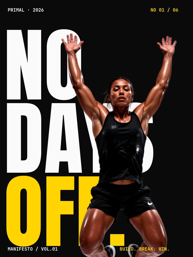
Athlete Manifesto - Action Cutout Template
A 3:4 athletic-brand manifesto carousel that reads as a Nike-style ad campaign rather than a slide deck. Pure black background, electric yellow and red accents, Anton condensed verbs at 50% pane height, and action cutouts of an athlete bursting diagonally through the type on every pane. Six panes built for fitness brands, gyms, athletic apparel, and supplement companies that need their drop-in social content to feel like a campaign, not a content calendar item.
#What Makes This Template Stand Out
The defining choice is the imperative-only voice paired with cutouts that burst through every verb. Most fitness-brand carousels read as either inspirational quote graphics or product flat-lays. This one inverts both - "RISE" sits at 50% pane height in white Anton condensed, an athletic cutout mid-pull-up pierces the letterforms with the body landing in front of the type, and the next pane does the same move with "BURN" and a mid-sprint cutout, and the next does it again with "WIN" and an arms-raised victory pose. The repetition is the rhythm; the variation is which body part interrupts the letter.
The image-splits-word pane is the cinematic gut-punch. The word "REVOLUTION" or "MOVEMENT" splits horizontally mid-height, an athlete in a stretched horizontal pose cuts through as a full-frame image strip, and the top and bottom halves of the letters stay readable above and below the band. It is the kind of typographic move that looks like a magazine spread rather than a feed-format graphic, which is exactly why it gets saved.
The closing pane is the brand mark drop. Full-bleed electric yellow, the brand wordmark knocks out to reveal a tight crop of muscle and sweat texture image showing through the letterforms (implemented via background-clip: text in a code child), and a tiny mono CTA sits underneath. The knockout move is the kind of detail that confirms the carousel was art-directed rather than templated, and it lands the brand mark with the same weight a print campaign would give it.
- Pure black stage with electric yellow primary accent and red secondary accent for one letter per pane
- Single-verb panes at 50% pane height in Anton condensed with action cutouts piercing every word
- Image-splits-word pane with a horizontal cutout strip cutting REVOLUTION or MOVEMENT mid-height
- Aggressive 2.5s-per-pane autoplay with stomp, bounce, and letter-scale animations on every verb
- Knockout logo reveal on the closing pane: brand wordmark cut out of yellow to reveal sweat texture
- 6-pane 3:4 carousel built for Instagram, TikTok story exports, and athletic-brand campaign drops
#Who Should Use This Template
- Athletic apparel and footwear brands running social-first campaign content. The Nike-style ad register and the cutout-pierces-type cover give the brand the campaign energy that a flat lookbook cannot.
- Gyms, fitness studios, and CrossFit boxes producing membership drives, class launches, or quarterly campaign content. The single-verb panes adapt to any class name (LIFT, ROW, FLOW) and the knockout logo reveal lands the studio brand at the end of every drop.
- Supplement, sports drink, and energy brands introducing a new SKU or running a seasonal campaign. The yellow and red accents pop against the black stage at any feed size, and the imperative voice matches the category's emotional register.
- Personal trainers, fitness coaches, and athlete personal brands building a launch carousel for a new program or training block. The six-pane structure is short enough to consume in one scroll and confident enough to read as a coach who knows what they are doing.
#Best Use Cases
#Athletic Brand Campaign Drop
The default use case. When a brand drops a new collection, a new sneaker, a new supplement, or a new training program, this carousel is the launch announcement. The verb cadence sets up the emotional register, the image-splits-word pane gives the campaign its cinematic moment, and the knockout logo reveal closes on the brand mark. Export to image sequence for Instagram, to MP4 for TikTok and Reels, and to PDF for retail-partner one-sheets.
#Gym and Studio Membership Campaign
Rewrite the verbs to match the studio's training language (LIFT, ROW, FLOW, GRIND, RECOVER, EARN) and rebuild the closing pane around the studio wordmark. The aggressive pacing and the black-stage palette read as a serious training facility rather than a wellness boutique, which is exactly what the audience expects for a quarterly membership drive or a new class launch.
#Athlete Personal Brand or Coach Launch
For trainers, coaches, and athlete personal brands launching a new program, the manifesto format does the credibility work that a long-form sales page usually has to do. The cutouts use your own physique, the verbs land your training philosophy in one word per pane, and the closing logo reveal lands your personal mark. Export to vertical video for Reels and TikTok where the 3:4 to 9:16 crop reads cleanly.
#How to Customize This Template
- Open PaneFlow and select "Athlete Manifesto - Action Cutout" from the template gallery
- Replace the cover action cutout with your own background-removed athlete image (mid-jump or mid-sprint, dynamic pose, no motion blur)
- Update the cover headline (NO DAYS OFF or your brand wordmark) and the accent letter color
- Rewrite the three verb panes (RISE, BURN, WIN) with your own imperatives and swap the matching action cutouts
- Replace the image-splits-word pane copy (REVOLUTION or MOVEMENT) and the horizontal cutout strip
- Update the corner stat callout on the WIN pane with your own numbers (days, reps, percent)
- Replace the brand wordmark on the knockout pane and swap the underlying sweat-texture image that shows through the type
- Update the CTA URL on the closing pane and export to MP4 for TikTok and Reels, image sequence for Instagram, or HTML for the campaign landing page
#Related Templates
- Keynote Speaker - Cinematic Bold - same brutalist black-stage palette in a 16:9 speaker introduction format
- Manifesto Declaration - Gesturing Cutout - vertical declaration carousel using the same cutout vocabulary
- Fitness Program - Energy - fitness program promotion deck with high-energy pacing
- Product Drop - Cutout Hero - cutout-hero product launch template if you need the SKU drop counterpart
#Related Resources
- PaneFlow for Ecommerce - product drops, lookbooks, and campaign carousels for online stores
- PaneFlow for Marketers - campaign-grade social content and animated launch assets
- PaneFlow vs Canva - how PaneFlow goes beyond Canva for animated cutout campaigns and knockout type
Start with Athlete Manifesto - Action Cutout
Open this template in PaneFlow, customize it to match your brand, and export as HTML, React, Vue, or video.