Founder Letter - Editorial Serif Template
An 8-pane founder-letter template for the year-end note, the funding announcement, the milestone retrospective, or the public reflection after a hard quarter. Cream background, warm-black ink, Playfair Display italic headlines that read like the cover of a literary magazine, JetBrains Mono body copy for the typewriter feel, halftone-treated black-and-white portraits, and a single deep red accent used three times across eight panes. The slow letter-fade animations and 6-second autoplay let every page breathe.
#What Makes This Template Stand Out
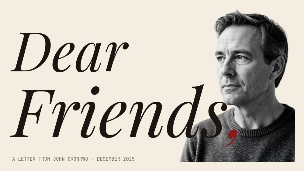
The defining choice is the editorial mixed-media register. Most founder letters live as plain Substack posts or LinkedIn essays. This one treats the letter as a designed object - the Playfair italic "DEAR FRIENDS," cover reads like a Monocle feature, the deep red comma after FRIENDS is the only accent on the page, and the halftone-treated portrait pierces the S so the salutation already carries the founder's presence. The cream background is warm rather than neutral, the JetBrains Mono body copy reads as personal correspondence rather than corporate communication, and the whole thing feels like a piece of writing someone actually wanted to publish.
The column triptych on pane 4 is the cinematic heart of the letter. "WE BUILT" sits in the left column, a halftone cutout of the founder with arms wide sits in the middle, and "SOMETHING REAL" sits in the right column - the three beats reading as one phrase across the page. The image is the punctuation between the words. Pane 5 inverts the move with pure typographic stillness: one stat per row, Playfair numerals next to mono units, no image, just the count of what happened.
Pane 7 is the showpiece. A single 50-word paragraph opens with a giant Playfair drop cap at 8x scale, and a tiny circular cutout of the founder lives inside the counter of that letter - the image-as-punctuation move done literally. It is the kind of typographic detail that gets the letter saved and shared rather than scrolled past. The sign-off pane closes with "WITH GRATITUDE," in Playfair italic and a Caveat handwritten signature underneath, with a small deep red accent line keeping the visual logic of the cover intact through the final frame.
- Cream background, warm-black ink, JetBrains Mono body copy, and a single deep red accent used sparingly
- Cover with massive Playfair italic DEAR FRIENDS and a halftone portrait piercing the S
- Column triptych pane reading WE BUILT / [halftone cutout] / SOMETHING REAL as one phrase
- Pure typographic stat pane with Playfair numerals next to JetBrains Mono units
- Drop-cap pane with a tiny circular founder cutout living inside the counter of the first letter
- 8-pane 16:9 arc closing with WITH GRATITUDE, a Caveat handwritten signature, and a red accent line
#Who Should Use This Template
- Founders writing a year-end letter to investors, customers, and the broader internet. The literary tone and the slow letter-fade animations match the cadence of a real annual reflection rather than reading as a marketing asset.
- Founders announcing a funding round, an acquisition, or a leadership change who want the narrative to land before the press release does. The drop-cap pane and the column triptych give the announcement editorial weight that a blog post cannot match.
- Company communications and brand teams producing milestone retrospectives (5 years, 10 years, 1 million customers, first international office). The stat pane on pane 5 and the lessons pane on pane 6 carry exactly the structural beats those retrospectives usually need.
- Solo operators and writers publishing a public reflection after a hard quarter, a product sunset, or a personal pivot. The cream and warm-ink palette reads as honest rather than promotional, which is the tone these moments usually call for.
#Best Use Cases
#Year-End Founder Letter
The default use case. Write a real letter, drop the panes into the template (cover, year in one sentence, the hard part, the build, the numbers, the lessons, the drop-cap reflection, the sign-off), and publish on the same week most founders are posting their year-end notes. The editorial typography is what differentiates the piece from every other year-end Substack post in the feed. Export to PDF for email, to image sequence for LinkedIn, and to HTML for the live blog link.
#Funding Announcement Narrative
When the press release goes out, the founder letter is what investors and customers actually read. This template gives the announcement an editorial frame so the news feels earned. Use the cover and the year-in-one-sentence pane to land the headline, the hard part and the numbers panes to show the work behind the round, and the drop-cap and sign-off panes to close on the human note. Pair the published letter with the standard press release.
#Company Milestone Retrospective
For a 5-year, 10-year, or seven-figure customer-count milestone, the eight-pane structure carries the narrative beats most retrospectives need. The lessons pane on pane 6 (three numbered Playfair italic items) is exactly the format readers expect for a milestone retrospective, and the column triptych on pane 4 gives the team a single emotional truth to land in the middle of the letter.
#How to Customize This Template
- Open PaneFlow and select "Founder Letter - Editorial Serif" from the template gallery
- Replace the cover halftone portrait with your own background-removed black-and-white founder image, and update the dateline below ("A LETTER FROM [NAME] · [MONTH] 2026")
- Rewrite the year-in-one-sentence headline on pane 2 to your own declarative line
- Edit the 80-word paragraph and the pull-quote on the hard-part pane (pane 3), and swap the window-light portrait
- Update the WE BUILT / SOMETHING REAL triptych phrase on pane 4 and replace the middle cutout
- Replace the three numbers on the stat pane (pane 5) with your own metrics, keeping units in mono and numerals in Playfair
- Rewrite the three numbered lessons on pane 6 and the 50-word drop-cap paragraph on pane 7
- Update the WITH GRATITUDE sign-off, the Caveat signature, and the contact details on pane 8, then export to PDF for email distribution
#Related Templates
- Magazine Cover - Editorial Mix - same editorial mixed-media palette in a magazine-cover format
- Newsprint Editorial - Feature Story - cream + mono + drop cap aesthetic for long-form feature stories
- About Me - Cutout Portrait - personal-brand carousel using the same cutout-pierces-type cover move
- Case Study - Long Form Customer Story - editorial long-form narrative template for customer stories
#Related Resources
- PaneFlow for Startups - founder letters, investor updates, and milestone retrospectives
- PaneFlow for Marketers - long-form narrative assets for brand and content marketing
- PaneFlow vs Canva - how PaneFlow goes beyond Canva for editorial typography and animated long-form content
Start with Founder Letter - Editorial Serif
Open this template in PaneFlow, customize it to match your brand, and export as HTML, React, Vue, or video.