Faster Layouts With Draw-Blocks And Relative Sizing
Designing a slideshow layout shouldn't feel like fighting the grid. You just want to sketch a block, drop content in, and know it'll resize properly when you move things around.
Today's update is all about that: making the pane-and-block workflow feel closer to drawing on a canvas, while still staying perfectly structured and developer-friendly.
You're getting three upgrades:
- Draw blocks directly on the grid instead of creating 1x1 blocks and resizing.
- Fixed vs Relative sizes for images, videos and similar elements, so layouts behave the way you expect when blocks move.
- Block naming in the sidebar, so complex panes stay readable (especially with animations and click actions).
Let's walk through what changed and how to use it in real projects.
#Draw Blocks Right On The Grid
Previously, creating a new block looked like this:
- Click on an empty cell to create a 1x1 block.
- Grab the block edges and drag to the size you want.
- Repeat... a lot.
Now you can just draw the block directly on the grid.
- Click on an empty cell
- Hold and drag across the grid
- Release to create a new block with that exact size
It feels a lot more like sketching cards on a whiteboard.
Why it's better
- Faster layout sketching - especially when you're mocking out dashboards, feature grids, or multi-pane storyboards.
- Less fiddling - you spend time choosing layouts, not micro-resizing.
- Still perfectly structured - every drawn area becomes a proper PaneFlow block, ready for animations, click actions, and exports.
#Fixed vs Relative Size For Images, Videos & More
PaneFlow always cared about responsive layouts. Until now, most element sizes (like images and videos) used fixed cqw units based on the main slideshow size. That's great for consistency across devices, but sometimes you want an element to follow the block instead of the whole slideshow.
So we're introducing Fixed and Relative sizing for most visual elements.
#Fixed Size - Consistent Relative To The Slideshow
This is what you already know:
- Size is defined with
cqwunits, relative to the main PaneFlow canvas. - Great when you want a logo, icon, or button to stay the same visual size no matter which pane/block it lives in.
#Relative Size - Responsive To The Containing Block
New option: Relative.
- Size is defined in percent (%) of the containing block.
- If the block changes size (or moves to a different pane with a different grid layout), the element adjusts automatically.
- Perfect for images, videos, cards, and thumbnails that should always fill a certain portion of the block.
Example:
- You place a hero image in the top-left block of Pane A and set it to Relative 80% width.
- Later, you move that block to another pane with a different layout.
- The image automatically resizes to stay at 80% of that block, without you touching the settings.
#When To Use Which
-
Use Fixed when:
- You want consistent UI elements across panes (logos, avatar badges, small icons).
- You're designing highly controlled product walkthroughs or app tours.
-
Use Relative when:
- You're moving or reusing blocks between panes.
- You want imagery to “live inside” the block and grow/shrink with it.
- You're building galleries, grids, or any layout where cards should adapt.
Nice side effect for exports
Because PaneFlow exports clean code and layouts (whether you publish to CDN, export to React/Vue/Svelte, or export to Video), these sizing decisions are first-class - not just CSS hacks.
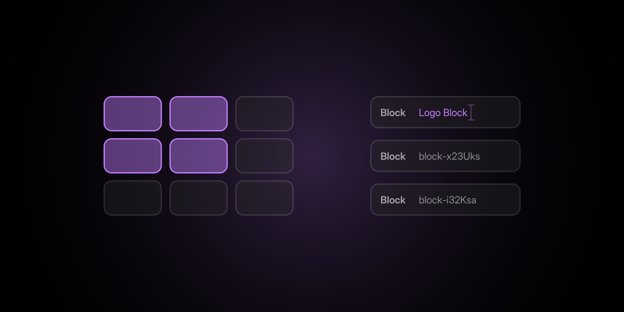
#Name Your Blocks For Cleaner Structure
In the previous update, we introduced pane naming so you could stop living with pane-H9kgk2 and start dealing with “Hero”, “Pricing”, “Testimonials”, etc.
Now you can do the same at the block level.
- Open the PaneFlow sidebar
- Find your block in the content tree
- Double-click its label to rename
Instead of a stack of anonymous “Block” items, you can now have:
Logo BlockFeature CardsCTA Button Row
This is especially useful when:
- You're working with nested blocks (e.g., logo + text + buttons inside a parent block).
- You're adding entry/exit animations per block (Animations feature).
- You're wiring up on click actions to navigate between panes or trigger states.
The sidebar becomes a readable outline of your slideshow, not just a list of generic containers.
#How This Fits Into Your PaneFlow Workflow
These three changes are small on paper, but they smooth out a lot of everyday friction:
- Sketch layouts faster with draw-to-create blocks.
- Choose the right sizing model depending on whether an element should follow the slideshow or the block.
- Keep complex projects readable with proper block names.
Combined with what you already have in PaneFlow:
- Rich visuals: Shapes, Masks, Gradients and Custom Fonts for precise brand match.
- Dynamic content: Charts, Video + YouTube/Vimeo blocks, and flexible animations on any element.
- Export anywhere: one-click publish to CDN, Webflow App, Framer Plugin, and clean HTML/React/Vue/Svelte code exports.
So you design once in this pane-and-block editor... and reuse that layout everywhere.
Don't Miss What's Next
Get updates, design tips, and sneak peeks at upcoming features delivered straight to your inbox.