New Feature: Charts in PaneFlow for Enhanced Data Visualization
We're so excited to share a new addition to PaneFlow: Charts!
This feature lets you bring your data to life in slideshows, making it a breeze to share insights with your audience.
Whether you're a designer crafting a portfolio, a marketer pitching a campaign, or a business owner presenting financials, Charts adds a fun and visual way to tell your story.
Let's explore what this feature offers, how it can help you, and how to dive in.
#Why Charts Are a Game-Changer
Charts turn numbers into something your audience can actually enjoy looking at. Here's how they can make a difference for different folks:
#For Designers
- Transform dry data into eye-catching visuals for your projects.
- Play with styles to match your creative flair, all without touching code.
- Skip the back-and-forth with other tools and build right in PaneFlow.
#For Marketers
- Show off trends or stats with a sleek Line or Pie chart for your next pitch.
- Tweak data or looks on the fly for those last-minute changes.
- Wow your team with slides that look like they took hours, not minutes.
#For Business Owners
- Highlight profits or budgets with a clear Bars or Donut chart for your next meeting.
- Create pro-level visuals without needing a tech expert on speed dial.
- Tie charts into other slides for a full picture of your business.
With Charts, your data doesn't just sit there - it tells a story that sticks with people.
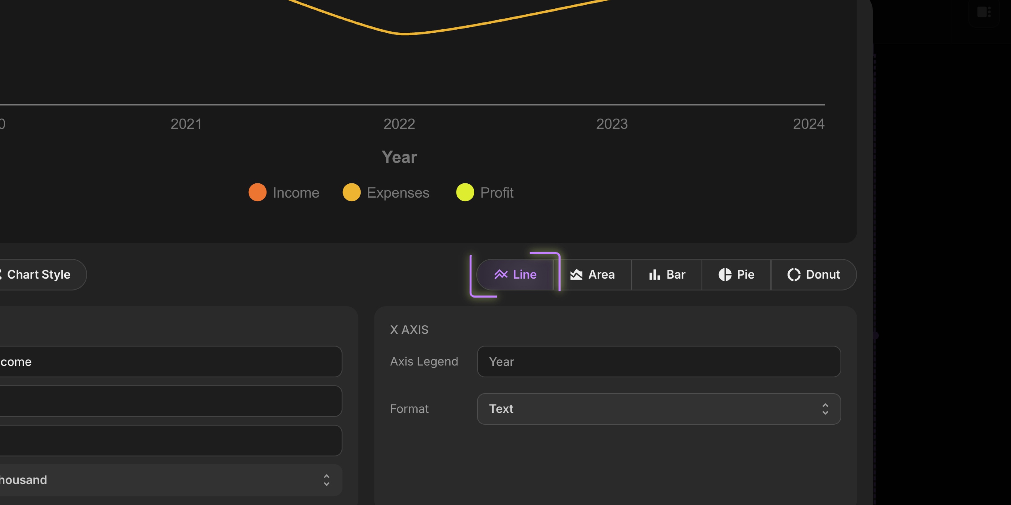
#How to Add Charts
Getting started with Charts is super simple:
-
Open your project in PaneFlow - whether it's a new one or an existing favorite with assets or templates.
-
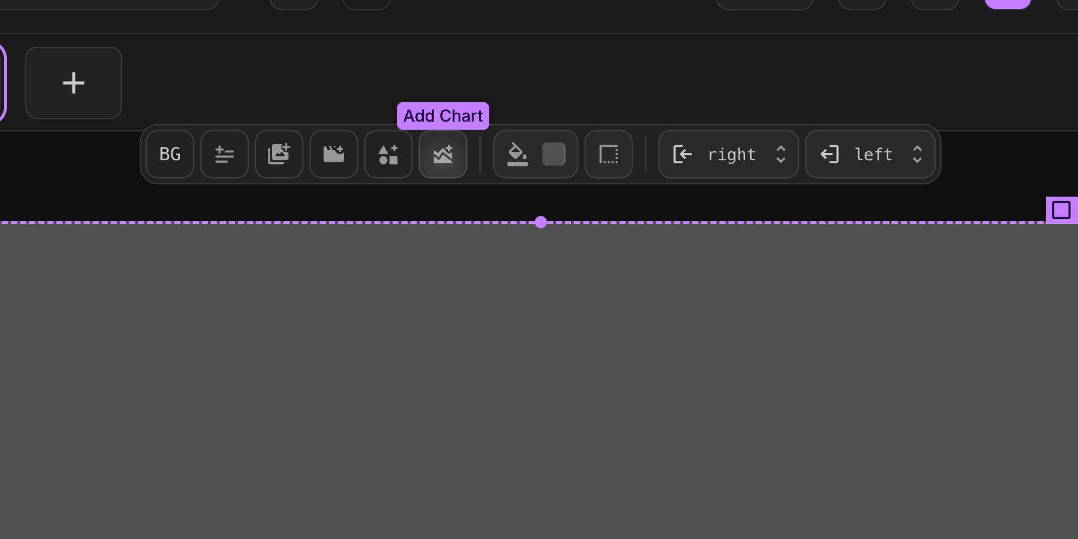
Spot the "Add Chart" button in the toolbar and give it a click to bring up the modal.
-
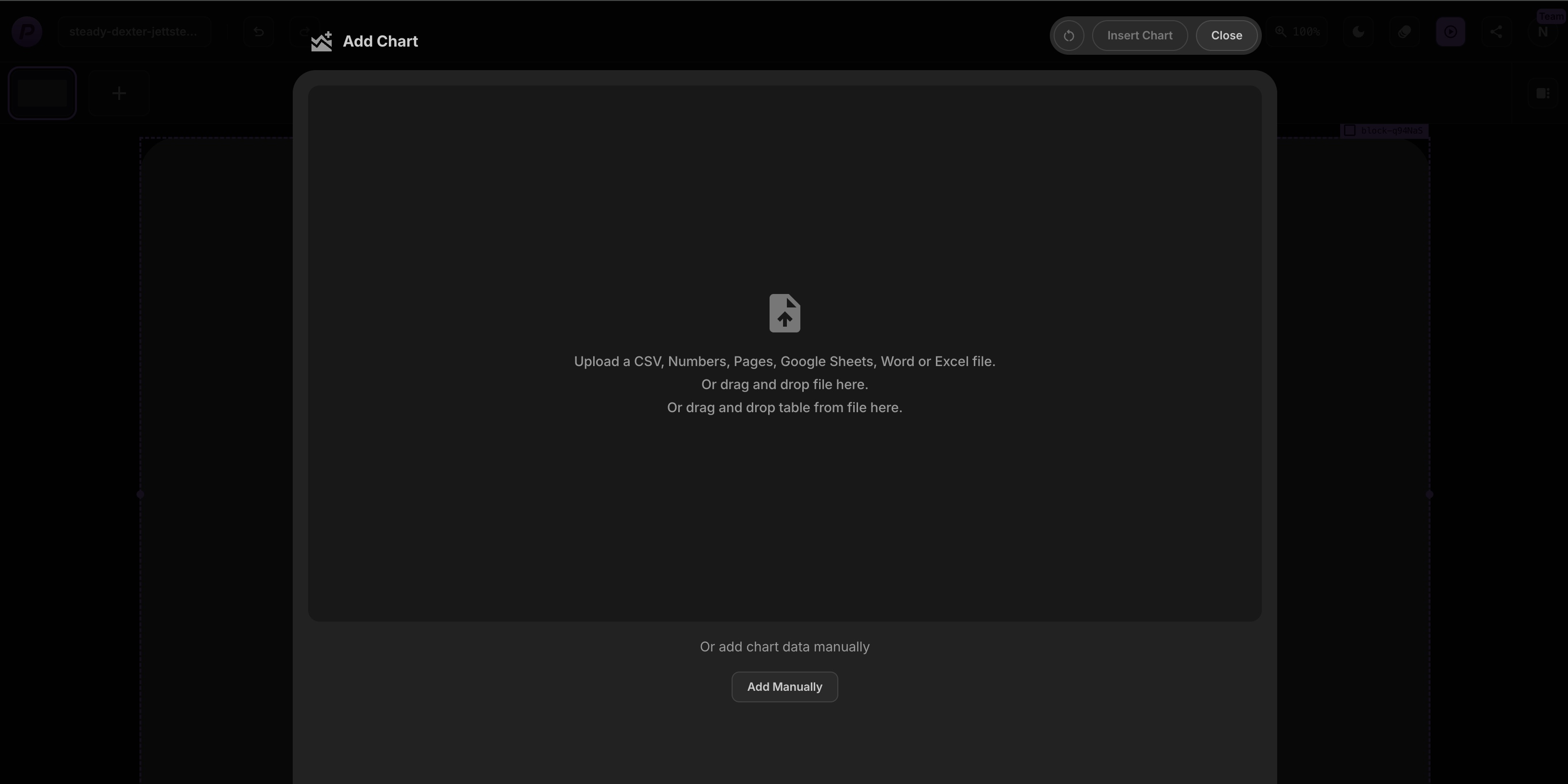
From there, you can upload a sheets file like Excel or CSV by dragging it in or picking it from your computer, or type in your data manually.
-
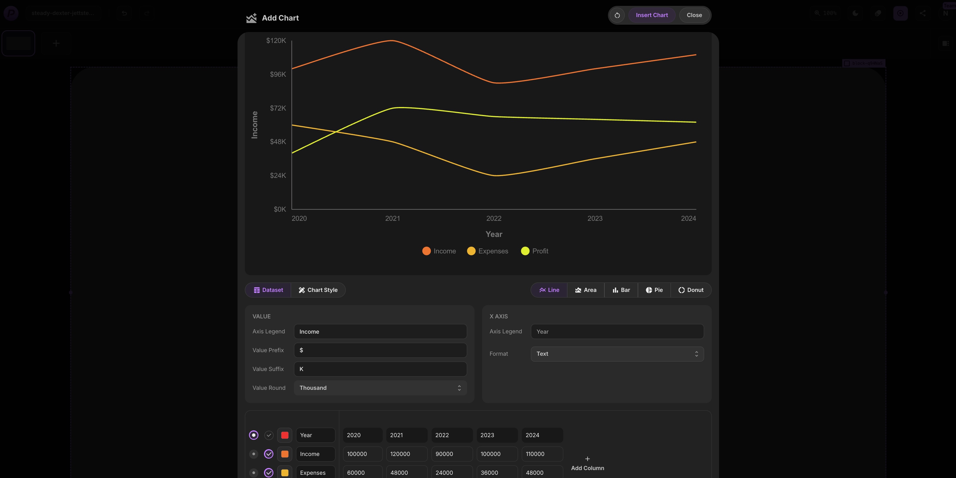
Now you'll see a Chart live preview.
-
Pick your style: Line for trends, Area for filled trends, Bars for comparisons, Pie for proportions, or Donut for a ring effect - the preview shifts to show your choice.
-
Next, play with the settings. Adjust axis labels, add or move a legend, pick colors (maybe from the Asset Library), or tweak labels to make it your own.
-
If your data needs a change, add or remove rows and columns right in the modal. When it looks good, hit "Insert Chart" to drop it onto your block.
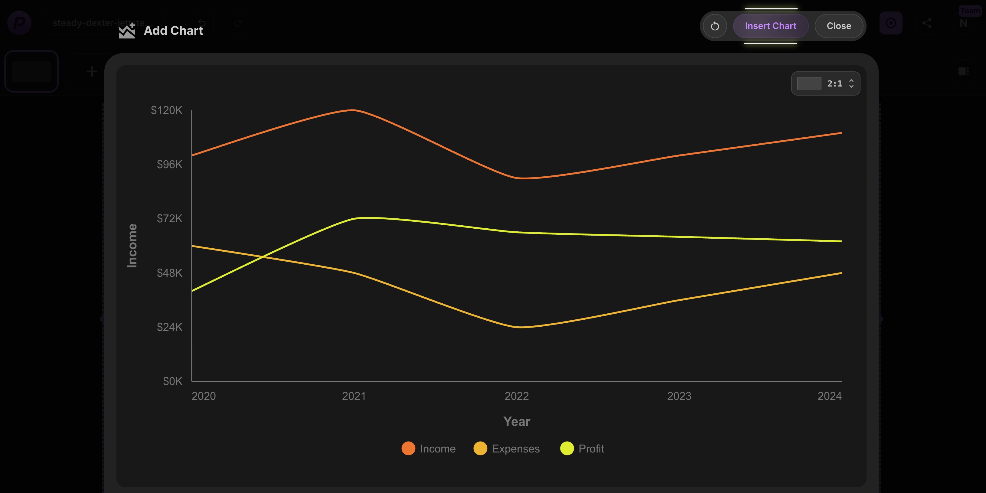
Then, just drag it where you want and resize it to fit your layout. It's a smooth process that lets you craft the perfect chart without any fuss!
#Give Charts a Try Today
Charts are here to make your data shine in PaneFlow, working beautifully with features like the Asset Library or Element Grouping. Whether you're putting together a report, a product pitch, or a business update, this tool helps you share your numbers with style and ease.
Get PaneFlow for as low as $4 per month.
#Additional Resources
- New Feature: Asset Library in PaneFlow for Streamlined Design Management
- New Feature: Grouping Elements in PaneFlow for Enhanced Design Flexibility
- PaneFlow Plugin for Framer: Embed Stunning Slideshows in Your Designs with Ease
- Explore PaneFlow's Features
Don't Miss What's Next
Get updates, design tips, and sneak peeks at upcoming features delivered straight to your inbox.