Tabbed Feature Showcase Template
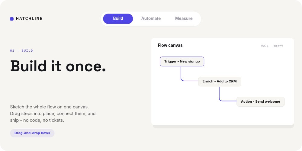
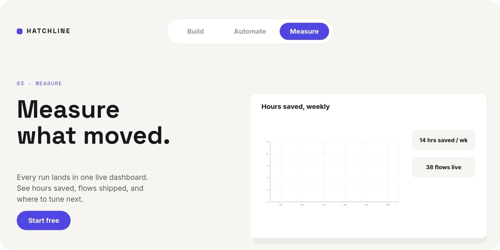
A 2:1 feature section for SaaS landing pages, built around the module every product site eventually needs: tabs that switch the screenshot. Here the screenshot is a live pane. Three tabs - Build, Automate, Measure - sit in a white segmented pill bar at the top, and each click swaps the whole stage: a new verb-first headline in Space Grotesk, a new floating UI card, a new proof chip. The fictional brand is Hatchline, a workflow automation tool, and every pixel of its product UI is composed from editable blocks rather than baked screenshots.
#What Makes This Template Stand Out
The tab bar is real navigation, not a drawing of one. Each tab carries two states - an indigo-filled pill with a white label when active, a muted ghost label when inactive - and both states are wired with click actions to their pane. Because PaneFlow exports interactivity along with animation, the tabs keep clicking after export to HTML, React, Vue, and Svelte, and the whole section plays through automatically when exported to video.
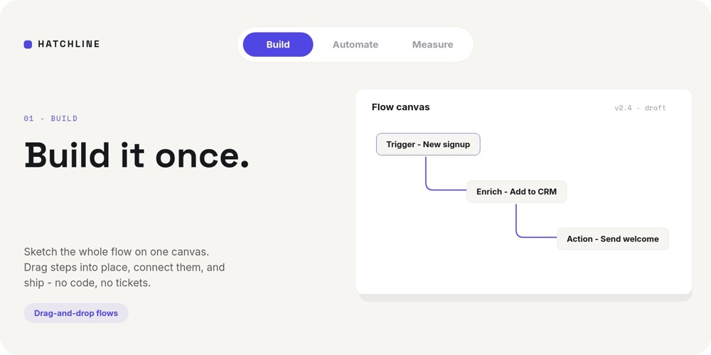
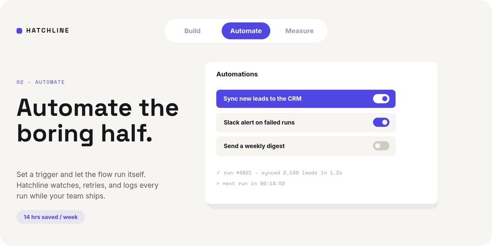
The UI cards are built from blocks, so they edit like a document. The Build pane shows a "Flow canvas" card with three connected nodes - "Trigger - New signup", "Enrich - Add to CRM", "Action - Send welcome" - joined by indigo connector lines that draw themselves in, with a mono "v2.4 - draft" version tag. The Automate pane re-stages the card as an Automations list: "Sync new leads to the CRM" highlighted in indigo with its toggle on, "Slack alert on failed runs" on, "Send a weekly digest" off, and a mono log line underneath reading "run #4821 - synced 2,140 leads in 1.2s". The Measure pane swaps in a real chart child titled "Hours saved, weekly" with stat chips for "14 hrs saved / wk" and "38 flows live".
The pacing is tuned for impatient landing-page readers. Each pane's card enters from below and shifts position slightly between tabs, so the switch reads as the card relocating rather than the page reloading. Card contents stagger-fade at double speed, the "14 hrs saved / week" chip rolls its number in, and the Measure pane closes the section with an indigo "Start free" CTA pill - the conversion moment lives on the last tab.
- Segmented tab bar with indigo active pills and muted inactive labels, wired with real click navigation
- Three composed UI cards: a flow canvas with drawn connector lines, a toggle-row automations list, and a live chart
- Verb-first Space Grotesk headlines - "Build it once.", "Automate the boring half.", "Measure what moved."
- Mono micro-details that sell the product: version tags, run logs, "next run in 00:14:52" countdowns
- Number-roll stat chips and double-speed stagger entrances tuned for landing-page attention spans
- 3-pane 2:1 interactive section with autoplay off - tabs survive HTML, React, Vue, and Svelte export
#Who Should Use This Template
- SaaS marketing teams who need the features module on the landing page to do more than rotate static screenshots. Three tabs map cleanly to three product pillars, and the visitor controls the pace.
- Product marketers shipping a launch page. The Build / Automate / Measure arc is a positioning story in miniature - rename the tabs to your pillars and the structure argues for the product on its own.
- Indie founders and developers who do not have a designer on call. The UI cards are composed from blocks, so making the demo look like your product is text editing, not screenshot surgery.
- Agencies building marketing sites for B2B clients. One template produces the interactive section for the site, the autoplay video cut for social, and a clean React or Vue component for the dev handoff.
#Best Use Cases
#The Features Section of a SaaS Landing Page
Export to HTML, React, Vue, or Svelte and drop the section where your static three-column feature grid used to be. Autoplay is off, so the module waits for a click, and each tab presents one pillar with a headline, two lines of copy, a proof chip, and a working illustration of the product. The "Start free" CTA on the Measure tab gives the section its own conversion endpoint instead of relying on the page hero.
#A Product Tour Without a Demo Environment
When the real app is too complex or too unfinished to screenshot, the composed UI cards stand in for it. The flow canvas, the toggle list, and the chart read as product truth while staying fully editable - rename nodes and toggles as the product evolves, and the tour never goes stale. Because it is one component, it can live in docs, in a changelog post, or on a pricing page without rebuild work.
#Launch Announcements and Social Cuts
Export the same project to video and the three tabs play through automatically - tab switch, card entrance, number roll, CTA. That is a 15-second feature reel for the launch tweet or LinkedIn post, generated from the same source as the interactive section, so the two never drift out of sync.
#How to Customize This Template
- Open PaneFlow and select "Tabbed Feature Showcase" from the template gallery
- Replace the "HATCHLINE" wordmark chip top-left with your own brand name, and rename the Build / Automate / Measure tabs - edit both the active pill and inactive label states of each
- On the Build pane, rewrite "Build it once." with its kicker, body copy, and "Drag-and-drop flows" chip, then rename the three flow-canvas nodes to your own trigger, enrich, and action steps
- On the Automate pane, edit the three toggle rows, set which toggles read on or off, and update the mono run-log lines and the "14 hrs saved / week" stat chip
- On the Measure pane, feed the "Hours saved, weekly" chart your own data, update the two stat chips, and point the "Start free" CTA pill at your signup link
- Adjust the indigo accent across pills, chips, and connector lines if your brand color differs
- Test all three tabs in preview, then export to HTML, React, Vue, or Svelte for the site - or to video for the launch reel
#Related Templates
- Feature Tour - SaaS Section - the autoplay sibling for feature storytelling without tabs
- Onboarding Walkthrough - Steps - the same composed-UI-card vocabulary as a Next/Back stepper
- SaaS Hero - Kinetic Type - a matching hero section to sit above this features module
- Hotspot Product Tour - click-driven exploration of a single product image instead of tabs
#Related Resources
- PaneFlow for SaaS - feature sections, product tours, and launch assets for software teams
- PaneFlow for Landing Pages - interactive sections that embed where static blocks used to sit
- PaneFlow for Product Managers - explain the product without waiting on a demo environment
Start with Tabbed Feature Showcase
Open this template in PaneFlow, customize it to match your brand, and export as HTML, React, Vue, or video.