Onboarding Walkthrough - Steps Template
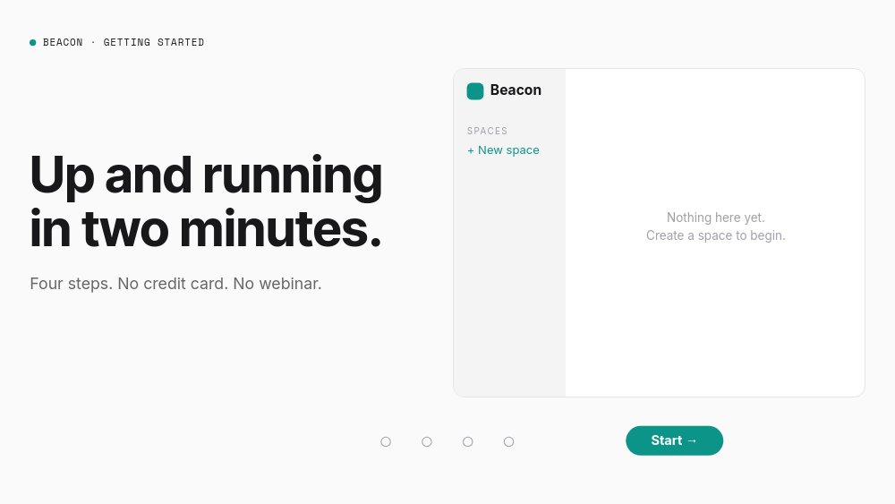
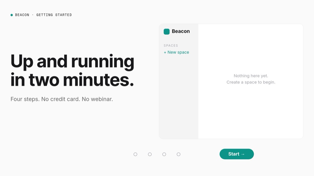
A 16:9 self-paced product walkthrough - the catalog's cleanest demonstration of explicit Next and Back navigation. The fictional product is Beacon, a team knowledge base, and the welcome pane promises what the template delivers: "Up and running in two minutes." over the subline "Four steps. No credit card. No webinar." A stepper rail runs along the bottom - ghost Back pill, four step dots, mono "STEP X OF 4" counter, teal Next pill - and on the right, a composed product UI card literally builds itself as visitors click: space, team, tools, done.
#What Makes This Template Stand Out
The stepper is honest navigation. Next and Back are wired to real next and previous pane actions, the four dots jump straight to their steps, and looping is off - the one bucket of PaneFlow templates where the show must stop at its ends, this one stops. The welcome pane hides Back and relabels Next as "Start →"; the final pane hides Next and keeps Back. Because PaneFlow exports interactivity along with animation, all of it survives HTML, React, Vue, and Svelte export - and the five panes play through automatically when exported to video.
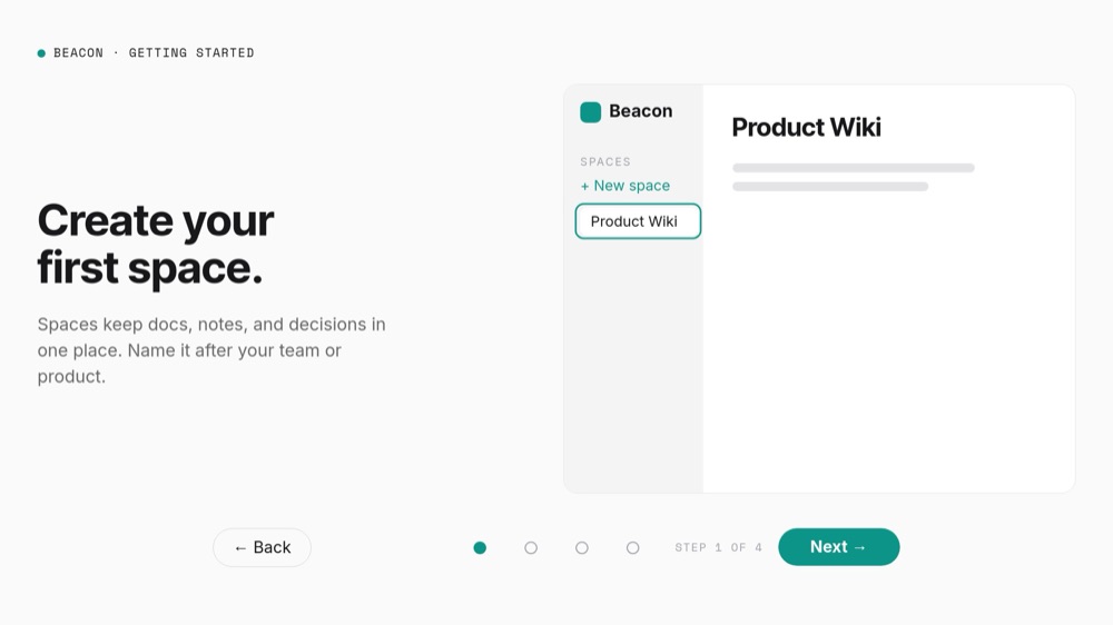
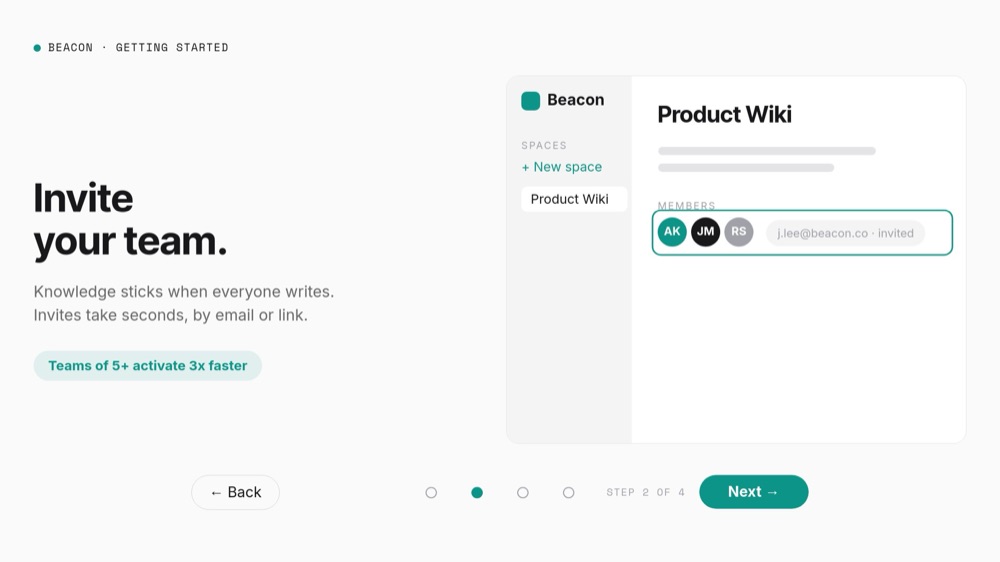
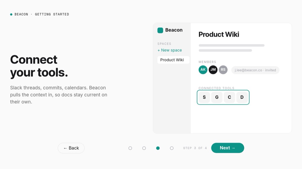
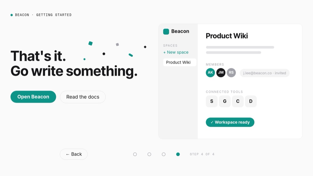
The UI card accumulates instead of swapping. Step 1 highlights "+ New space" and a teal-ringed "Product Wiki" appears in the sidebar. Step 2 adds a MEMBERS row - AK, JM, RS avatars plus a pending "j.lee@beacon.co · invited" field - under the chip "Teams of 5+ activate 3x faster". Step 3 ring-lights a CONNECTED TOOLS row of four monogram tiles. The final pane drops confetti shapes, stamps a teal "Workspace ready" badge on the finished card, and declares "That's it. Go write something." with "Open Beacon" and "Read the docs" pills. The product visibly assembles, which is the entire argument an onboarding page needs to make.
Every element of that product UI is composed from blocks - zero screenshots, zero image credits. The sidebar, avatars, invite field, and tool tiles are editable children with a teal accent you can swap for your brand color in one pass. Each step's new element enters with a pop and a teal highlight ring (the "look here" move), copy staggers in at double speed, and the activation stat number-rolls on step 2.
- Stepper rail with Back and Next pills, four clickable step dots, and a mono "STEP X OF 4" counter
- No-loop navigation that stops at both ends, with dead controls hidden per pane - Back on the welcome, Next on the finish
- Composed product UI card that accumulates a space, member avatars, an invite field, and tool tiles step by step
- Pop-plus-teal-ring "look here" choreography on each step's new element
- Confetti finish with a "Workspace ready" badge and dual CTAs - "Open Beacon" and "Read the docs"
- 5-pane 16:9 interactive format with autoplay off - the stepper survives HTML, React, Vue, and Svelte export
#Who Should Use This Template
- SaaS teams with a getting-started page. Four steps, explicit controls, and a product that assembles on screen explain a first run better than a wall of doc headings - and the export drops into the help center as a component.
- Product managers shipping onboarding flows. Prototype the ideal first-run narrative here, test the step order on real users, and hand the export to engineering as the spec that already works.
- Developer tools and API products whose setup is a sequence by nature. Install, configure, connect, done maps directly onto the four dots, and the composed UI card swaps cleanly for a terminal-and-config motif.
- Growth and lifecycle marketers who need the activation story outside the app - in launch emails, on landing pages, and as a video clip - without asking design for three separate assets.
#Best Use Cases
#The Getting-Started Page in Your Docs
Export to HTML, React, Vue, or Svelte and embed the walkthrough at the top of the quickstart. Autoplay is off, so the welcome pane waits with "Start →" until the reader is ready, and the no-loop stepper means they can move at reading speed, jump by dot, and back up without the flow wrapping around on them. The final pane's "Open Beacon" pill deep-links straight into the product, closing the loop from docs to activation.
#A Pre-Signup Product Preview
On a landing or pricing page, the walkthrough answers "what happens after I sign up?" before the form. Four clicks show a space created, a team invited, and tools connected - "No credit card. No webinar." sets the tone - and prospects who finish the stepper arrive at signup already knowing the first session is two minutes long. The "Teams of 5+ activate 3x faster" chip seeds the multi-seat conversation early.
#Launch Clips and Lifecycle Emails
Export the same project to video and the stepper plays through automatically: headline, step, step, step, confetti. That is the 20-second clip for the launch post and the animated centerpiece of the onboarding email sequence, produced from the same source as the docs embed - when the product flow changes, you update one project and re-export everything.
#How to Customize This Template
- Open PaneFlow and select "Onboarding Walkthrough - Steps" from the template gallery
- Replace the "BEACON · GETTING STARTED" chip top-left with your product name, and rebrand the UI card's logo chip and sidebar
- On the welcome pane, rewrite "Up and running in two minutes." and the "Four steps. No credit card. No webinar." subline - keep "Start →" as the relabeled Next pill
- On step 1, rewrite "Create your first space." with its body copy, and rename the "Product Wiki" space to your product's first object
- On step 2, update "Invite your team.", the member avatars and pending-invite address, and the "Teams of 5+ activate 3x faster" stat chip
- On step 3, rewrite "Connect your tools." and relabel the four monogram tool tiles to your real integrations - monograms, not trademarked logos
- On the final pane, edit "That's it. Go write something." and point "Open Beacon" and "Read the docs" at your app and docs URLs
- Add or remove steps if your flow is not four steps - mirror the dot count and the per-pane hiding of Back and Next at the new ends
- Click through forward, backward, and by dot in preview, then export to HTML, React, Vue, or Svelte for the docs - or to video for launch clips
#Related Templates
- Tabbed Feature Showcase - the same composed-UI-card vocabulary with free tab navigation instead of a stepper
- Feature Tour - SaaS Section - the autoplay way to walk through product capabilities
- Choose-Your-Path Quiz - branching click navigation for self-segmenting flows
- Hotspot Product Tour - exploratory click navigation over a single product image
#Related Resources
- PaneFlow for SaaS - onboarding tours, feature sections, and activation assets
- PaneFlow for Product Managers - prototype flows that export as working components
- PaneFlow for Startups - one source project for docs, landing pages, and launch content
Start with Onboarding Walkthrough - Steps
Open this template in PaneFlow, customize it to match your brand, and export as HTML, React, Vue, or video.