Creative Agency Pitch Deck Template - Editorial Magazine
A creative agency pitch deck template for design, branding, and motion studios that pitch by letting the work do the talking. 10 panes carry an editorial magazine aesthetic - cream textured paper, near-black ink, a single warm-red accent, italic Cormorant Garamond headlines, and full-bleed hero plates - through the studio capabilities, three featured projects, the process, and the contact details.
#What Makes This Template Stand Out
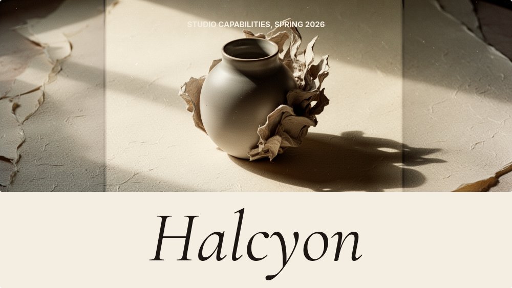
The defining choice is restraint with confidence. Most agency decks try to prove range by showing fifteen logos and a wall of services, and the work gets lost in the noise. This deck inverts the format. The cover sits a single moody object - a sculptural vase, a sheet of torn paper, a textured surface - on a cream backdrop with the studio name set huge in italic Cormorant Garamond at the foot of the frame. The about pane is one paragraph, centered. The capabilities pane is four numbered columns (Brand, Digital, Motion, Strategy) with the warm-red accent on the numerals, and below each, a vertical list of the actual services. By the time the deck reaches the work plates, the room already knows what kind of studio you are.
Featured work is the heart of the deck. Three full-bleed hero panes, each holding one image - a packaging system, a website on a laptop, a film still, a poster on a city wall - with the client name and a single line of outcome below. Parallax depth on the hero photography means the image drifts slightly slower than the headline as panes change, which is the editorial-magazine feel that pulls the eye through the deck. The italic serif lets each project title read like a magazine spread headline, not a slide title.
The process pane is three large outlined circles with serif numerals 01, 02, 03 inside, and the words Discover, Make, Deliver set in italic underneath. Each step gets one short paragraph. There is no flowchart, no arrows, no decorative chrome. Animation across the deck is drift-y, slow letter-fade on the italic headlines, succession on the capability lists, and parallax on the hero plates. Nothing loops, nothing bounces, and the pacing is intentionally calm - the deck moves at the speed an art director reads a magazine.
- 10-pane editorial structure: cover, manifesto, capabilities, three work plates, process, clients, team, contact
- Cream textured paper canvas with near-black ink and a single warm-red accent for numerals
- Italic Cormorant Garamond 600 headlines paired with Inter body for editorial magazine feel
- Three full-bleed featured-work panes with parallax depth on hero photography
- Four-column capabilities grid (Brand, Digital, Motion, Strategy) with vertical service lists
- Three-step process pane with large outlined circles and italic numerals - no flowcharts, no arrows
#Who Should Use This Template
- Design and branding studios pitching new business who want the deck to read as cultured rather than corporate. The italic serif and the cream palette signal taste before the first work plate even loads.
- Motion and film studios who need the work to play larger than life. The parallax hero plates and slow drift entrances are exactly the rhythm a motion reel deserves on a pitch screen.
- Independent creative directors and small studios without a full sales team, who need a deck that does the introduction work for them. The manifesto pane and the work plates carry most of the conversation.
- Strategy and brand consultancies where the deliverable is a brand book or a positioning system. The capabilities grid and the editorial process pane match the kind of artifact you are about to produce for the client.
#Best Use Cases
#New Business Pitches and Capabilities Decks
The deck plays both roles. The opening four panes (cover, manifesto, capabilities, first work plate) are exactly what a prospect needs to see in the first five minutes of a chemistry meeting. The next four panes (two more work plates, process, selected clients) cover the substance of how you actually work. The final two panes (team and contact) wrap the introduction. Re-order the work plates so the most relevant project leads, and the deck retargets to a new sector without rewriting copy.
#Studio Capabilities Microsite
Publish the deck to a private link and send the URL instead of a PDF attachment. The italic headlines, the parallax photography, and the slow letter-fades all play live in the browser, which is the right experience for a creative studio - a static PDF flattens the work. Keep the same link evergreen and update individual panes as new projects ship.
#Awards Submissions and Press Decks
When a press contact, an awards committee, or a design conference asks for "your studio info," this is the deck you send. Export as PDF for the formal submission, or share the live link for editors who want to see the motion. The editorial magazine register reads as native to the design press, which is exactly the audience evaluating it.
#How to Customize This Template
- Open PaneFlow and select "Creative Agency Deck - Magazine" from the template gallery
- Replace the cover photograph with a single moody studio object and set your studio name in italic
- Edit the manifesto paragraph on pane 2 with your own one-paragraph statement of intent
- Adjust the four capability columns and the service lists below them to match what you actually sell
- Swap the three featured-work hero plates with your strongest case images and update client names plus one-line outcomes
- Tune the Discover, Make, Deliver paragraphs on the process pane to match your real engagement model
- Replace the selected-clients logo wall (or set client names as an italic typeset list) and update the leadership portraits
- Set studio email, address, and Instagram on the contact pane, then export as PDF or publish to a private link
#Related Templates
- Sales Proposal - Services Agency - the proposal format that follows the capabilities deck once a client engages
- Case Study - Long-form Customer Story - long-form format for turning a featured project into a standalone story
- Brand Guidelines - Brand Book - the brand book deliverable that follows a winning brand pitch
- Digital Storyteller - editorial scrolling layout for studios that publish their own writing
#Related Resources
- PaneFlow for Agencies - capabilities decks, case studies, and proposals built for creative and brand studios
- PaneFlow for Designers - portfolio and presentation tools for independent designers and small studios
- PaneFlow vs Pitch - how PaneFlow compares to Pitch for editorial agency decks
Start with Creative Agency Deck - Magazine
Open this template in PaneFlow, customize it to match your brand, and export as HTML, React, Vue, or video.