LinkedIn Stat-Driven Carousel Template - Brutalist Data Post
A LinkedIn stat carousel template that turns a single data point into the whole post. Pure black background, electric yellow accent, huge Space Mono numerals, and a number-roll animation that counts the figure up as the pane comes into view. Built for analysts, researchers, and marketers who lead with a stat and want the slide to do the work.
#What Makes This Template Stand Out
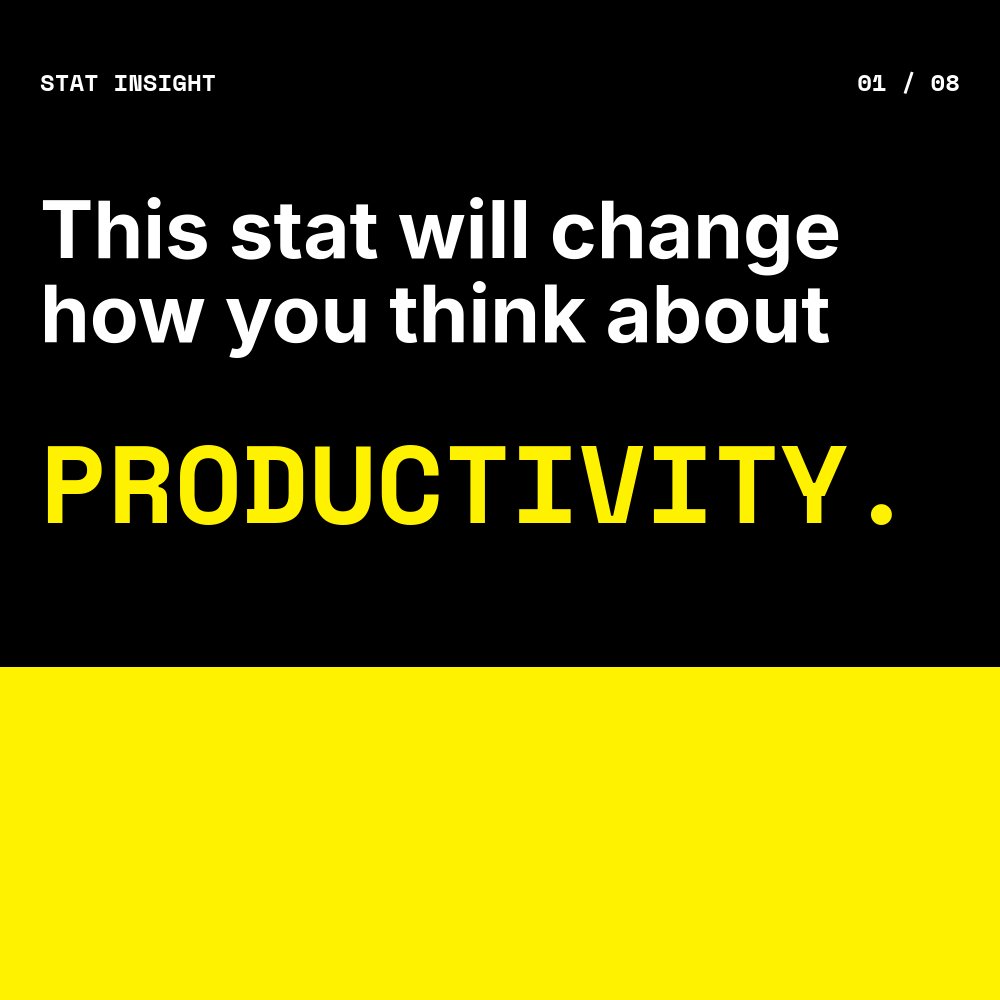
This is the loudest template in the LinkedIn carousel set, and that is the point. The aesthetic is brutalist - pure #000000 black, pure #ffffff white, and one accent at electric #fff200 yellow. There are no gradients, no rounded corners, no decorative imagery. The hook pane locks an all-caps Space Mono headline against the black background and ends the sentence with a single yellow word ("PRODUCTIVITY.") that runs full-bleed underneath, so the cover reads as both a question and a colored block at the same time.
The defining pane is pane 2, the stat reveal. The big numeral - "73%" by default, but written to hold any percentage, count, or currency - takes roughly 70 percent of the canvas in heavy Space Mono 700 weight. The pane fills with the yellow accent, so the figure reads as a black numeral on a yellow billboard. A number-roll animation counts the value up as the pane comes into view, which both stops the swipe and makes the figure feel earned rather than declared. The supporting context sits in two short Inter lines above and below the number.
Motion is hard. Stomp drops the headline onto the cover, number-roll runs the stat reveal, hard pop entrances bring the implication bullets in one at a time, and there is nothing soft about the pacing. The choices match the voice the brief asks for - punchy, no hedging, fact-led - and the post reads like a single confident claim rather than an explanation.
- 8-pane structure: hook, the number, source, why it matters, two implications, action, CTA
- Brutalist palette of pure black, pure white, and electric yellow with no gradients
- Number-roll animation on the big stat pane that counts the figure up on view
- Space Mono 700 for the running tag and huge numerals, Inter for body copy
- Stomp headline entrances and hard pop bullets for high-energy pacing
- Square 1:1 format sized for LinkedIn document post upload at 1080x1080
#Who Should Use This Template
- Analysts and researchers publishing a striking data point from a report and want the carousel to land with the same weight as the underlying number.
- Marketers running B2B thought leadership for SaaS, fintech, or research-led brands where the hook is always a stat and the goal is always a download or a follow.
- Founders citing market-shaping figures in pitches that double as social content - a TAM number, an industry benchmark, a category shift.
- Newsletter writers repurposing a single chart or stat from a long-form piece into a swipeable post that drives readers back to the full edition.
#Best Use Cases
#Data-Led LinkedIn Document Posts
The post format is built around the moment a swiper lands on pane 2 and sees the big number. The cover sets the topic, pane 2 lands the data, panes 3 through 7 give the figure context and consequence, and pane 8 converts. Export the project as a PDF and upload as a document post. The yellow-on-black contrast cuts through a feed full of softer content, and the number-roll bakes out cleanly even in a static export.
#Industry Report Promotion
If you publish quarterly or annual industry reports, this template is the carousel companion. Pull the most surprising stat into the hook, frame it on pane 2, walk through implications across panes 4 through 6, and link the final CTA to the full report download. The brutalist visual language signals research over opinion, which lifts the perceived authority of the source.
#Stat-Hook Newsletter and Twitter Cross-Posts
The same content works as a Twitter image grid (export as four panes, post as a thread) or a newsletter header graphic. The huge yellow numeral reads at any scale, and the high-contrast palette holds up to compression on every social platform. Use the carousel as the primary asset and slice individual panes for repurposing.
#How to Customize This Template
- Open PaneFlow and select "LinkedIn Carousel - Stat Insight" from the template gallery
- Edit the cover headline and the closing yellow word ("PRODUCTIVITY.") with your topic
- Replace the big numeral on pane 2 with your stat - the number-roll value updates automatically
- Update the source line on pane 3 with the report or dataset and the year
- Rewrite the why-it-matters lines, the two implication bullets, and the action line
- Swap the electric yellow accent in the project palette if you need a different brand color
- Replace the handle and follow line on the final CTA pane
- Export as PDF for LinkedIn document upload, or as video for stat-led short-form content
#Related Templates
- LinkedIn Tutorial Carousel - clean Linear-style how-to companion in the same square format
- LinkedIn Mini Case Study - outcomes-led square carousel for client wins
- LinkedIn Listicle Carousel - editorial cream and serif "lessons learned" variant
- Personal Wrapped - Vibrant - Spotify-style personal year recap with big stat panes
#Related Resources
- PaneFlow for Marketers - animated social, campaign, and content assets for B2B marketing teams
- PaneFlow for SaaS - product-led content, launch carousels, and stat-driven posts for SaaS teams
- PaneFlow vs Canva - how PaneFlow's animated carousels compare to Canva for LinkedIn document posts
Start with LinkedIn Carousel - Stat Insight
Open this template in PaneFlow, customize it to match your brand, and export as HTML, React, Vue, or video.