Quarterly Business Review - Donut & Bars Template
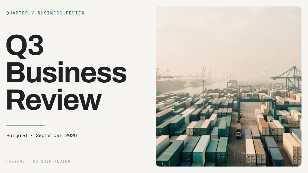
A quarterly business review template that leads with the verdict and backs it with charts. The fictional logistics SaaS Halyard opens its Q3 2026 review with a stacked "Q3 Business Review" headline in Archivo beside an aerial shot of a container port, then gets straight to the point on pane two: "Revenue up. Activation flat. One big miss." That candor is the whole design brief. The QBR deck spends eight panes proving the one-liner with a bar chart, a donut chart, a line chart against its target, and a pane that names the miss, its causes, and its owner.
#What Makes This Template Stand Out
Three chart types, each doing one job. The revenue pane shows five quarters as bars from Q3 '25 to Q3 '26, with only the current quarter in teal and the rest in warm grey, so the eye goes to the right bar before you say a word. The revenue mix pane is a donut with "$4.2M TOTAL ARR" set in its center and a three-item legend beneath - Enterprise 58%, Mid-market 31%, Self-serve 11% - next to a two-sentence read titled "Enterprise carries the quarter." The activation pane plots 13 weeks of activation hovering around 34% under a flat coral line at 40%, captioned "Flat at 34%. Target 40%."
A persistent KPI strip ties the charts together. "$4.2M ARR", "+18% revenue QoQ", and "112% net revenue retention" debut large on the one-line pane, then shrink into a slim band at the top of the revenue and mix panes as the same block. A small teal HIT and coral MISS legend rides in the top-right corner through the chart panes, so every number reads as either on target or not. The palette is boardroom paper: warm off-white, charcoal ink, deep teal for hits, muted coral for misses, charts on white cards with hairline rules.
Motion stays formal. Titles blur in, copy fades, chart cards rise from the bottom, and the charts themselves draw in with PaneFlow's chart animation - bars grow, the donut sweeps, the line traces. Every headline stat number-rolls, including the coral "46 days" on the miss pane and the three Q4 targets: 30 days, 40%, and 2 enterprise logos. No pops, no letter effects, no loops.
- Native bar, donut, and line charts with animated draw-in, editable data, and no screenshots to maintain
- Single highlighted bar for the current quarter and a donut with a centered total ARR label
- Line chart with a coral target line built as a second dataset
- KPI strip that morphs from full size into a slim header band across adjacent panes
- Teal HIT and coral MISS legend that frames every chart as on or off target
- 8-pane 16:9 QBR deck in Archivo, Inter Tight, Inter, and Space Mono with number-roll stats
#Who Should Use This Template
- Heads of revenue, ops, and customer success presenting the quarter to the executive team. The structure forces a clear hit or miss call on every metric.
- Account managers running customer QBRs. Replace the internal metrics with the customer's adoption, usage, and ROI numbers and the chart panes still do the talking.
- Product leaders who report activation, retention, or onboarding time and want a line against a target instead of a table.
- Founders and finance leads preparing a board meeting section that needs to look considered without a week of slide polishing.
#Best Use Cases
#Executive QBR Deck Presented Live
Publish the deck as a hosted link and present it in the browser. The pace is yours - autoplay is off - and each chart animates as you arrive on it, which gives the room a beat to read the axis before you explain the trend. Close on the "Discussion" pane with three numbered prompts ("Do we fund a dedicated onboarding squad in Q4?") so the meeting ends on decisions, not applause.
#Board Pack and Async Pre-Read
Export to PDF and attach it to the board pack or send it the day before. The charts, legends, and captions are baked in exactly as they appear on screen, and the miss pane reads cleanly on paper: a giant coral 46, "Enterprise onboarding took 46 days. Target: 21.", three cause chips, and a named owner.
#Customer Business Reviews for Key Accounts
Account teams can duplicate the project per customer, swap in that account's usage bars and adoption donut, and send a hosted link after the call. One template, one structure, and a consistent look across every strategic account.
#How to Customize This Template
- Open PaneFlow and choose "Quarterly Business Review - Donut & Bars" from the template gallery
- Edit the cover: "Q3 Business Review", the "Halyard · September 2026" line, and the persistent "HALYARD · Q3 2026 REVIEW" footer
- Rewrite the one-line verdict ("Revenue up. Activation flat. One big miss.") and the three KPI values and labels in the strip
- Select the revenue bar chart, enter your quarterly values, and update the "+18% QoQ" and "+41% YoY" callouts
- Update the donut slice values, the "$4.2M TOTAL ARR" center label, the three legend lines, and the "Enterprise carries the quarter." read
- Replace the weekly activation data and the target line values, then adjust "Flat at 34%" and "Target 40%"
- Rewrite the miss pane (the "46" numeral, cause chips, owner line) and the three Q4 commitments with their owners
- Swap the logistics photos, edit the three discussion prompts and "ops@halyard.co", then publish as a hosted link or export to PDF
#Related Templates
- Monthly Investor Update - One-Pager Deck - the monthly cadence version for investors
- OKR & Strategy - Three Objectives - set next quarter's objectives after the review
- Company Year Recap - the annual counterpart to a quarterly review
- Team Wrapped 2026 - Stat Cards - a lighter year-end stat recap for the whole team
#Related Resources
- PaneFlow for Startups - board decks, investor updates, and reporting that looks sharp
- PaneFlow for SaaS - metric-heavy decks with native animated charts
- PaneFlow for Product Managers - activation, retention, and roadmap reporting
Start with Quarterly Business Review - Donut & Bars
Open this template in PaneFlow, customize it to match your brand, and export as HTML, React, Vue, or video.