Monthly Investor Update - One-Pager Deck Template
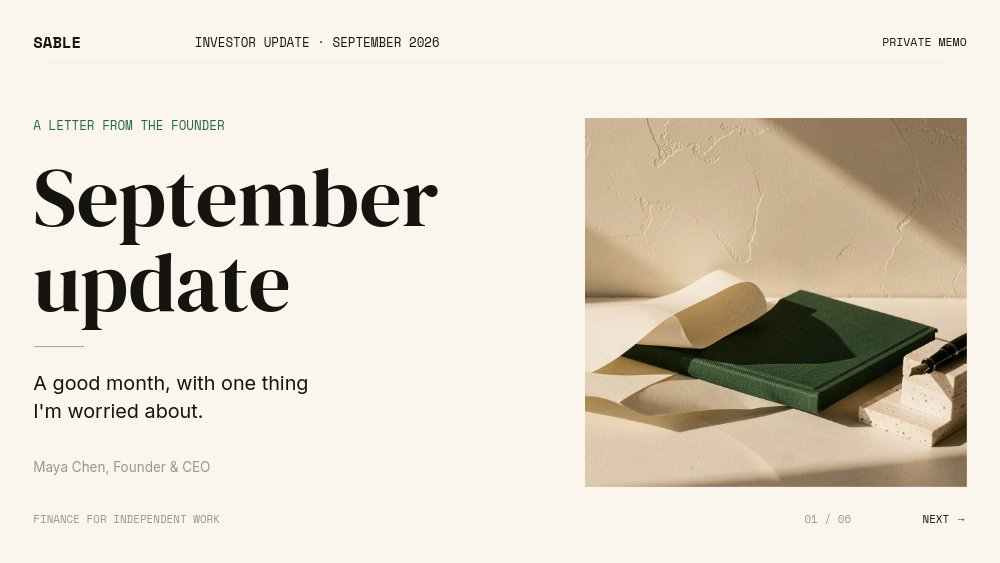
An investor update template for founders who send a monthly letter, not a pitch. Sable, a fictional fintech for freelancers, reports September 2026 in a cream-and-ink memo: a "SABLE · INVESTOR UPDATE · SEPTEMBER 2026 · PRIVATE MEMO" masthead, "September update" set in large DM Serif Display, and an opening line every investor wants to read - "A good month, with one thing I'm worried about." Six panes follow the same rhythm as a good update email: numbers, growth, mix, the worry, the asks.
#What Makes This Template Stand Out
It looks like a document, which is the point. There are no white cards and no slide chrome. Headlines are serif, metrics sit on hairline rules, and the charts are drawn small and precise directly on cream. The palette has exactly two signals - dark green for up and rust for down - so the reader never has to guess whether a number is good news. A persistent masthead runs across every pane, and the footer carries a page count ("02 / 06") with PREV and NEXT links wired as click actions, like turning pages in a letter.
The numbers come first and stay visible. "The numbers." opens with four metrics in a 2x2 grid: $86k monthly recurring revenue (+9% MoM), 1,240 paying customers (+6% MoM), $61k monthly net burn, and 19 months of runway - all number-rolling on entry. On the next two panes, the MRR card shrinks into the top-right corner alongside a green "MOM GROWTH" arrow chip, so the headline figure stays on screen while you explain it. "Growth, with discipline." plots twelve months of MRR in green against a muted plan line, with the takeaway beside it: "Two months ahead of plan." "A healthier revenue mix." follows with a pie chart - Solo 44%, Studio 38%, Team 18% - and "Team plan grew fastest." with a green +31% rolling up.
Then the honest pane. The arrow chip flips to rust and reads "WATCHING CHURN", the headline says "Churn ticked up.", and a large rust 3.1% sits above three plain sentences about the cause and the fix. Investors read every update for this pane. The close keeps the same candor: "Two ways you can help." with two numbered asks, an italic "Thank you", and the founder's name. Motion is the quietest in the catalog - fades, soft blurs, a drawn rule under the title, and charts that draw in.
- Serif memo design in DM Serif Display, Inter Tight, Inter, and Space Mono on a cream field
- Four headline metrics with number-roll, plus an MRR card that stays pinned in the corner of the chart panes
- Animated line chart of MRR vs plan and a pie chart of revenue by plan, both with editable data
- Green up and rust down arrow chip that switches state from growth to the month's worry
- Page-count footer with PREV and NEXT click actions that keep working in hosted links and code exports
- 6-pane 16:9 deck built to be duplicated and refreshed every month in minutes
#Who Should Use This Template
- Seed and Series A founders who owe investors a monthly or quarterly update and want it to be read, not archived unopened.
- Solo founders and indie SaaS operators reporting to angels and advisors who appreciate brevity and honesty over polish.
- Finance and operations leads at startups who assemble the update for the CEO and need a format that stays consistent month to month.
- Accelerator and fund platform teams who want to hand portfolio companies a clean, repeatable update format.
#Best Use Cases
#Monthly Investor Update Email
Publish the deck as a hosted link and put it at the top of the email with a two-line summary. The link previews cleanly, loads in any browser, and walks investors through the month in under a minute. Close the email the way the deck closes - with your two asks - and you will get more intros than a wall of text ever produced.
#Board and Advisor Calls
On a call, share your screen and present the same link full-screen. The numbers pane doubles as the agenda, the charts give you something to point at, and the worry pane turns into the discussion. Autoplay is off, so you can stay on the churn pane for as long as the conversation needs.
#Data Room and Fundraising Prep
Export each month to PDF and drop it into your data room. When you raise, a stack of consistent, candid monthly updates is some of the strongest evidence a founder can show - and this format makes the stack look deliberate.
#How to Customize This Template
- Open PaneFlow and select "Monthly Investor Update - One-Pager Deck" from the template gallery
- Edit the masthead ("SABLE", "INVESTOR UPDATE · SEPTEMBER 2026", "PRIVATE MEMO") and the cover line "A good month, with one thing I'm worried about."
- Replace "Maya Chen, Founder & CEO" and swap the cover photo for your own image or leave the still life in place
- Update the four metrics - "$86k", "1,240", "$61k", "19" - and their growth or context lines
- Enter twelve months of MRR and plan values in the line chart and rewrite "Two months ahead of plan." and its supporting lines
- Set the pie chart slices, edit the Solo, Studio, and Team legend, and update the "+31%" highlight
- Rewrite the worry pane: the "WATCHING CHURN" chip, the "3.1%" figure, and the three sentences on cause and fix
- Replace the two asks and signature, then publish as a hosted link and export a PDF for the archive
#Related Templates
- Quarterly Business Review - Donut & Bars - a fuller, chart-first review for leadership each quarter
- Founder Letter - Editorial Serif - the long-form serif letter format for bigger announcements
- Minimal SaaS Pitch - when the update turns into a fundraise
- Fintech Editorial Pitch - a serious serif pitch deck for financial products
#Related Resources
- PaneFlow for Startups - investor updates, pitch decks, and board materials
- PaneFlow for SaaS - metric-led decks with native animated charts
- PaneFlow Animated Pitch Deck - for the fundraise that follows a string of good months
Start with Monthly Investor Update - One-Pager Deck
Open this template in PaneFlow, customize it to match your brand, and export as HTML, React, Vue, or video.