DTC Pitch Deck Template - Bold Consumer Brand Deck
A consumer brand pitch deck template for DTC founders raising from consumer-focused investors who want the deck to feel like a brand campaign, not a McKinsey document. Cream background, warm Fraunces serif headlines, a saturated orange accent that pops against the soft palette, and 10 panes that walk an investor from product hero through unit economics without losing the lifestyle voice that made the brand worth building in the first place.
#What Makes This Template Stand Out
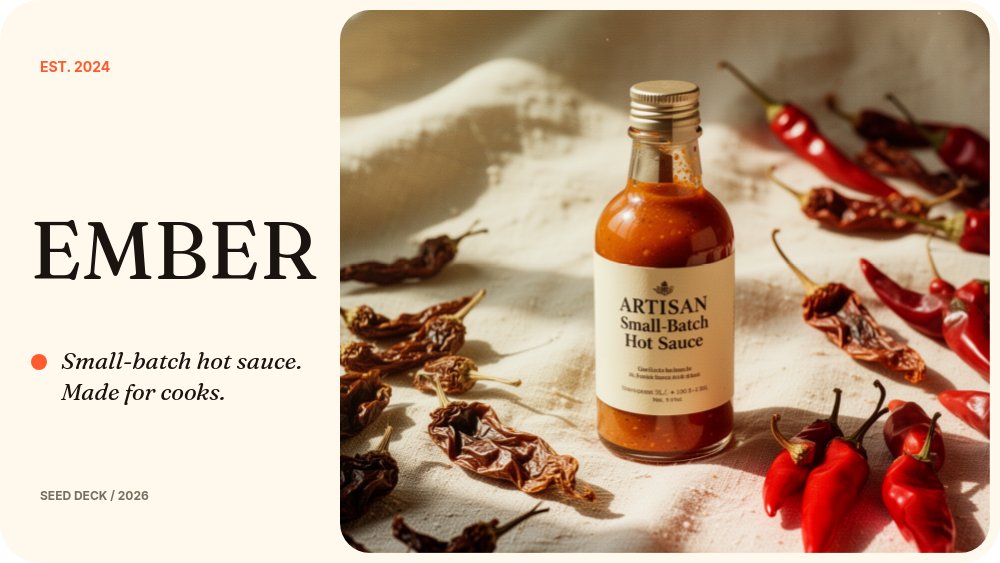
The defining choice is the brand-voice register. Most pitch decks read like financial documents with product photos pasted in. This one inverts that - the deck looks and feels like the brand itself. The cream background is warm rather than neutral, the Fraunces serif on headlines and italic accents reads editorial rather than corporate, and the saturated orange accent (used on the product name treatment, the price tags, and the round number) lands like a campaign color rather than a chart highlight.
The product line pane is the emotional core of the deck. Three SKU images sit side by side with a serif italic name, a single-line descriptor, and a bold orange price - the exact format a consumer customer recognizes from a product page, scaled up for an investor room. The traction pane pairs a monthly net revenue chart on the left with a black callout card on the right showing blended CAC, LTV-to-CAC ratio, and repeat purchase rate. Investors scanning for the unit economics get them in three lines without having to ask.
Animation is brand-warm rather than tech-flashy. Headlines use letter-fade with the Fraunces serif blooming in word by word, product shots use a pop entrance, and the SKU row uses succession so the three bottles enter in sequence. Body copy drifts gently. There are no looping animations - the deck reads as a curated print piece that happens to be in motion.
- Cream background with warm Fraunces serif headlines and Inter body for editorial DTC feel
- Saturated orange accent for product names, price tags, and the round amount
- Three-SKU product line pane with succession entrance animation
- Monthly net revenue chart paired with CAC, LTV-to-CAC, and repeat purchase rate callouts
- Lifestyle photography panes for hero shot, brand voice, and founder portraits
- 10-pane consumer pitch arc covering brand, product line, traction, market, team, and ask
#Who Should Use This Template
- DTC consumer brand founders raising seed or Series A from consumer investors and platform funds. The deck shows you understand brand as a moat, not just a logo, which is the bar most consumer investors are pattern-matching against.
- Food and beverage operators with a defined product line and at least one quarter of monthly revenue data to chart. The SKU pane and unit economics card both translate naturally to F&B catalogs.
- Beauty, apparel, and home brands scaling from launch into post-PMF revenue. The lifestyle photography slots and the warm typographic system match the visual language buyers and investors expect from premium consumer brands.
- Founders who built the brand before the deck and want the pitch to look like an extension of the brand book rather than a generic investor template.
#Best Use Cases
#Seed and Series A Consumer Brand Pitches
Consumer investors look for three things in the first five minutes - a recognizable product, a story they want to repeat, and unit economics that hold up. This template gives each one its own pane. The product hero on cover, the brand voice on pane 6, and the CAC/LTV/repeat-rate card on traction. The arc respects how a consumer partner reads a deck rather than forcing the founder into a B2B SaaS structure.
#Brand-Led Fundraising Updates
Once you have one round closed, the next deck has to update existing investors and convert new ones at the same time. This template's editorial polish lets you send the same file to both audiences. Existing investors get the brand evolution and the updated traction chart. New leads get a complete story they can read end to end without context. Export to PDF for the cold-outbound email, link the live version for the warm intro.
#DTC Demo Day and Pitch Competition Decks
Consumer-focused accelerators and pitch competitions reward decks that feel like the brand they describe. The Fraunces and Inter pairing reads as taste-led rather than technical, the cream and orange palette is warm enough to hold attention on a projector, and the 10-pane structure fits a 5 to 8 minute pitch slot without trimming. The succession animation on the SKU row gives you a natural beat to land each product.
#How to Customize This Template
- Open PaneFlow and select "DTC Pitch - Bold" from the template gallery
- Replace the brand wordmark and the hero product shot on the cover pane
- Update the consumer behavior stat on the problem pane and the cultural-shift bullets on why now
- Swap the three SKU photos, names, descriptors, and prices on the product line pane
- Replace the lifestyle imagery and rewrite the brand voice block on the brand pane
- Edit the traction chart values and the CAC, LTV-to-CAC, and repeat purchase rate numbers
- Update founder portraits, names, and short bios on the team pane
- Set the round amount, three milestones, and contact email on the ask pane, then export to PDF or publish to a private link
#Related Templates
- Marketplace Pitch - Playful Illustrated - illustrated two-sided marketplace deck for consumer-platform plays
- Beauty Drop - Luxe - luxury cosmetics drop template for product launches
- Apparel Collection - fashion lookbook with Cinzel serif and warm gold accents
- Nonprofit Pitch - Photography Led - photography-driven mission deck with similar editorial restraint
#Related Resources
- PaneFlow for Ecommerce - product launches, lookbooks, and brand decks for online stores
- PaneFlow for Startups - pitch decks and investor updates for early-stage founders
- PaneFlow vs Canva - how PaneFlow goes beyond Canva for animated, brand-led pitches
Start with DTC Pitch - Bold
Open this template in PaneFlow, customize it to match your brand, and export as HTML, React, Vue, or video.