Nonprofit Pitch Deck Template - Photography Led
A nonprofit pitch deck template for development directors, founders, and program leads making the case for support to donors and institutional funders. 10 panes carry a photography-led documentary aesthetic - warm cream paper, near-black serif headlines, a single warm-orange accent, and full-bleed dignified portraits - through the story, the scale of the problem, the program pillars, the impact, and the ask.
#What Makes This Template Stand Out
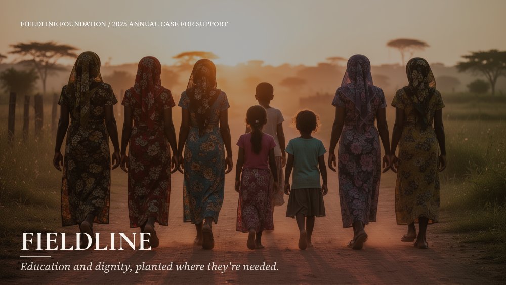
The defining choice is photography first, copy second. Nonprofit decks tend to over-explain - paragraphs of mission language, bullet lists of programs, and a closing slide of donation tiers buried under fine print. This template moves in the opposite direction. The cover sits one full-bleed documentary photograph of the people you serve, with the foundation name set quietly in serif caps in the lower-left corner and a one-line tagline below it. The story pane is one image and one paragraph. The scale pane is one statistic against a supporting photograph. By the time the deck reaches the program pillars, the room has already met the people the math is about.
The program pillars pane is structured as three named columns - in the shipped deck, "Read", "Build", "Belong" - each numbered 01, 02, 03 in the warm-orange accent, each with an italic subtitle (literacy, workforce, community) and a short paragraph. The serif headlines on every pane are Cormorant Garamond 600, paired with Source Serif Pro for body copy, so the deck reads as a long-form magazine article rather than a slideshow. There is no decorative chrome - no gradients, no shape graphics behind people, no oversaturated brand color stamped over photographs.
Animation is slow letter-fade on serif headlines, drift on body paragraphs, and parallax depth set to 8-10 on every photographic pane so the imagery moves at a different speed from the text as you advance. The single exception is the impact pane, which uses number-roll on the three big metrics (people served, apprentices graduated, completion rate) and chart-draw on the line chart of served-population growth at the foot of the pane. That is the only place the deck quickens - because that is the only place a donor needs to feel the math move.
- 10-pane structure: cover, story, scale, program pillars, impact, beneficiary stories, partners, team, ask, thank-you
- Photography-led layout with full-bleed documentary imagery and parallax depth on every photo pane
- Cormorant Garamond serif headlines with warm-orange numerical accents on the program pillars
- Number-roll animation on three impact metrics paired with a chart-draw served-population line chart
- Beneficiary-stories pane with three photo-and-quote cards for real names and short testimony
- Slow letter-fade on headlines and drift-y body copy - no looping motion, no decorative chrome
#Who Should Use This Template
- Development directors and major-gift officers preparing a year-end case for support. The story-first arc is exactly the rhythm individual donors respond to, and the impact pane gives gift officers somewhere concrete to point.
- Nonprofit founders and executive directors pitching new institutional funders, family foundations, or government grant officers. The serif typography and dignified photography signal seriousness without sliding into corporate aesthetics.
- Mission-driven and faith-based organizations with strong human stories and a multi-program portfolio. The three-pillar approach pane is built to hold a literacy plus workforce plus community kind of program mix without flattening any of them.
- Community-based and global development NGOs who need the same deck to work for a board meeting, a donor lunch, and a program-officer conversation. The 10-pane arc covers all three audiences with minor pane-level edits.
#Best Use Cases
#Major-Gift Pitches and Year-End Donor Appeals
The 10-pane arc maps directly onto a 30-minute major-gift conversation. The cover and story panes set the human stakes, the scale pane introduces the size of the problem, the approach pane shows your three programs, and the impact pane lands the proof points. The beneficiary stories pane gives the donor specific names to remember, and the ask pane closes the conversation with tiered participation. Number-roll on the impact pane is the moment most major-gift conversations turn - donors stop hearing it as advocacy and start hearing it as evidence.
#Institutional Grant Applications and Foundation Decks
Foundations and government program officers usually evaluate decks alongside written applications. Export this deck as PDF for the formal submission and the same content reads as a polished case statement, with the photography intact. Swap the ask pane to your capital raise tier or your specific grant request, and the deck drops into a foundation review packet without further editing.
#Annual Reports and Board Presentations
The template doubles as an annual report when you swap the ask pane for a "what comes next" pane. The impact pane already holds the year's numbers, the program pillars carry the program update, the beneficiary stories show real human outcomes, and the partners and team panes recognize the people who made the year possible. Print and PDF exports both preserve the editorial layout.
#How to Customize This Template
- Open PaneFlow and select "Nonprofit Pitch - Photography Led" from the template gallery
- Replace the cover photograph with your strongest documentary image and update the foundation name plus tagline
- Edit the story pane with one human story (full image plus one paragraph caption) from your own work
- Update the scale pane with your headline statistic and a supporting photograph
- Rename the three program pillars and rewrite the italic subtitles plus paragraph copy to match your real programs
- Replace the three impact numbers and update the line chart values for served-population growth
- Swap the three beneficiary photo cards with real names and one-line testimony from people you serve
- Set donation tiers (or capital raise tiers for institutional asks) on pane 9, then export as PDF or publish to a private link
#Related Templates
- Case Study - Long-form Customer Story - long-form storytelling format for in-depth beneficiary or program profiles
- Outdoor Adventure - photography-led editorial template with similar parallax depth on full-bleed imagery
- Photographer Minimalist Portfolio - quiet typographic frame around dignified photography
- DTC Pitch - Bold - alternate pitch format when the brand voice needs more energy than restraint
#Related Resources
- PaneFlow for Marketers - case-for-support decks, donor pitches, and campaign pages for mission-driven teams
- PaneFlow for Startups - investor decks and fundraising slideshows that share the same evidence-led structure
- PaneFlow vs Canva - how PaneFlow compares to Canva for animated nonprofit decks
Start with Nonprofit Pitch - Photography Led
Open this template in PaneFlow, customize it to match your brand, and export as HTML, React, Vue, or video.