Beauty Product Launch Template - Luxe Cosmetics Drop
A beauty product launch is mostly a piece of editorial content with a checkout button at the end. This template treats it that way - deep aubergine velvet, oversized italic Cormorant headlines, sensorial three-line copy in the voice of a perfume ad, and a chapter-by-chapter walk through the product from origin story to shop CTA. It is the kind of layout you see in luxury fragrance microsites, translated into a slideshow that any small beauty brand can ship in an afternoon.
#What Makes This Template Stand Out
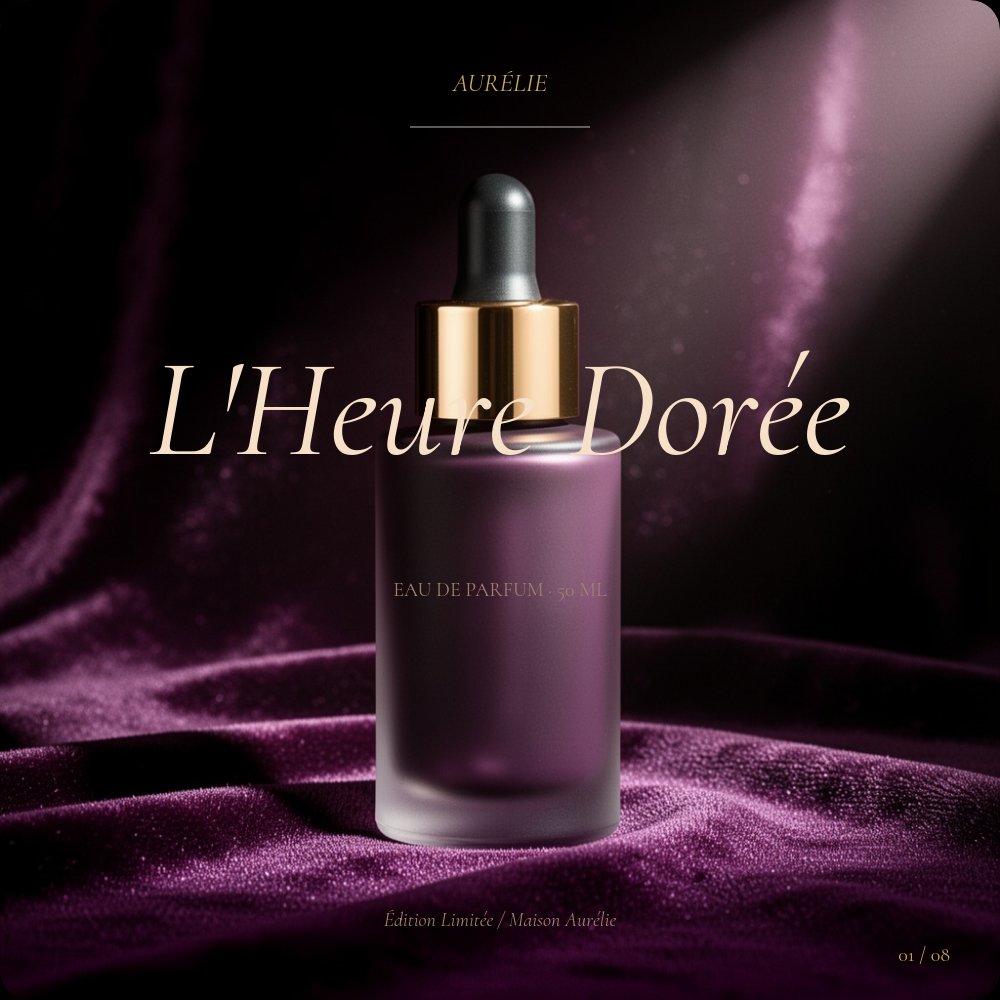
The defining choice is restraint paired with sensuality. The palette is unusually narrow - deep aubergine background (#1a0e0a), cream type (#f6e0c8), muted brown supporting text, and a single gold accent (#c9a960) used only for chapter numerals, hairline rules, and the price type on the collection pane. That discipline is what separates luxury beauty design from drugstore beauty design. There are no gradients, no badges, no lifestyle shots of people - only product, ingredient, and italic typography on velvet.
The 8-pane structure follows the chapter logic of a fragrance house microsite. Cover with hero product, the story (origin paragraph), the ingredient (single botanical close-up), the promise (three sensory benefits in roman numerals - I Touch / II Scent / III Glow), how to use (three steps), the collection (3 SKUs in a row with prices), reviews (one or two pulled quotes), and the shop CTA. The "promise" pane in particular is the most distinctive layout - three roman numerals stacked over three single-word italic benefits with a two-line poetic description below each. It is the pane that signals to viewers that this is luxury beauty positioning, not mass-market.
Animation character is intentionally quiet. Slow fade between panes, letter-fade on the italic headlines, subtle parallax on the product photography, and a single subtle pulse on the cover bottle to add life without making the slideshow feel like an ad. Pacing is the slowest of any template in the catalog because luxury reads slowly.
- 1:1 square format optimized for Instagram, paid social, and product page hero embeds
- 8-pane chapter arc: cover, story, ingredient, promise, how to use, collection, reviews, shop
- Deep aubergine velvet palette with cream type and gold accent only on numerals and prices
- Italic Cormorant Garamond headlines paired with roman Cormorant body for editorial fragrance feel
- Three roman numeral structure on the promise pane: I Touch / II Scent / III Glow
- Slow fade and letter-fade animations with subtle parallax and a single pulse on the hero product
#Who Should Use This Template
- Independent beauty brands launching a single product or limited collection. The luxury aesthetic levels the visual playing field with established fragrance and skincare houses without requiring custom design work.
- Beauty e-commerce stores producing product launch hero content. The slideshow embeds on product pages, runs as paid social, and exports as video for Reels and TikTok from one source file.
- Niche fragrance houses and indie perfumers that already have the editorial vocabulary but need the production. The template's chapter structure mirrors how niche fragrance sites already write about their products.
- Beauty agencies and DTC consultants producing campaign assets for clients. Faster than custom design, and the editorial polish lands credibility with luxury brand stakeholders.
#Best Use Cases
#Single Product Launches and Limited Editions
This is the template's most natural fit. A new fragrance, a limited-edition serum, a holiday-only candle. The chapter structure walks the customer from "what is this" through "how does it feel on the skin" to "buy it here," which is exactly the conversion arc a luxury product launch needs to land. Embed on the product page as the hero unit, then export as Instagram carousel and 9:16 video for Reels.
#Product Page Hero Embeds
For a luxury beauty brand running a Shopify or custom e-commerce store, the slideshow replaces the static product photo gallery as the hero unit. Customers land on the product page and see the full editorial story before they scroll to the buy button. The 1:1 format slots into existing product page layouts without breaking the grid, and the slow autoplay invites lingering rather than scrolling away.
#Fragrance Sampler and Discovery Set Marketing
For brands selling discovery sets or fragrance samplers, the collection pane (3 SKUs in a row with prices) is the natural anchor. The story, ingredient, and promise panes give context for the entire line, and the collection pane handles the conversion. Customers understand the brand before they buy, which is what discovery-set marketing depends on.
#How to Customize This Template
- Open PaneFlow and select "Beauty Drop - Luxe" from the template gallery
- Replace the cover with your hero product photograph and product name in italic Cormorant
- Edit the story pane - one paragraph of origin copy in the voice of a perfume ad
- Swap the ingredient hero shot for your signature botanical or active
- Rewrite the three promise benefits (I / II / III) with your sensorial benefits and two-line descriptions
- Update the how-to-use steps if your product needs ritual instructions
- Replace the collection pane with your three SKUs - product name, format / volume, price
- Add one or two pulled-quote reviews from press, customers, or partners
- Update the shop CTA URL on pane 8 and export as video, JPG sequence, or HTML embed
#Related Templates
- Restaurant Menu Editorial - cream and terracotta editorial template using the same italic Cormorant heading discipline
- Wedding Invite Romantic - pastel editorial template for events with shared Cormorant typography
- Cafe Coffee Brand - warm chapter-based brand template for hospitality and lifestyle products
- Instagram Story Fashion - vertical bold-type template for fashion and beauty social content
#Related Resources
- PaneFlow for E-commerce - building product launch and storefront content
- PaneFlow for Marketers - producing campaign assets for beauty and luxury brands
- PaneFlow vs Canva - how PaneFlow's animation and editorial typography go beyond static design tools
Start with Beauty Drop - Luxe
Open this template in PaneFlow, customize it to match your brand, and export as HTML, React, Vue, or video.