Consumer Brand Pitch - Linen Serif Template
A seed-round deck for consumer brand founders who want the pitch to feel like the product's packaging rather than a quarterly business review. Eight panes of oat linen background, italic Fraunces serif headlines, and oval outline badges, built around a fictional home fragrance brand called Ember & Oak. The story, traction, market, and team panes are all in place - you bring the photography and the numbers.
#What Makes This Template Stand Out
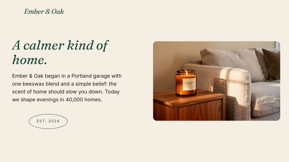
The deck commits to one typographic voice and lets it carry everything. Headlines run in Fraunces italic - "A calmer kind of home.", "People come back.", "The road ahead." - at a scale that makes each pane feel like a chapter title rather than a slide header. Body copy stays in quiet Inter, so the serif never has to compete. Investors see hundreds of template decks; they do not see many that read like a brand already shipping.
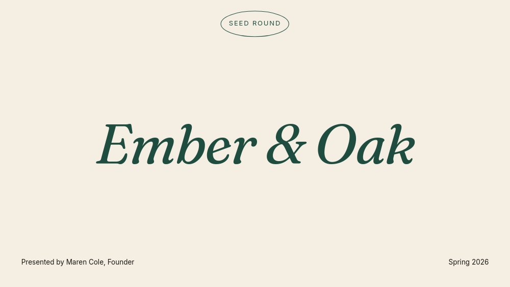
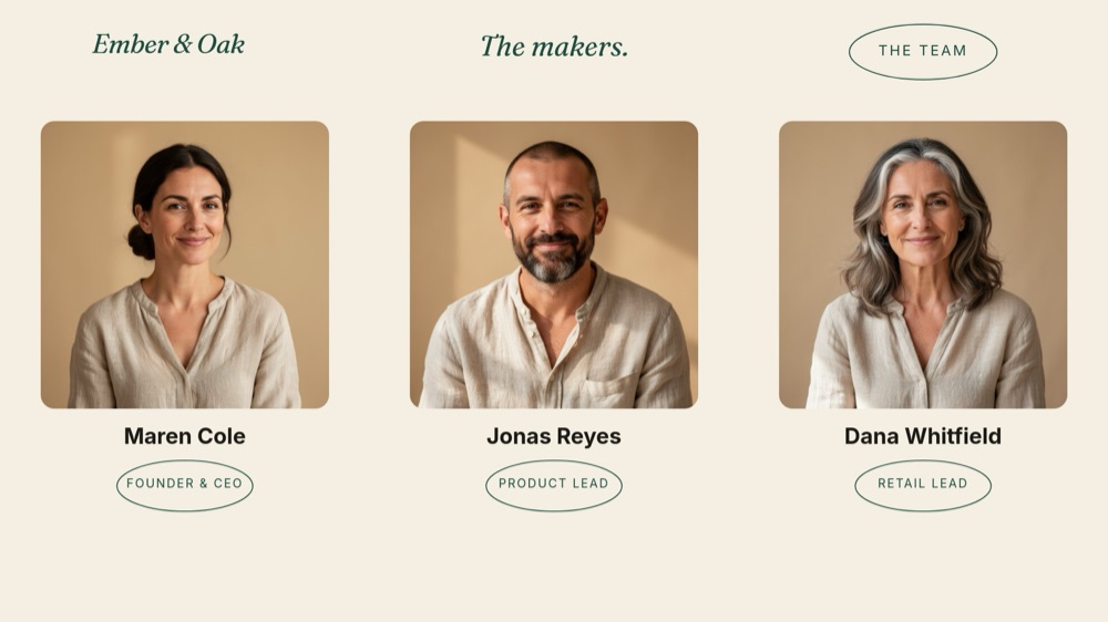
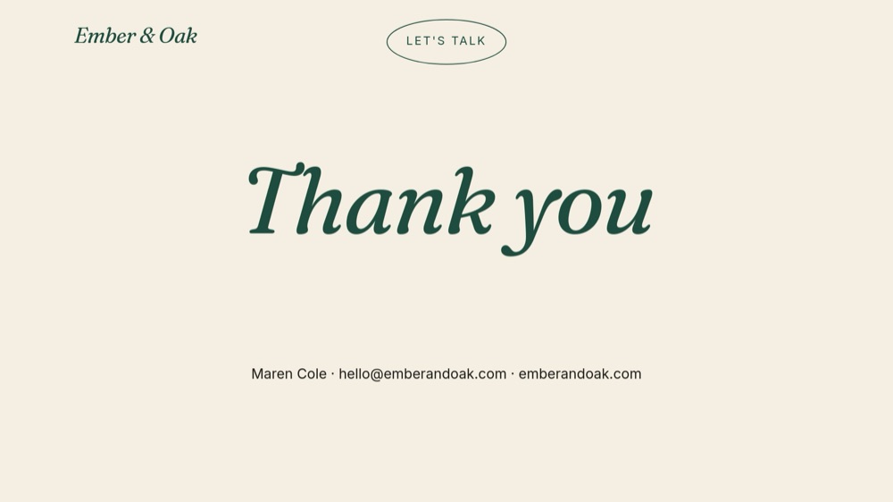
The oval outline badge is the connective tissue. A thin bottle-green ellipse with a tracked uppercase label appears on every pane in a new role: "SEED ROUND" floating over the cover, year markers strung along a drawn line on the roadmap, "No. 01 Hearth" through "No. 03 Coast" naming the product trio, role labels under the team portraits, and "LET'S TALK" above the closing thank-you. One repeated shape does the brand-system work that usually takes a full identity guide.
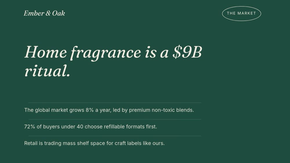
The market pane flips the palette for one beat. Seven panes sit on warm oat, then pane 5 drenches the full canvas in bottle green with "Home fragrance is a $9B ritual." in cream italic and three trend lines separated by hairline dividers. It is the deck's single dramatic gesture, placed exactly where the room needs to feel the size of the opportunity - and the contrast makes the return to linen on the product pane land like a reveal.
- Italic Fraunces serif headlines on an oat linen field with bottle-green accents
- Reusable oval outline badge system: section labels, year markers, SKU numbers, team roles
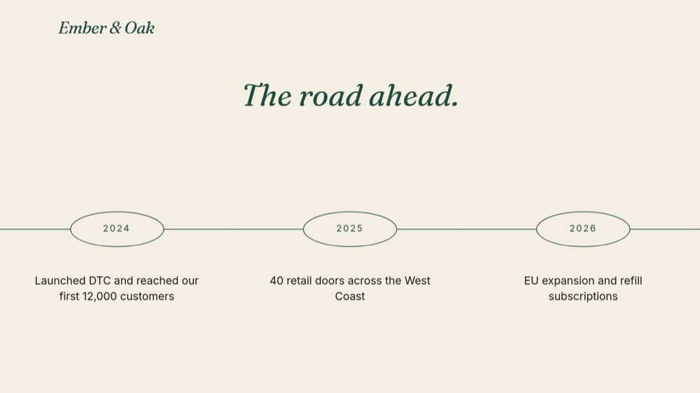
- Roadmap pane with three year badges strung on a drawn connecting line
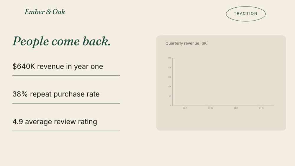
- Traction pane with underlined number-roll stats and a quarterly revenue chart
- Full bottle-green market pane - the deck's one palette flip - with hairline-divided trend lines
- 8-pane 16:9 arc: cover, story, roadmap, traction, market, product line, team, close
#Who Should Use This Template
- DTC and consumer brand founders raising a seed round who need the deck itself to prove brand taste. If the product sells on warmth and craft, a cold corporate deck actively argues against the investment thesis.
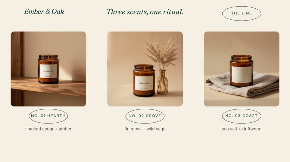
- Founders pitching retail buyers and wholesale partners on shelf placement. The product line pane - three SKUs, three badges, three scent notes - is built to read like a line sheet with a story attached.
- Food, beverage, skincare, and home goods teams whose photography is the strongest asset they own. The layouts give lifestyle and product shots generous rounded frames instead of cramming them into corners.
- Brand-led operators updating an old deck before a new raise. Swapping fixtures - logo, photos, milestones, metrics - takes an afternoon because the badge system and typography do the design work.
#Best Use Cases
#Seed and Angel Investor Pitches
The eight panes walk the exact arc an early consumer-brand conversation takes: who you are, why you exist, where you are going, proof people come back, how big the ritual is, what is on the shelf, who is building it, and how to reach you. The traction pane pairs three underlined number-roll stats - $640K revenue in year one, 38% repeat purchase rate, 4.9 average review rating - with a quarterly revenue chart, so the deck's emotional warmth is anchored by numbers at the midpoint.
#Retail and Wholesale Partner Meetings
Retail buyers evaluate whether a brand will look at home on their shelves, and this deck answers visually before you speak. Lead with the story pane's origin paragraph, let the product line pane present the trio - Hearth, Grove, Coast, each with its scent notes - and use the roadmap's "40 retail doors across the West Coast" milestone as the ask. Publish to a link so the buyer can flip back through it after the meeting.
#Brand Books and Press Introductions
Because the deck reads as packaging, it doubles as a lightweight brand introduction for press, collaborators, and early hires. Trim the ask, keep the story, market, and team panes, and export to PDF as the document you attach when someone asks "so what is the brand?" The Fraunces italic voice and badge system survive the format change intact.
#How to Customize This Template
- Open PaneFlow and select "Consumer Brand Pitch - Linen Serif" from the template gallery
- Replace "Ember & Oak" on the cover with your wordmark, update the "SEED ROUND" badge, and edit the presenter and date lines
- Rewrite the story pane - the "A calmer kind of home." headline and origin paragraph - and swap in your own lifestyle photo with the "EST. 2024" badge
- Update the three roadmap year badges and their milestone lines to your actual launch, retail, and expansion plan
- Enter your real numbers on the traction pane: the three underlined stats and the quarterly revenue chart values
- Rework the bottle-green market pane with your category's headline figure and three trend lines
- Replace the three product photos, badge names, and scent or variant notes on the product line pane, then swap the team portraits and role badges
- Edit the closing contact line under "Thank you", then present live, export to PDF, or publish to a private link
#Related Templates
- DTC Pitch - Bold - the louder, punchier counterpart for consumer brands that sell on energy instead of calm
- Founder Letter - Editorial Serif - the same serif warmth applied to a long-form founder narrative
- Coffee PDP - Origin Story - a product page in the matching craft-brand register for the post-raise website
- Startup Pitch - Soft Gradient Rounds - a rounder, software-leaning take on the friendly pitch deck
#Related Resources
- PaneFlow for Ecommerce - product pages, lookbooks, and brand decks for teams that sell things
- PaneFlow for Startups - pitch decks, demo day decks, and investor updates for early-stage founders
- PaneFlow vs Pitch - how PaneFlow compares to Pitch for animated investor decks
Start with Consumer Brand Pitch - Linen Serif
Open this template in PaneFlow, customize it to match your brand, and export as HTML, React, Vue, or video.