Agency Proposal - Gradient Italic Template
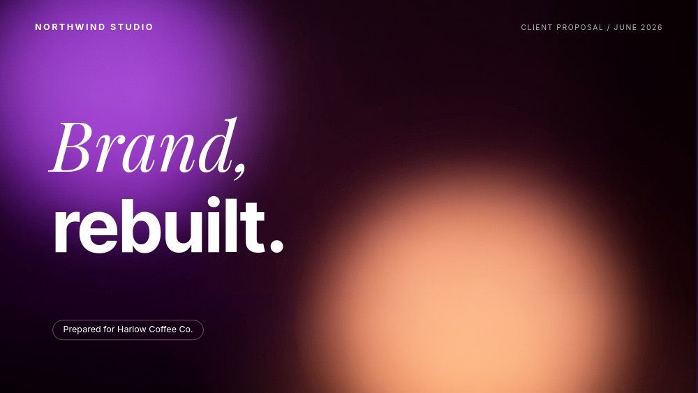
A client proposal for agencies that sell taste and need the proposal itself to demonstrate it. Nine panes alternate between airy off-white and deep aubergine washed with violet-to-peach gradient glows, and every headline splits between Playfair italic and Inter Tight bold - "Brand," soft, "rebuilt." hard. The deck walks a brand-refresh engagement for a fictional studio called Northwind, from diagnosis to process to three priced tiers to a client quote that closes the loop. Present it full-screen in the browser, export to PDF for the follow-up, or render to video for an async pitch.
#What Makes This Template Stand Out
The split headline is the deck's signature and its argument. Italic serif for the emotional word, bold sans for the rational one, repeated on the cover, the diagnosis, the process, the pricing, and the close. It is a typographic demonstration of what the agency is selling - feeling and discipline in the same sentence - and because it is one reusable block, rewording it for each new client takes minutes without touching the geometry.
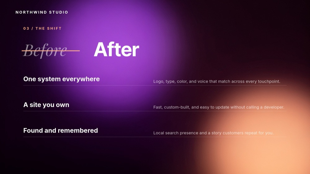
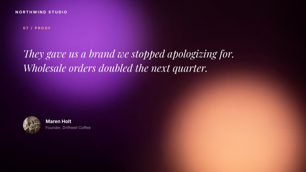
The dark panes are placed where the stakes are. Seven panes sit on calm off-white, but the cover, the "Before / After" shift pane, and the client-proof quote drench the canvas in aubergine with large blurred violet and peach gradient shapes drifting behind the type. The "Before" on pane 4 is struck through with a drawn line next to a bold "After" - the whole engagement summarized in one typographic gesture, staged at the exact midpoint of the pitch.
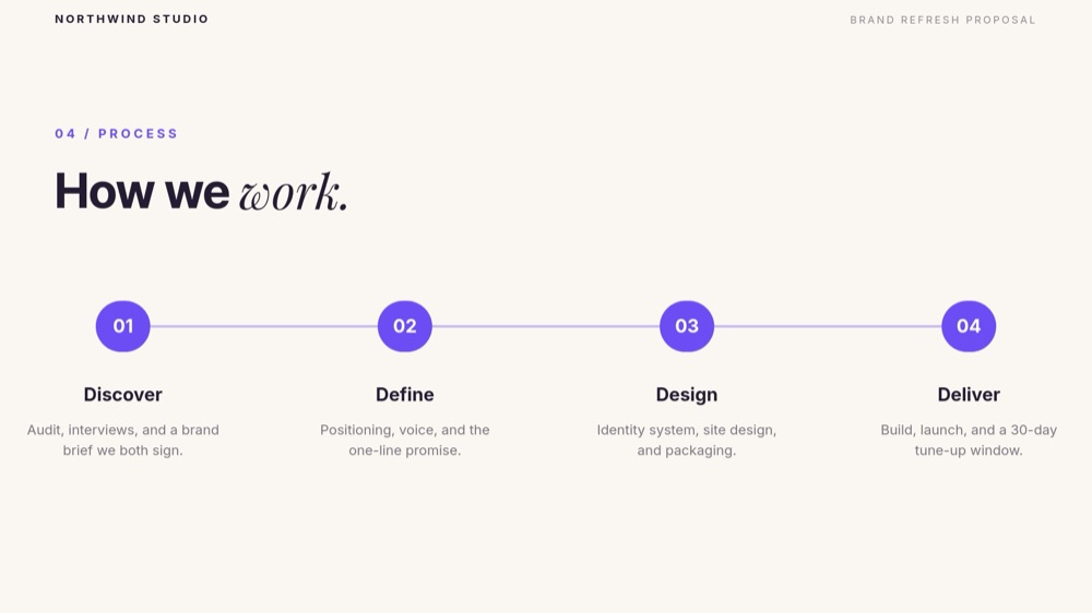
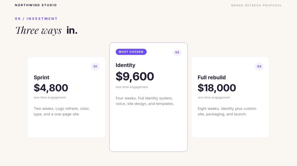
Pricing reads like a decision, not a menu. Three cards - Sprint at $4,800, Identity at $9,600, Full rebuild at $18,000 - with the middle tier elevated, violet-bordered, and chipped "MOST CHOSEN". Prices land with number-roll animation, each card states its duration and scope in two lines, and the numbered circle on each card reuses the same geometry as the process pane's Discover-Define-Design-Deliver steps, so the system feels engineered end to end.
- Split headlines pairing Playfair Display italic with Inter Tight bold on every key pane
- Aubergine dark panes with drifting violet-to-peach gradient blur shapes
- Drawn strike-through "Before / After" shift pane with three hairline-divided benefit rows
- Four-step process line - Discover, Define, Design, Deliver - that draws in as circles pop
- Three-tier pricing with number-roll figures and an elevated "MOST CHOSEN" middle card
- 9-pane 16:9 arc: cover, studio, diagnosis, shift, process, work, investment, proof, close
#Who Should Use This Template
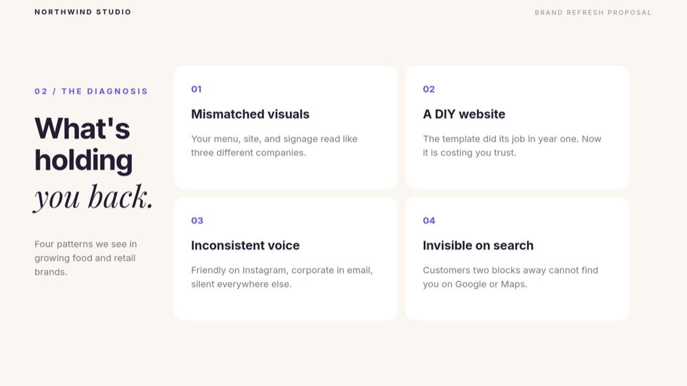
- Brand and web design studios pitching refresh or identity engagements. The placeholder content is already your pitch - the four diagnosis cards name the exact pains (mismatched visuals, a DIY website, inconsistent voice, invisible on search) that make founders call a studio.
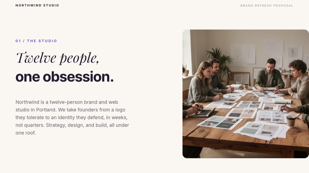
- Freelance designers and small creative teams who need a proposal that out-dresses agencies ten times their size. The "Twelve people, one obsession." studio pane scales down to one person without losing its confidence.
- Marketing, SEO, and development consultancies that sell fixed-scope engagements in tiers. Swap the deliverables and the three pricing cards carry any service that ships in sprints.
- Agencies tired of proposal PDFs that read like invoices. The letter-fade headlines, drawn process line, and number-roll prices make the proposal feel like a piece of the work being sold.
#Best Use Cases
#Live Client Pitch Meetings
The nine panes pace a 20-minute pitch: open on the gradient cover with the client's name in the "Prepared for" chip, diagnose their four pains while they nod, flip to the dark "After" pane when the room is warmed up, then walk process, proof, and price without a single transition that feels like a slide change. The strike-through draw on "Before" is the moment the meeting turns - place your strongest claim right after it.
#Async Proposals and Follow-Ups
Most proposals are read alone, after the call, by someone who was not in the room. Publish the deck to a link so the decision-maker gets the full animated read - gradient drift, number-roll prices, the Driftwell Coffee quote ("Wholesale orders doubled the next quarter.") - instead of a flattened attachment. Export to PDF in parallel for the procurement folder, and to video when the buying committee wants a two-minute version.
#Productized Service Launches
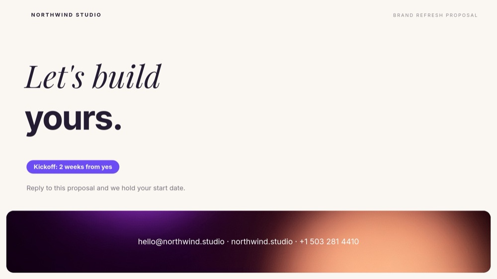
If you sell the same engagement repeatedly - brand sprints, site rebuilds, audit packages - keep one master deck and duplicate per prospect, changing only the cover chip and the diagnosis card details. The pricing pane becomes your canonical rate card, and the "Kickoff: 2 weeks from yes" chip on the close sets the same urgency for every deal.
#How to Customize This Template
- Open PaneFlow and select "Agency Proposal - Gradient Italic" from the template gallery
- Edit the cover - your studio name in the top meta, the "Brand, rebuilt." split headline, and the "Prepared for Harlow Coffee Co." chip with your prospect's name
- Rewrite the "Twelve people, one obsession." studio pane with your own intro paragraph and swap in a photo of your team or workspace
- Update the four numbered diagnosis cards with the pains your clients actually bring you
- Rework the dark "Before / After" pane's three benefit rows to your engagement's outcomes
- Rename the four process circles and their one-liners if your phases differ from Discover, Define, Design, Deliver
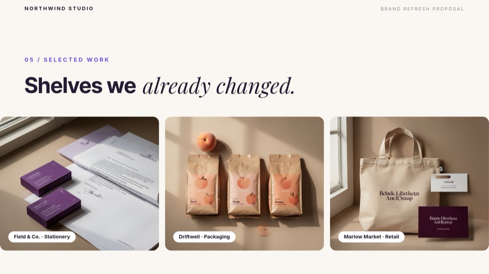
- Replace the three portfolio tiles and caption chips with your own work, then set your real tier names, scopes, and number-roll prices on the investment pane
- Swap the testimonial quote, name, and headshot on the proof pane, update the contact band and kickoff chip on the close, then present in the browser, publish to a link, or export to PDF
#Related Templates
- Sales Proposal - Services Agency - a straighter-laced proposal arc for engagements that need fewer gradients
- Creative Agency Deck - Magazine - the editorial portfolio counterpart for when the work leads the pitch
- Pricing Packages - Reveal - the three-tier pricing moment as a standalone animated section
- Content Strategy - Forest Neon - the strategy deck to present after this proposal wins
#Related Resources
- PaneFlow for Agencies - proposals, case studies, and client decks that demonstrate craft
- PaneFlow for Designers - typography-led layouts with animation you control per element
- PaneFlow vs Pitch - how PaneFlow compares to Pitch for animated client proposals
Start with Agency Proposal - Gradient Italic
Open this template in PaneFlow, customize it to match your brand, and export as HTML, React, Vue, or video.