Pricing Page Template - Animated Packages Reveal
A pricing page that scrolls past in two seconds gets ignored. This template makes the reveal the moment, with three plan cards that pop in sequence, prices that count up on entrance, and a confident DTC aesthetic that signals "we know what we charge and why." Cream paper, terracotta accent, Fraunces serif headlines, and an 8-pane arc that takes the reader from value philosophy to a single CTA without a comparison-table wall.
#What Makes This Template Stand Out
The defining choice is treating each plan as its own pane rather than cramming three cards into a single comparison table. Plan one (Basic) lands first with a typographic price set in massive Fraunces, a four-feature list, and "per month, billed yearly" framing. Plan two (Pro) lands as the highlighted tier, painted in terracotta with the price in cream and a "MOST POPULAR" badge anchored top-right. Plan three (Enterprise) shifts to a "let's talk" frame for prospects who self-select up. Giving each plan its own pane means each one gets a full beat to register before the eye moves on.
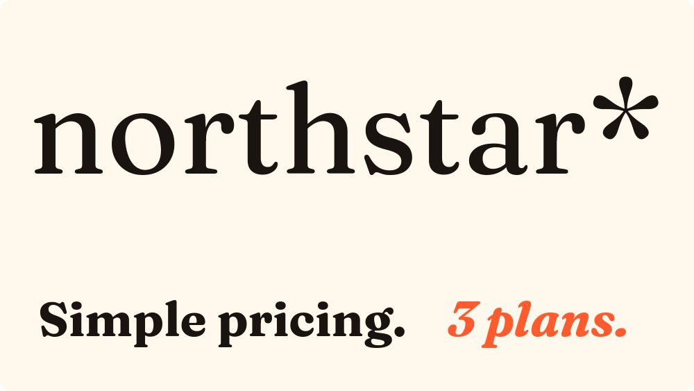
The aesthetic reads as DTC consumer bold rather than enterprise gray. Cream background, ink black body, and a single hot terracotta accent pull the eye exactly where you want it. Fraunces 700 on the price figures gives the numbers a confident, almost editorial weight, and italic Fraunces on the cover wordmark and "3 plans" line ties the cover to a brand that takes pricing seriously. Inter on the body keeps feature lists readable.
Motion is the value engine. Pop on the cards, number-roll on the prices, and succession on the feature lists turn what would be a static comparison into a sequence of small reveals. Nothing loops. The reader rolls through the plans once, lands on the FAQ, then arrives at a single CTA on pane eight that asks for the conversion.
- 8-pane arc covering cover, value philosophy, three plans, add-ons, FAQ, and final CTA
- Three plan cards with massive Fraunces pricing typography and per-feature succession
- Highlighted Pro plan painted in terracotta with a "MOST POPULAR" badge anchored top-right
- Number-roll on price figures and pop entrance on plan cards for a confident reveal
- Cream paper palette with terracotta accent and ink black body for DTC consumer warmth
- Add-ons pane and 3-4 question FAQ for the objections that block the buy decision
#Who Should Use This Template
- SaaS founders launching or re-launching pricing and wanting the page itself to feel like a product moment rather than an admin task.
- Productized services agencies packaging engagements as fixed tiers (Basic / Pro / Custom) and selling them off a pricing page instead of bespoke proposals.
- Indie hackers and bootstrapped founders who can't justify a custom pricing page build but still want the launch to look intentional and confident.
- Marketers and growth leads A/B testing pricing changes and needing a fast, visually distinct alternative to the standard three-card comparison-table format.
#Best Use Cases
#Replacing a Comparison-Table Pricing Page
Standard three-column comparison tables blur after the first scroll. This template trades horizontal density for vertical sequencing, which is more legible on mobile, more shareable as a video clip, and easier to update when a plan changes. Embed it on your /pricing route and let each plan get its own scroll moment instead of competing for attention in a single grid.
#Pricing Launch or Re-Launch Announcement
When you change pricing, you want the announcement to feel like a release, not a ticket. Export the deck as a video for social posts and a public link for the announcement email so subscribers can scroll the new tiers in the same animated experience your homepage now ships. The pop entrances on the plan cards make screenshots and short clips look intentional in a Twitter or LinkedIn feed.
#Productized Services Pricing
Agencies and freelancers moving from project-based to productized pricing can drop their three retainers, sprint packages, or tiers into the plan panes and ship a public pricing page in an afternoon. The "let's talk" Enterprise frame on plan three keeps a custom-engagement door open without requiring you to publish a custom price.
#How to Customize This Template
- Open PaneFlow and select "Pricing & Packages Reveal" from the template gallery
- Replace the cover wordmark with your brand logo and update the "[N] plans" line to your plan count
- Rewrite the value philosophy on pane two in one line that explains why your pricing is structured this way
- Set the Basic, Pro, and Enterprise plan names, prices, and four-feature lists
- Move the "MOST POPULAR" badge to the tier you want highlighted, or remove it entirely
- Update the add-ons pane with optional upgrades or one-off services
- Edit the 3-4 FAQ questions to address the objections you hear most often during sales conversations
- Set the final CTA to "Start free," "Get a demo," or whichever conversion event matters most
- Export as HTML for embedding on /pricing, or as video for the launch announcement post
#Related Templates
- SaaS Pitch - Minimal - investor pitch deck that pairs naturally with this pricing page
- Sales Proposal - Services Agency - bespoke proposal format for prospects who self-select into Enterprise
- Web App Feature Announcement - feature update format for shipping pricing-adjacent product changes
- Product Launch - t0ggles - full launch arc for the broader product moment
#Related Resources
- PaneFlow for SaaS - product launches, pricing pages, and growth marketing decks
- PaneFlow for Marketers - campaign assets and conversion-driving content
- PaneFlow vs Pitch - how PaneFlow compares for SaaS pricing reveals
Start with Pricing & Packages Reveal
Open this template in PaneFlow, customize it to match your brand, and export as HTML, React, Vue, or video.