Websites Portfolio - 3D Desktop & Laptop Showcase Template
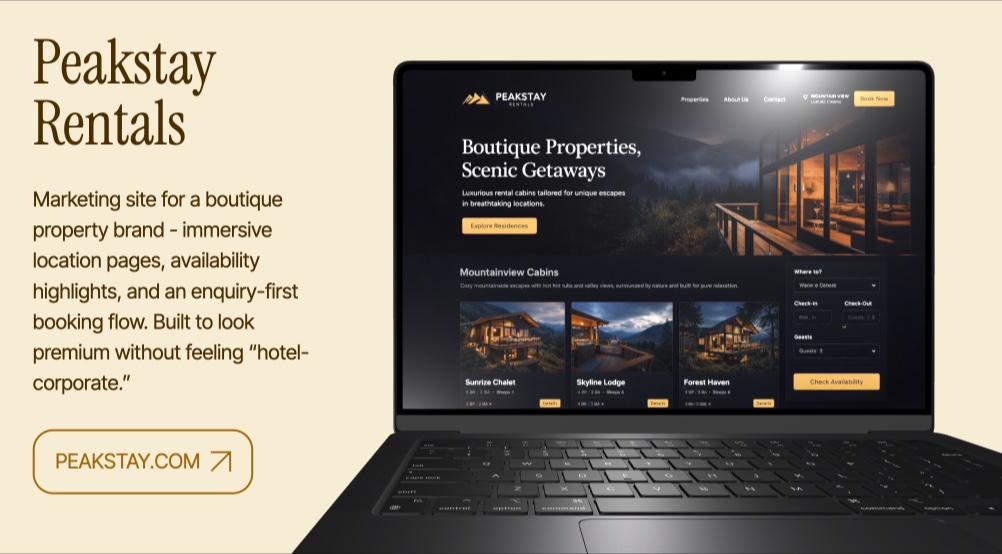
Web designers and developers spend weeks crafting responsive, pixel-perfect websites, then present them as flat screenshots in a portfolio page. The Websites Portfolio template changes that. Each project is displayed inside a rotating 3D device mockup - alternating between Apple Studio Display and MacBook Pro models - giving your web work the same premium presentation that product designers give to physical products.
#What Makes This Template Stand Out
The template alternates between two device types across its 5 panes: Apple Studio Display for desktop-focused sites and MacBook Pro for projects where the laptop context matters. This variety prevents the visual monotony of showing every project in the same frame. One pane even features a laptop-lid animation where the MacBook Pro opens to reveal the website - a dramatic reveal effect that is unique to this template.
- Alternating Studio Display and MacBook Pro 3D device mockups
- Laptop-lid opening animation for dramatic project reveals
- 3D rotation on X and Y axes during pane transitions
- Transparent background that adapts to any embedding context
- Serif heading typography (Instrument Serif) for editorial quality
- Clean 2-block-per-pane layout focused on the website showcase
The typography choice reinforces the professional tone. Instrument Serif headings paired with clean body text create an editorial feel - each pane reads like a portfolio entry in a design annual. The project names, descriptions, and domain URLs are presented with typographic care that signals attention to detail - exactly what web design clients evaluate when hiring.
#Who Should Use This Template
- Web design agencies showcasing client work. The 3D device mockups present websites in context, helping prospective clients visualize how their own project might look. The alternating desktop and laptop views show that your agency delivers responsive work across device types.
- Freelance web developers building a portfolio to attract clients. Five project slots cover a strong portfolio sample, and the 3D presentation immediately differentiates your portfolio from competitors using flat screenshots. The transparent background means the template integrates cleanly into your existing portfolio site.
- Design studios creating case study presentations for completed projects. Export the slideshow as video for client testimonial videos, or embed the interactive version on your case study pages for a hands-on walkthrough of the final deliverables.
- Job-seeking frontend developers preparing portfolios for interviews. The 3D mockups and smooth animations demonstrate an understanding of modern web experiences, and the template itself serves as proof that you care about presentation quality.
#Best Use Cases
#Web Design Portfolio Site
Embed the slideshow as the central showcase on your portfolio homepage. The alternating device mockups create visual rhythm as visitors browse through your projects, and the 3D rotation gives each website a dynamic introduction. The transparent background means the template blends seamlessly into your site's existing design rather than imposing its own aesthetic.
#Client Pitch Meetings
Open the slideshow in a browser during sales calls or in-person meetings. The 3D device animations create a memorable first impression, and the clean pane structure lets you discuss each project individually. The laptop-lid animation on the MacBook Pro pane adds a moment of surprise that keeps the presentation engaging.
#Dribbble and Behance Case Studies
Export individual panes as images or the full slideshow as video for your design platform profiles. The 3D mockups give your Dribbble shots and Behance case studies a polished, professional look that stands out in platform feeds. The device context helps viewers understand the scale and purpose of each website design.
#How to Customize This Template
- Open PaneFlow and select "Websites Portfolio" from the template gallery
- Replace the screen images on each 3D device model with your website screenshots
- Update the project names, descriptions, and domain URLs in the text blocks
- Adjust the 3D rotation angles and animation types per pane as needed
- Add or remove panes to match the number of projects in your portfolio
- Customize the heading fonts and text styling to match your brand
- Export as HTML for your website, video for social media, or publish to CDN for embedding
#Related Templates
- Mobile Apps Portfolio - iPhone 3D mockups for mobile app projects
- Lime Design - creative agency template with multiple 3D device types
- Projects Portfolio - multimedia project showcase with video backgrounds
- Product Launch - t0ggles - SaaS product launch with 3D laptop mockup
#Related Resources
- PaneFlow for Developers - animated developer portfolios and project showcases
- PaneFlow for Portfolios - professional portfolio presentations for creatives
- PaneFlow vs PowerPoint - how PaneFlow compares for portfolio presentations
Start with Websites Portfolio
Open this template in PaneFlow, customize it to match your brand, and export as HTML, React, Vue, or video.