Webinar Promo Template - Editorial Event Registration Slides
Webinar promotion is mostly about two things: making the event feel worth showing up to, and making registration friction-free. This template handles both. Seven square panes carry the visitor from a warm editorial cover through speaker portraits and a clear "how it runs" breakdown to a single high-contrast registration CTA, with Fraunces serif headlines doing the heavy lifting on every pane.
#What Makes This Template Stand Out
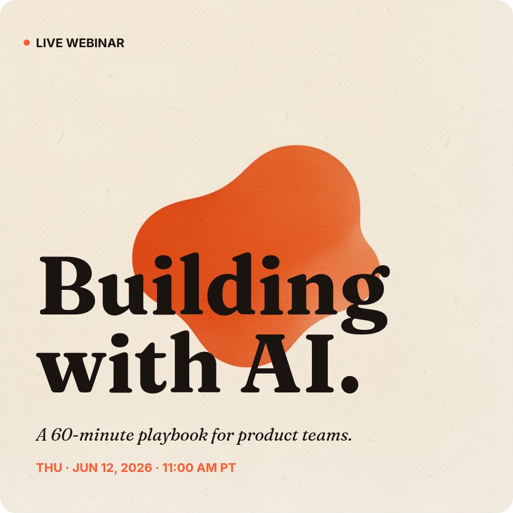
Most webinar promo graphics fall into one of two traps: they look like a boring corporate event flyer, or they look like a screaming sale ad. This template avoids both by borrowing from editorial print design. The cream #fff8ec background reads warm and considered rather than cold and corporate, the Fraunces 700 serif gives the headlines a magazine-cover gravitas, and a single hot orange #ff5b2e accent does all the visual work - the bullet, the speaker number, the blob shape on the cover, and the entire registration card on the final pane.
The blob shape on the cover is the signature visual. It is an organic orange form that sits behind the headline at a deliberate offset, so the words "Building with AI." overlap it and create a layered, magazine-cover feel. It does the same job as a stock photo would (giving the cover something to look at) without the staleness of a stock photo.
The "how it runs" pane is the part that earns the registration. Three vertical cards - 01 Live talk, 02 Live Q&A, 03 Replay - lay out exactly how the 60 minutes are spent and what attendees get afterwards. The middle Q&A card flips to the orange accent fill so the live, interactive portion of the event is visually the centrepiece. This is the pane that converts: it removes the "what is this actually" objection that most webinar invites leave hanging.
- 1:1 square format ready for Instagram, LinkedIn, Threads, and email hero blocks
- 7-pane registration arc: cover, why attend, what you'll learn, two speakers, how it runs, register CTA
- Cream `#fff8ec` background with hot orange `#ff5b2e` accent and organic blob shape on the cover
- Fraunces 700 serif headlines paired with Inter body for editorial magazine-cover gravitas
- Two interchangeable speaker panes with portrait, name, role, and one-sentence bio
- Three-card "how it runs" pane covering live talk, live Q&A, and 24-hour replay delivery
#Who Should Use This Template
- B2B marketing teams running a recurring webinar series and needing a consistent visual frame for every event
- SaaS demand gen teams promoting a product-led webinar or live demo where speaker credibility matters as much as the topic
- Agencies and consultants hosting a thought-leadership talk to fill the top of their pipeline with qualified registrants
- Community managers running a virtual meetup or panel where the speakers are the draw and need to feel like the headline act
#Best Use Cases
#Pre-Event Social Promotion Across Two to Three Weeks
The seven panes give you seven discrete posts you can drip-feed across the lead-up to the event. Post the cover three weeks out as the announcement, post each speaker pane individually in the second week to build credibility, post the "what you'll learn" and "how it runs" panes in the final week to push fence-sitters over the line, and end with the registration pane on the day. Same project, seven posts, consistent visual identity throughout.
#Embedded Registration Page
Publish the project to a public PaneFlow URL and use it as your event landing page. Visitors land on the cover, autoplay walks them through the why-attend, the speakers, the format, and the registration card, and the final pane points at your real registration form. The autoplay pacing acts as a mini sales sequence without requiring you to write or design a separate landing page in Webflow or Framer.
#LinkedIn Document Post for B2B Audiences
LinkedIn rewards document posts (PDF carousels) with disproportionate reach in the B2B feed. Export the seven panes as a PDF and upload it as a document post. Viewers swipe through the full pitch inside the LinkedIn feed, and your speaker portraits and orange accent palette stand out from the default LinkedIn pastel-and-stock-photo aesthetic that most webinar invites use.
#How to Customize This Template
- Open PaneFlow and select "Webinar / Event Promo" from the template gallery
- Update the cover headline, the 60-minute tagline, and the date and time line with your own event details
- Rewrite the "Why attend" outcome on pane 2 in one declarative sentence about what the attendee walks away with
- Edit the three numbered learning outcomes on the "What you'll learn" pane to match your real session agenda
- Replace the placeholder portraits on the two speaker panes and update names, roles, and one-sentence bios
- Adjust the "How it runs" timings (30 MIN, 20 MIN, 24 HRS) and copy to match your real format and replay policy
- Update the registration URL and capacity note on the final pane and verify the date and time line matches the cover
- Export as MP4 video for social, PDF for LinkedIn document posts, or HTML for an embedded landing page
#Related Templates
- Course Intro - Curriculum - long-form curriculum and module overview for cohort courses
- Podcast Episode Promo - Deep Dive - episode promo template with the same warm editorial sensibility
- Coming Soon - Waitlist Teaser - pre-launch teaser page for events not yet open to register
- Web App Feature Announcement - the SaaS-minimal counterpart for product release announcements
#Related Resources
- PaneFlow for SaaS - presentation tooling for product, growth, and demand gen teams
- PaneFlow for Marketers - campaign assets, social content, and landing-page slideshows
- PaneFlow vs Gamma - how PaneFlow compares for animated event and webinar promotion
Start with Webinar / Event Promo
Open this template in PaneFlow, customize it to match your brand, and export as HTML, React, Vue, or video.