Cafe Brand Template - Coffee Shop Storytelling
A cafe brand lives or dies on warmth. Customers come back because the place feels like a regular's spot, not because the espresso bar has the latest grinder. This template builds that warmth directly into the presentation - cream paper background, handwritten Caveat headings, sourcing-led writing, and a chapter-by-chapter structure that reads like an independent coffee shop's "about" page rather than a brand pitch deck.
#What Makes This Template Stand Out
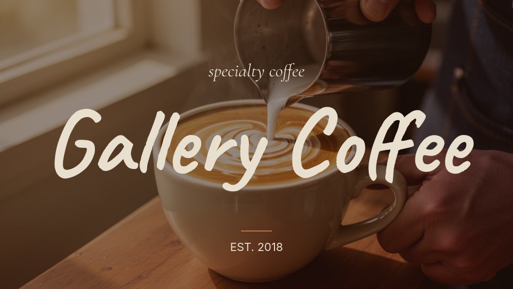
The two fonts working together do most of the work. Caveat is a friendly handwritten script that immediately signals small-batch and personal - the kind of lettering you see on a chalkboard menu in a neighborhood cafe. Cormorant Garamond italic adds an editorial second voice for things like "single origin" or "tasting notes," giving the template a bit of magazine polish without losing its hand-drawn warmth. The two typefaces are treated as different chapters of the same story, not competing styles.
The chapter structure is the second distinctive feature. Eight panes step through a real cafe brand the way a customer would discover one: cover, our story, the beans (origin), the roast, the drinks (3-up menu with prices), the space, the community, find us. Each chapter pane carries a small "Chapter 02 - the beans" cue in muted rust, so the slideshow reads like a hand-bound zine rather than a generic deck. The 3-drink menu pane in particular is the most-used pane in this template, because every cafe needs to show three hero drinks with prices, and the layout was tuned for that exact job.
Animations stay quiet. Slow letter-fade on the Caveat headings, gentle drift on the chapter labels, and parallax 6-8 on the coffee photography. Nothing bounces. Nothing pops. The motion matches the pace of pour-over coffee, not the pace of a Black Friday banner.
- 16:9 widescreen format with 8-pane chapter structure
- Cream `#e8dfce` background with deep ink and warm rust accent
- Handwritten Caveat headings paired with Cormorant Garamond italic editorial cues
- Chapter-numbered structure: story, beans, roast, drinks, space, community, find us
- 3-drink hero menu pane with names, ingredient lines, and prices
- Slow letter-fade and drift animations with parallax 6-8 on coffee photography
#Who Should Use This Template
- Independent cafes and coffee shops that want their digital presence to feel as warm as their actual storefront. The chapter structure gives owners room to tell the sourcing story most cafes never get to tell on Instagram.
- Specialty roasters and single-origin coffee brands launching a new bean. The "the beans" and "the roast" panes are pre-built for tasting notes, processing method, and harvest details - the kind of provenance story specialty coffee customers actually read.
- Cafe consultants and hospitality agencies producing brand pitches and deck-style cafe storefronts for clients. Faster than building a one-pager from scratch, and the editorial polish lands credibility immediately.
- New cafe owners pre-launch who need a brand asset before the doors open. The "find us" pane works as a soft launch announcement, and the slideshow is video-exportable for the Instagram pre-launch reel.
#Best Use Cases
#Independent Cafe Brand Storytelling
This is the template's most natural fit. A small cafe with a real sourcing story, a roasting process worth explaining, and three signature drinks worth featuring. The 8-pane sequence walks a customer through the full brand the way the owner would explain it across a slow Tuesday morning conversation. Embed it on the cafe's site, share it as an Instagram carousel, or run it on a tablet behind the counter as ambient brand content.
#Specialty Coffee Bean Launches
Roasteries dropping a new origin bean can rebuild the chapters around the bean itself - the cover becomes the bean name, "the beans" becomes the producer or farm story, "the roast" becomes the development time and roast level, and the drinks pane becomes brewing recipes. The parallax photography panes were designed with single-origin beans, burlap sacks, and pour-over equipment in mind.
#Hospitality Pitches and Cafe Brand Books
Hospitality consultants pitching new cafe concepts, or franchise teams documenting a brand book, can use this template as the brand bible itself. Export as PDF for the printed brand book, as HTML for the internal training site, or as video for the franchisee onboarding deck. The chapter structure maps directly to the sections of a typical cafe brand book.
#How to Customize This Template
- Open PaneFlow and select "Cafe / Coffee Brand" from the template gallery
- Replace the cafe name on the cover and the "Est. [year]" subtitle
- Swap the photographs - cover (latte pour), beans (single-origin), roast (machine), 3 drinks, space, customer
- Edit the chapter copy - story paragraph, sourcing notes, roast process, drink menu with prices
- Update the closing pane with your hours, address, and Instagram handle
- Adjust the cream background or warm rust accent if your brand uses a different palette
- Add or remove chapter pairs to handle pastry, retail beans, or merch sections
- Export as HTML for the cafe website, JPG sequence for Instagram, or video for in-store displays
#Related Templates
- Restaurant Menu Editorial - editorial cream and terracotta menu template for restaurants and trattorias
- Beauty Drop Luxe - editorial italic Cormorant template adapted for product launches with a darker palette
- Wedding Invite Romantic - soft pastel editorial template using the same Cormorant heading discipline
- Outdoor Adventure - warm photography-led template for nature and lifestyle brands
#Related Resources
- PaneFlow for Marketers - building social and brand content for hospitality and lifestyle brands
- PaneFlow for Agencies - producing client-grade brand content at speed
- PaneFlow vs Canva - how PaneFlow's animation and parallax features go beyond static design tools
Start with Cafe / Coffee Brand
Open this template in PaneFlow, customize it to match your brand, and export as HTML, React, Vue, or video.