Healthtech Pitch Deck Template - Clinical Clean
A healthtech pitch deck template for digital health, medtech, and biotech founders pitching healthcare investors who expect evidence first and adjectives never. 10 panes carry a clinical-clean aesthetic - pale sage background, near-black ink, sage and muted-blue accents, Inter Tight headlines, Inter body, and IBM Plex Mono for regulatory tags and citations - through the full healthtech investor arc.
#What Makes This Template Stand Out
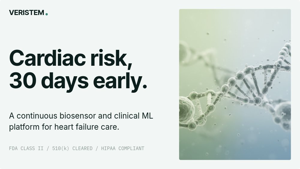
The defining choice is regulatory legibility. Most pitch decks treat compliance as a footer footnote on slide 19. This deck makes it part of the visual language from the cover onward. The cover sets the wordmark in Inter Tight with a single sage dot, a bold headline ("Cardiac risk, 30 days early."), a one-line subhead naming the platform category, and a monospace strip across the bottom holding the regulatory pathway in caps - FDA CLASS II / 510(K) CLEARED / HIPAA COMPLIANT. By the time an investor reads the cover, they already know what kind of pathway this company is on. That signal is the difference between a deck that looks like a healthcare deck and one that looks like a SaaS deck pasted into a stethoscope.
The mechanism pane is the second distinctive choice. Instead of a generic "how it works" slide, it lays out a three-step clinical loop - Sense, Predict, Intervene - on the left and a clean anatomical or molecular illustration on the right, with a monospace caption tying the whole loop together. The illustration is sage and muted blue rather than bright product chrome, which keeps the deck inside the clinical aesthetic while still answering the mechanism question every healthcare investor asks first. Pane 5 is clinical evidence - a bar chart of three study results with mono labels and a citation line at the foot.
The market pane segments TAM, SAM, and SOM by payer, provider, and patient rather than the usual single-number market size, because that is how healthcare deals actually close. The U.S. TAM number sits oversized in sage, and three smaller columns to the right break out payer spend, provider spend, and patient out-of-pocket with one-line context under each. A monospace source row at the foot cites AHA, CMS, and analyst sources. Animation is fade only - no looping, no parallax, no motion that could read as marketing. The pace is intentionally slow because the audience is reading, not watching.
- 10-pane structure: cover, problem, why now, mechanism, clinical evidence, product, market, regulatory pathway, team, ask
- Clinical-clean palette: pale sage background, near-black ink, sage and muted-blue accents
- Inter Tight 600 headlines, Inter body, IBM Plex Mono for regulatory tags and source citations
- Cover regulatory strip naming FDA pathway, clearance, and HIPAA status in monospace caps
- Three-step mechanism pane (Sense, Predict, Intervene) with anatomical illustration and mono caption
- Payer, provider, patient market segmentation with cited TAM and a clinical-evidence bar chart
#Who Should Use This Template
- Digital health founders building software-as-a-medical-device, remote patient monitoring, clinical decision support, or chronic-care platforms. The Sense, Predict, Intervene mechanism frame fits these products almost without rewriting.
- Medtech and device companies raising capital for FDA-cleared or CE-marked hardware. Swap the mechanism illustration for a device render and the cover regulatory strip already speaks the language reviewers expect.
- Biotech and diagnostics teams at the seed-to-Series-B stage who need to present clinical evidence alongside business model. The bar-chart evidence pane and the cited TAM pane handle both halves of that conversation.
- Health systems innovation and payer-facing startups pitching enterprise buyers and strategic investors. The payer-provider-patient market segmentation is the slide health-system buyers actually want to see.
#Best Use Cases
#Healthcare Investor Pitches and Strategic Reviews
The deck is structured around how healthcare investors evaluate companies: clinical problem, biological or technical mechanism, evidence, regulatory path, market, team, ask. Each pane delivers exactly one of those answers, with citations where citations are warranted. The clinical evidence bar chart is the slide most healthtech decks botch by either overstating effect size or burying it; this template gives that slide its own pane and treats it as the load-bearing moment of the deck.
#Strategic Partner and Pharma BD Decks
When the audience is a strategic partner or pharma BD team rather than a pure-play investor, the same deck works as a partnership pitch. The mechanism, evidence, and market panes are exactly what a partnership team will run through internally to evaluate a pilot, and the regulatory pathway pane sets the realistic timeline for any go-to-market collaboration.
#IRB, Advisory Board, and Internal Stakeholder Reviews
Export the deck as PDF and the clinical evidence pane reads as a presentable summary for internal advisory boards or IRB submissions. The fade-only motion means nothing distracting plays in a static export, and the IBM Plex Mono source rows preserve the citation-heavy layout that clinical readers expect.
#How to Customize This Template
- Open PaneFlow and select "Healthtech Pitch - Clinical Clean" from the template gallery
- Replace the wordmark, the bold problem headline, and the regulatory mono strip on the cover
- Update the why-now pane with your tech enabler (genomics, sensors, AI, regulation change)
- Swap the mechanism illustration and rewrite the Sense, Predict, Intervene step labels and one-liners to match your platform
- Edit the clinical evidence bar chart with your three study results and update the source citation line
- Replace the product UI screenshot or device shot, and update the four cell metrics on the device specs row
- Adjust TAM, SAM, and SOM numbers and the payer-provider-patient breakdown with cited sources
- Update the regulatory pathway timeline milestones, then export as PDF or publish to a private link
#Related Templates
- Fintech Pitch - Editorial Serious - serious editorial deck for regulated financial services with similar evidence-led pacing
- SaaS Pitch - Minimal - the horizontal SaaS variant for software-led healthtech without the regulatory load
- Case Study - Long-form Customer Story - long-form clinical case study format for hospital and payer references
- Course Intro - Curriculum - curriculum format adaptable for clinician training and CE programs
#Related Resources
- PaneFlow for Startups - pitch decks and investor updates for early-stage healthtech and medtech founders
- PaneFlow for SaaS - animated decks and product tours for software-led digital health platforms
- PaneFlow vs Pitch - how PaneFlow compares to Pitch for evidence-led investor decks
Start with Healthtech Pitch - Clinical Clean
Open this template in PaneFlow, customize it to match your brand, and export as HTML, React, Vue, or video.