What Are cqw Values - And Why PaneFlow Uses Them
If you've ever designed a responsive layout, you've probably used units like %, vw, em, or rem. But in PaneFlow, you'll notice something different - we rely heavily on a newer, more dynamic unit called cqw.
So what is cqw, and why is it so important to how PaneFlow works?
#What is cqw?
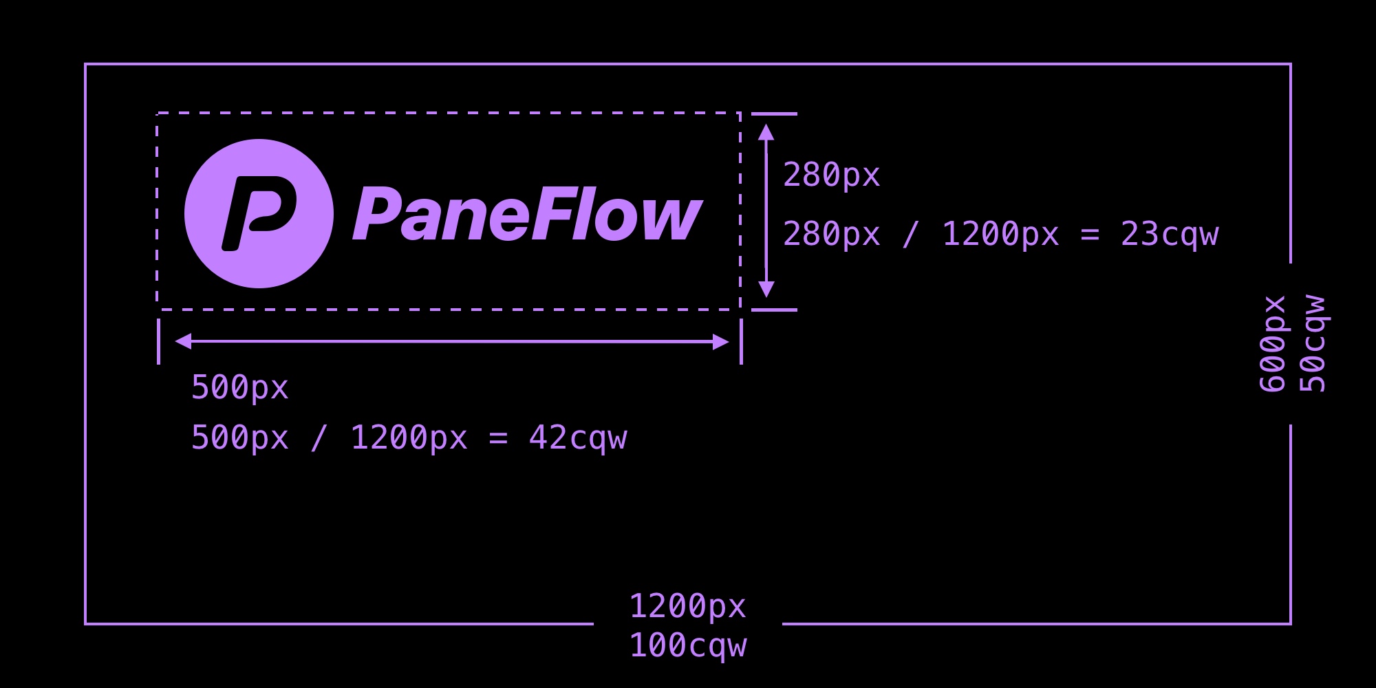
cqw stands for Container Query Width - it's a CSS unit that's relative to the width of the element's container, not the viewport.
1cqw= 1% of the container's width- It works similarly to
vw(viewport width), but is scoped to a specific parent container
It belongs to the CSS Container Queries spec, a modern approach to responsive design that's supported in all major browsers.
#Why We Use cqw in PaneFlow
PaneFlow is a block-based slideshow system where each pane acts like a container. And that's where cqw shines.
Instead of sizing and positioning elements based on the full page or screen, we size everything relative to the pane itself. That means:
- When the pane scales (e.g. embedded in different sizes or devices), all blocks, gaps, images,fonts, and animations scale with it
- Transitions remain fluid and proportional
- There's no need for media queries or manual breakpoints
#Real Usage in PaneFlow
In the PaneFlow Studio, you'll see cqw used for:
- Block widths & heights
- Font sizes (e.g.
5cqwfor responsive type) - Gaps between blocks
- Border radius
- Transforms like
translateX(10cqw),translateY(-5cqw)
Because everything is defined in cqw, your slideshow behaves like a self-contained, responsive system - no matter where you embed it or how big it appears on screen.
#Why Not Just Use vw?
Using vw (viewport width) ties your layout to the entire browser window - which can break layouts inside smaller containers like:
- Webflow sections
- Shopify product pages
- Blog embeds
- Split screens
By using cqw, PaneFlow ensures your presentation always scales within its own boundary, making it modular and portable.
#Building Responsive Slideshows Without the CSS
cqw is what makes a PaneFlow slideshow look right at any size - dropped into a Webflow section, a blog post, or exported as a React, Vue, or Svelte component. You design once on a fixed canvas and PaneFlow handles the responsive math with container query units, so there are no breakpoints or media queries to maintain.
If you build presentations or product showcases for the web, this is the hard part PaneFlow does for you. Try PaneFlow free - design visually, then export clean code that scales with its container.
#TL;DR
1cqw=1%of a container's width- Used in PaneFlow to make slideshows scale intelligently and proportionally
- Ensures every element resizes as the pane resizes
- Allows you to build once, scale everywhere - without extra CSS
Don't Miss What's Next
Get updates, design tips, and sneak peeks at upcoming features delivered straight to your inbox.