PaneFlow Editor Refresh - A Cleaner Sidebar, Better Navigation Controls, And Smarter Styling
PaneFlow has always been about speed without sacrificing craft that "designer-grade, dev-friendly" sweet spot. But over time, one thing started to fight us a bit: the Editor UI itself.
So we went after the biggest surfaces - the sidebar controls, content tree, navigation/pagination settings, and a bunch of "small frictions" that add up when you're building real projects. This is one of the largest Editor updates we've shipped yet, and it's all about making PaneFlow feel cleaner, faster, and more predictable from the first click.
Let's walk through what changed - and how to use it.
#Sidebar Controls - Goodbye Sliders, Hello Compact Number Inputs
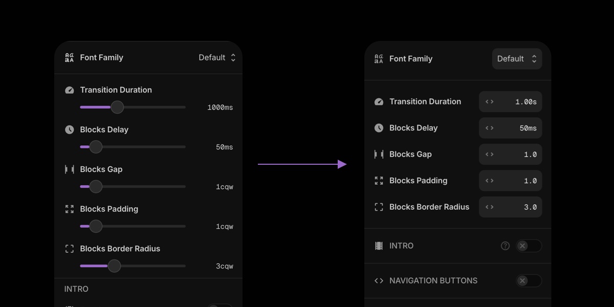
Range sliders look nice in demos and then you use them all day and realize they're space-hungry and annoyingly imprecise.
We redesigned a big part of the sidebar controls to use compact number inputs that work in two modes:
- Drag-scrub the value (left/right) to adjust quickly
- Click + type when you need exact numbers
This does two important things:
- Saves a lot of vertical space (less scrolling, more "real" controls visible)
- Feels more "pro" - faster adjustments and fewer micro-misses
#How to Use It
- Hover the number input
- Drag left/right to scrub the value
- Click to type a precise value
#Content Tree - Rename Any Element (Not Just Panes and Blocks)
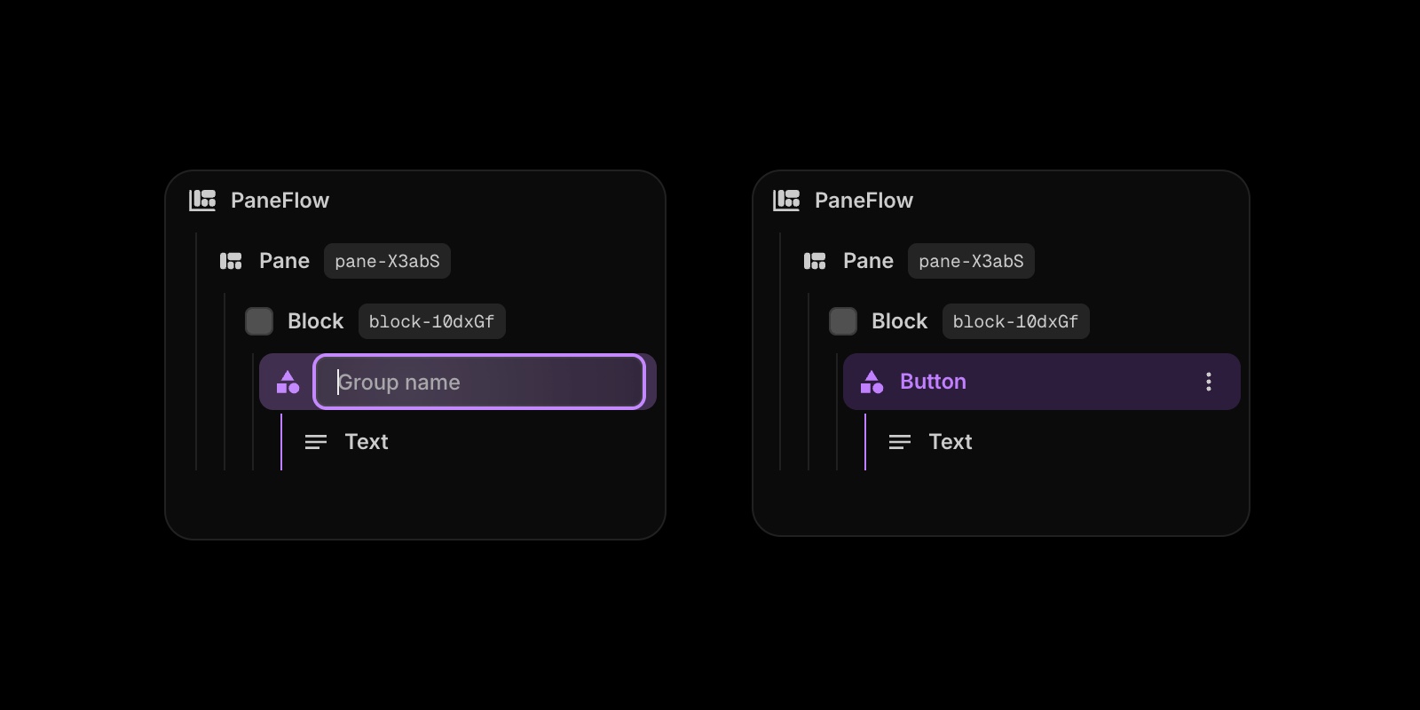
You already could name panes and blocks. That helped a lot when projects got bigger.
Now we extended custom naming to every element in the content tree.
Why this matters: complex slideshows aren't "Rectangle 14" and "Text 22". They're "Pricing Card", "Hero Badge", "Shadow Blur", "CTA Button", "Product Shot Mask", etc. When names match intent, you move faster and break fewer things.
#How to Rename an Element
- Open the content tree in the sidebar
- Double-click any element name
- Type the name you actually want
- Hit Enter
#Pagination Settings - Size and Offset Controls

Pagination used to be "on/off + style". Now you can actually tune it like a real component.
New controls include:
- Item size (bigger thumbs, smaller dots, etc.)
- Offset from the bottom edge (so it doesn't fight your footer/CTA area)
This is especially useful when you're publishing to a real page layout where the slideshow sits inside a section with its own spacing rules.
#How to Adjust Pagination
- Open Slideshow Settings → Pagination
- Set Item Size
- Set Item Offset (from bottom edge)
- Preview and tweak until it sits "just right"
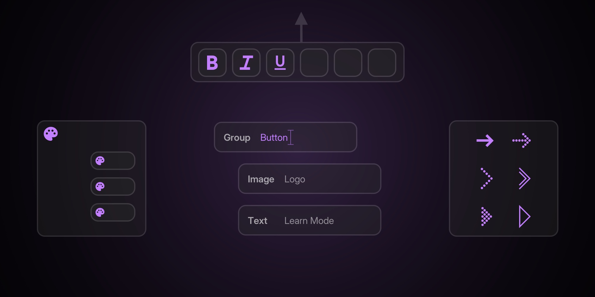
#Navigation Buttons - Size, Offset, and Icon Style Picker
![]()
Same story for navigation. We made it way more flexible without making it complicated.
You can now control:
- Button size
- Offset from left/right edge
- Arrow icon style (chevrons, arrows, triangles, dotted variants, etc.)
So whether you want "minimal and subtle" or "big and obvious", you can match the navigation to the visual language of the slideshow.
#How to Customize Navigation
- Open Slideshow Settings → Navigation Buttons
- Set Icon (pick a style that matches your template)
- Set Item Size
- Set Item Offset (distance from edges)
- Adjust colors if needed
#Slideshow Container Styling - Background Color and Border Radius
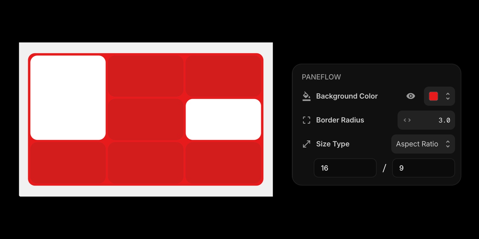
This one sounds small until you use it.
You can now style the main slideshow container itself:
- Background color
- Border radius
That means you can drop a slideshow into a layout and have it feel like a real embedded component - especially nice for dark sections, card-style layouts, or when you want the slideshow to visually "sit" inside a rounded frame.
#Where It Shines
- Webflow/Framer embeds inside rounded sections
- Clean product "feature cards" where the slideshow is part of a grid
- Dark UI demos where the container needs contrast
#Floating Toolbar - Now Pinned to the Top Center
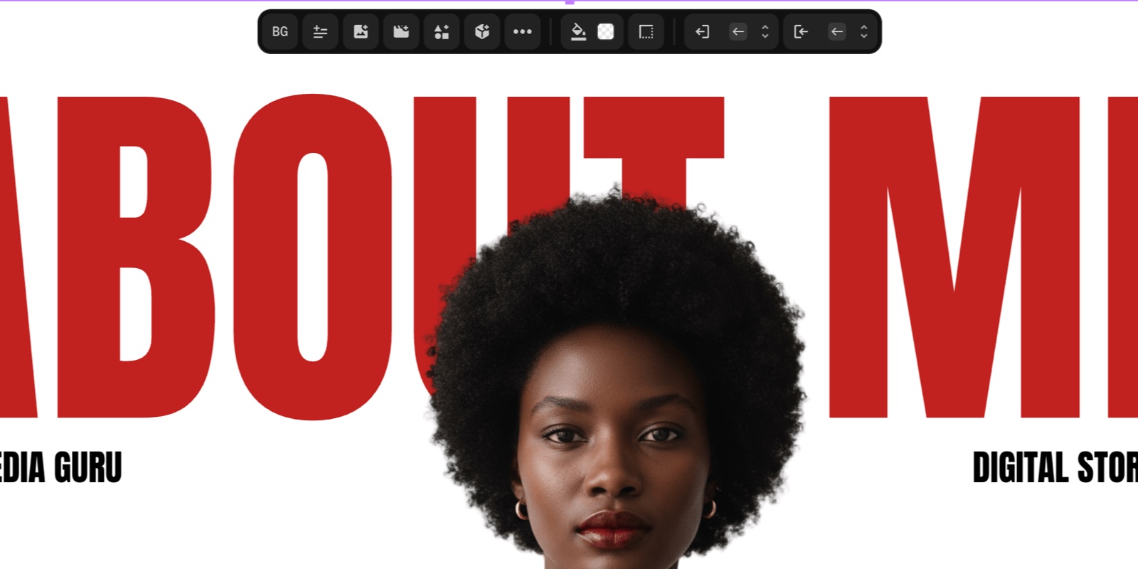
If you've ever had the floating toolbar overlap your design (especially near the top edge), yeah. Same.
The main floating toolbar is now always positioned top-center of the canvas, not attached to element positions. So it stays consistent, visible, and out of the way.
Result: fewer moments where you're trying to click a detail and the toolbar is sitting on it like a parked car.
#Cleaner Values - We Removed the CQW Unit Labels
PaneFlow still uses cqw under the hood (it's great for responsiveness and consistent scaling), but the unit label itself confused some users.
Now the UI shows clean numbers without unit noise, while keeping the same responsive behavior internally.
If you're exporting code, you still get the benefit. If you're designing, you get a cleaner editor.
#New Shapes Added
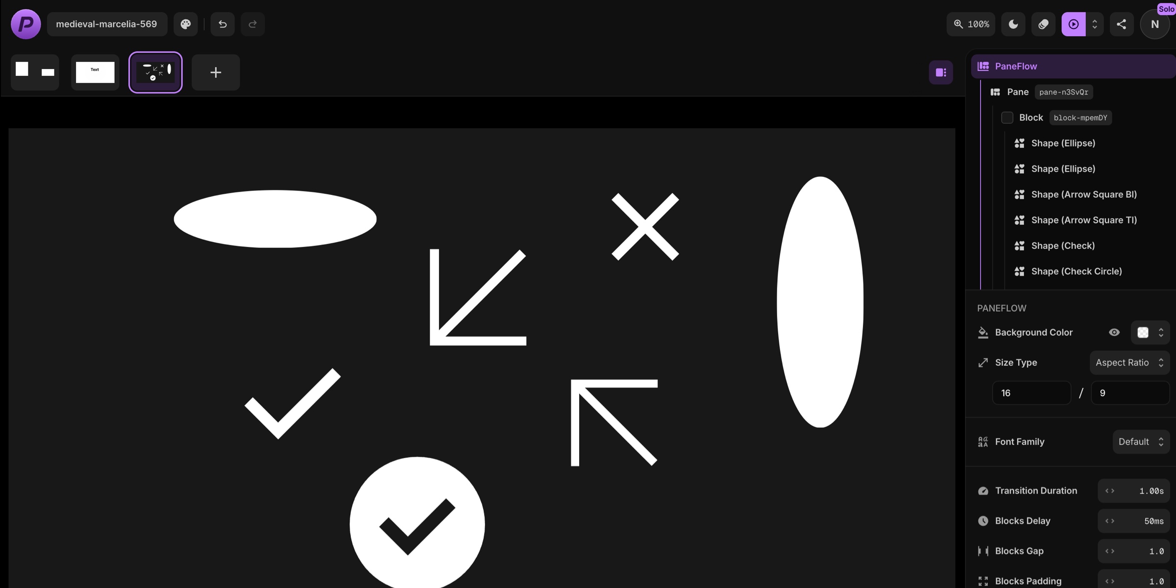
We added a few shapes that are practical and template-friendly:
- Resizable ellipse (perfect with blur for shadows)
- Square arrows
- Check icon shapes
- Close icon shapes
These are small building blocks that make templates feel more complete - especially for UI walkthroughs, pricing slides, comparisons, and "feature checklist" layouts.
#New Visual Effect - Blur for Images, Videos, and Shapes
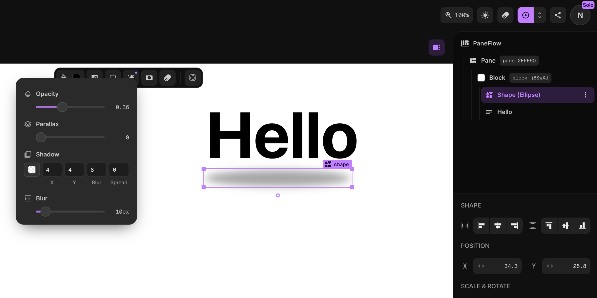
Blur is now available as a visual effect for:
- Images
- Videos
- Shapes
This is one of those "design glue" tools. It helps you create depth without adding more assets.
#What to Try First
- Add a resizable ellipse shape
- Apply blur
- Lower opacity
- Use it as a soft shadow behind product shots or UI cards
#New Blocks Transition - Fade
Blocks used to always "slide in" from a direction. That's great for bold motion… but sometimes you want subtle.
Now you can choose Fade as a Blocks transition effect - cleaner, calmer, and often a better fit for premium product storytelling.
#When Fade Is the Right Choice
- "Apple-ish" product slides
- Minimal typography layouts
- Any slideshow where motion should support the content, not announce itself
#Project Colors Editor - See and Edit All Colors in One Place
If you've ever started from a template and thought: "Ok… where are all the colors hiding?" - this is for you.
There's a new Project Colors button near the project name (top left). It shows:
- All colors used across the project (text, backgrounds, shapes, etc.)
- How many elements use each color
- A fast way to edit them to match your brand
This makes template customization feel like changing a theme, not hunting for needles in a haystack.
#How to Use Project Colors
- Click the Project Colors button near the project name
- Review the palette list
- Click a color to edit it
- Watch updates apply across the slideshow
#Groups Got Smarter - Copy/Paste Groups and Cmd+G for Single Elements
Two small changes that unlock a lot of workflow speed:
- Copy/paste groups (finally - duplicating grouped layouts is frictionless)
- Cmd+G wraps a single element into a group when it's selected
That second one is sneakily powerful. Wrapping a single element can help when you want:
- A background behind text (group background)
- Extra padding without changing the text box
- A container for effects or future layering
#Export Modal Refresh - Clearer and Cleaner
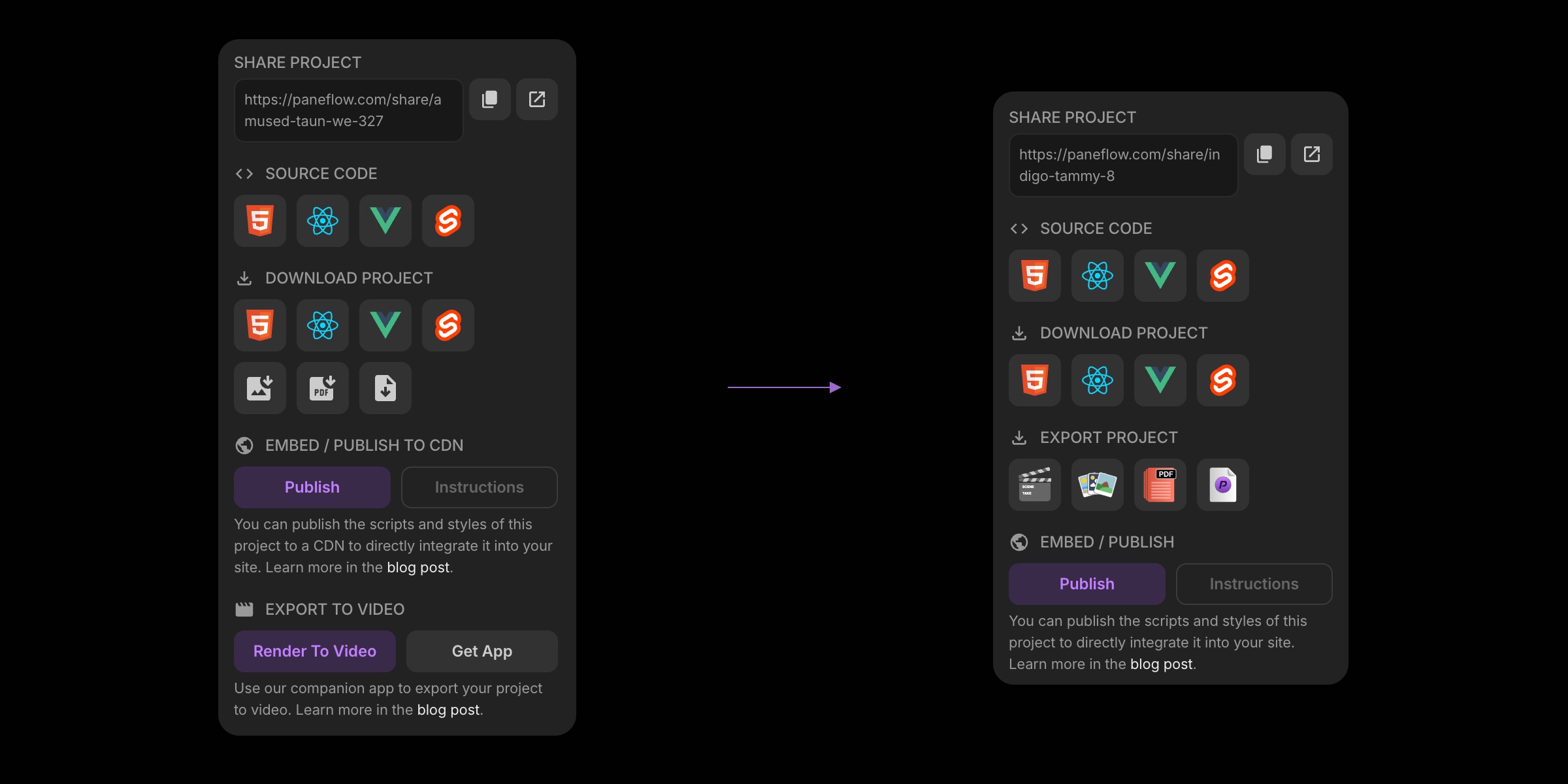
We also updated the Project Export modal to make it easier to understand at a glance - less visual noise, clearer grouping.
This pairs nicely with PaneFlow's core workflow: design → export/embed anywhere.
If you're exporting to code, check out:
- HTML export
- React/Vue/Svelte exports
If you're publishing:
- Publish to CDN (then embed via snippet or one-line iFrame)
And if you're sharing:
- Export to video (MP4) for socials and async demos
#Cleaner Output Code - Fewer Defaults, Smaller Exports
Under the hood, we did a bunch of optimizations to the generated output:
- Don't render properties when they're at default values
- Reduce unnecessary noise in exported configs/styles
- Result: smaller, cleaner code
If you're a developer dropping PaneFlow exports into a real codebase, this is exactly the kind of improvement you feel over time.
#Try PaneFlow Today
PaneFlow is designed to be the tool you actually keep open while you work:
- Solo - $5/mo or $48/yr
- Team (up to 5 seats) - $10/mo or $96/yr
If you're already using PaneFlow for client work or product marketing, these Editor upgrades are meant to pay you back in time saved every week.
Don't Miss What's Next
Get updates, design tips, and sneak peeks at upcoming features delivered straight to your inbox.