10 New PaneFlow Templates Drop
If you've ever stared at a blank slideshow thinking "I know what I want, I just don't want to design it from scratch" this drop is for you.
Today we're shipping 10 brand-new PaneFlow templates built to feel modern, bold, and easy to adapt. Each one is designed as a real starting point (not just a pretty cover slide) - with layouts you can reuse, swap content into fast, and scale into a full story.
Below you'll find a quick video demo for each template, plus a short "what it's good for" intro so you can pick the right one in seconds.
#Websites Portfolio
If your "portfolio" is basically a folder of screenshots right now... this template fixes that fast. Websites Portfolio is built for showcasing real web work with clean, premium typography on the left and a 3D device model on the right (laptop / desktop). So instead of a flat mockup image, you get a scene you can angle, animate, and make feel alive.
Best for
- Web studios and freelance designers showing client work
- Agencies doing "case study" landing pages
- Indie makers shipping multiple sites/products
- Anyone who wants a portfolio that feels high-end without over-designing it
What makes it special
- Real 3D models (not a PNG mockup) - perfect for subtle rotations, parallax, and "show-and-tell" motion
- A repeatable layout: Project title + short positioning + link button (left) and the website preview in a device (right)
- Works great as a portfolio slideshow, a case-study section, or a homepage showcase you can embed anywhere
What to customize
- Swap the project name + 2-3 sentence summary (keep it punchy)
- Replace the website screenshot inside the device screen
- Update the domain/button label (it's designed to look like a "real" link card)
- Optional: add a "role / stack / timeline" line under the description for extra credibility
#Short Intro - Northpeak Studio
This one is a clean, punchy 5-slide intro you can drop at the top of a reel, a landing page, a pitch deck, or even a YouTube pre-roll. Big type. High contrast. Simple motion-friendly shapes. It's designed to say "we're serious" without doing the whole cinematic trailer thing.
The flow is intentionally minimal: Build → What Matters → with... (your differentiator) → Real Results → Logo + URL
Best for
- Design studios and agencies that want a quick brand intro video
- Freelancers who need a "before the work" opener for case studies
- Product teams introducing a new initiative or launch sequence
- Any brand that wants a consistent bumper for social posts
What makes it special
- Built for motion: bold words and simple geometry animate beautifully (and don't get messy)
- High-contrast layout that reads instantly on mobile
- Easy to adapt into multiple variations (different hooks, different "with" line, different endpoints)
What to customize
-
Replace "Northpeak Studio" with your brand name and URL
-
Swap the key phrases:
- "Build" can become "Ship", "Design", "Launch", "Grow"
- "What Matters" can become "What Works", "Quality First", "Less Noise"
- The "with" slide is your signature line (ex: "with clarity", "with speed", "with taste")
- "Real Results" can become "Real Work", "Real Teams", "Real Wins"
-
Optional: add 1 short line under the logo slide (service focus, city, or niche) if you want a little extra context
#Seaglass Yachts
Seaglass Yachts is a full-on mini pitch deck... but designed like a premium website. Big editorial type, soft rounded panels, and image-first blocks that feel modern without going "tech startup." It's perfect when you need to explain a product clearly (problem → market → solution → products → traction → team → contact) and still keep it visual.
This template is also a great example of PaneFlow's pane-and-block workflow: each slide is built from reusable blocks (hero, stat cards, image grids, profile cards) so you can swap content without rebuilding layouts.
Best for
- Hardware and product brands pitching a new category (boats, EV, consumer products)
- Investor/partner decks that should feel like a landing page
- High-ticket services with a story to tell (premium travel, real estate, luxury goods)
- Any "explainer" deck where you need credibility fast
What makes it special
- Strong narrative structure: Problem → Opportunity → Solution → Products → Traction → Team → Outro
- Built-in stat tiles and number blocks that make metrics look intentional (not pasted in)
- Image grid layouts that work with real photography (and don't feel like a random collage)
- Clean team section with profile cards (looks great even with AI-generated portraits)
What to customize
- Swap the brand name + the first-slide promise (what you're building and why it matters)
- Replace the "Problem" and "Market Opportunity" headlines with your own language (keep them bold and specific)
- Update the stats (or remove them) - the layout still looks balanced with fewer numbers
- Products slide: rename the product cards and swap images (great for tiers, packages, or a roadmap)
- Traction slide: replace the metrics with whatever "proof" you actually have (waitlist, pilots, revenue, partnerships)
- Footer/contact slide: make it real - email, website, socials, location
#Photographer Minimalist Portfolio
This template is built for photographers who want their work to feel like the hero... not the layout. It's minimalist, soft, and editorial - big serif titles, lots of breathing room, and gallery grids that look curated even if you're starting with a small set of photos.
The vibe is "printed portfolio" more than "noisy Instagram carousel." Calm background gradients, simple icons, and clean pagination so it works as a slideshow, a portfolio embed, or a lightweight landing page.
Best for
- Photographers (street, travel, editorial, weddings, lifestyle)
- Creators building a simple personal brand deck
- Visual artists who want a quiet, premium presentation
What makes it special
- Strong editorial typography that instantly reads "portfolio"
- Gallery-first slides with flexible grids (easy to swap from 3 photos to 8 without redesign)
- A simple "About Me" and "Get in Touch" structure that feels professional, not corporate
What to customize
- Cover slide: name + year/edition (or replace with "Selected Work" / "Portfolio" / "Journal")
- About slide: 2-4 short lines about your style + what you're available for
- Category slides: rename "Street Photo / Nature Photo" to your real sets (Weddings, Portraits, Studio, Travel, Events)
- Replace the image grids with your own photos (works great with consistent aspect ratios)
- Contact slide: phone/email/socials - keep it minimal and readable
If you want to make this one even more "you", the easiest upgrade is swapping the background gradient + changing the accent shape (stars) into something that matches your style (dots, lines, a simple stamp, anything).
#Mobile Apps Portfolio
Mobile Apps Portfolio is a sleek, product-focused showcase template designed for app developers, studios, and indie makers who want to present multiple apps in one clean, cohesive flow. Each slide features a real 3D phone model with realistic reflections and perspective - so your app screens feel tangible, premium, and launch-ready.
It's perfect for app portfolios, startup presentations, or even as a personal developer's showcase. The tone is professional but minimal - dark gradient backgrounds, bold product names, and subtle App Store/Play Store callouts.
Best for
- App developers and studios presenting multiple products
- Indie creators with a small app ecosystem
- Marketing decks for client projects or investor demos
- Web and mobile UI/UX designers showing case studies
What makes it special
- Uses real 3D phone models (not flat mockups) for photorealistic presence
- Unified dark background palette with slight hue shifts per app
- Consistent app showcase layout - icon, name, tagline, screen, and download badges
- Each slide feels like a standalone promo page, but together they tell a story
- Designed for simplicity: one product per pane, quick transitions, easy to update
What to customize
- Replace the logo, app name, and tagline per project
- Update screenshots (any 9:20 app screen fits seamlessly into the 3D mockup)
- Change background tone per app to match its brand color
- Replace or remove App Store/Play Store buttons if not relevant
- Optionally, add a closing "About" or "Contact" slide if you're using this as a studio portfolio
This template is ideal if you want your apps to look ready for launch day - professional, consistent, and cinematic in motion.
#Digital Storyteller
A bold, editorial-style portfolio template for social media specialists and digital storytellers. Built around oversized typography, clean white space, and punchy "section divider" slides - so your work reads like a modern magazine spread.
Best for
- Social media specialists
- Content strategists
- Creative directors
- Freelancers and small studios pitching services
- Creators who want a high-contrast, type-led portfolio
What's inside
- Hero cover with big statement title, role callouts, and contact/location
- About / intro slide with a short positioning paragraph
- Services slide ("What I do") as a clean, scannable list
- Proof slide ("Proof in results") to frame your work as outcomes-first
- Case study slides (example: "Launch Campaign") with visual-heavy layouts
- System slide (example: "Content System") to show process + consistency
- Community / growth slide for engagement-first strategies and UGC vibes
- Testimonials slide with client headshots + quotes
- Contact slide ("Let's connect!") with email/social/site
Why it works
- Instant personality: giant headlines + minimal copy = confident brand voice
- Easy to skim: each section is obvious at a glance (great for busy clients)
- Portfolio that sells: emphasizes outcomes, systems, and repeatable execution
- Built for swapping content fast: replace titles, lists, case studies, and quotes without redesigning slides
Customization tips
- Keep headlines to 1-3 words (same energy as the template)
- For case studies: use 3 parts on one slide - goal / execution / result
- Swap the red accent for your brand color and reuse it across dividers, numbers, and separators
- Replace location with "Remote" or "Available worldwide" if needed
#Digital Storyteller Inverse
Same as Digital Storyteller, but with an "inverse" color scheme.
#Lime Design
A bold, modern design studio slideshow with a black + neon-lime look, oversized typography, and clean "service card" layouts. Built to pitch a studio, showcase core principles, highlight key offerings (web, iPad, mobile), and close with social proof + a strong CTA.
Best for
- Product design studios and small agencies pitching services
- Freelance designers presenting as a "studio" (not a personal CV deck)
- Capability decks, proposal decks, and client intro presentations
- Teams showcasing multi-surface work: website + mobile + iPad
What makes it special
- Black + neon-lime palette that instantly reads "modern studio"
- Huge, bold typography and clean spacing - every slide feels like a landing page
- Modular service slides with numbered feature blocks (/1, /2, /3, /4) for fast scanning
- Strong visual rhythm: big headline → proof/project → breakdown → testimonial → CTA
- Built-in sections for principles, projects, and social proof without feeling cluttered
What to customize
- Studio name, logo mark, and URL (top bar + footer branding)
- Intro headline + short studio positioning paragraph (who you help + what you ship)
- Principles (3 values, each with a short, confident explanation)
- Service slides (Website / iPad / Mobile): replace the /1–/4 bullets with your exact deliverables
- Project visuals (swap mockups/screenshots and keep the same "big image" layout style)
- Testimonials (names, companies, quotes - pick one card to be the highlighted "feature" review)
- Final CTA contacts (email, phone, website) and optional single primary action (Book a call / Request a quote)
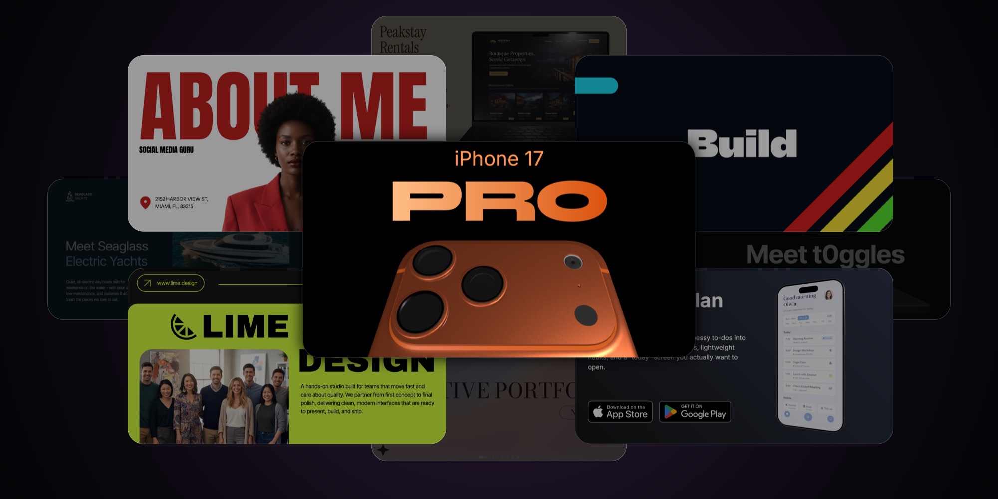
#iPhone 17 Pro
A keynote-style product launch slideshow built around a real 3D iPhone model - designed to make specs, features, and "upgrade reasons" look premium, cinematic, and instantly credible.
Best for
- Apple-style product launch decks (phones, gadgets, hardware accessories)
- Feature-by-feature product storytelling with premium visuals
- Turning a product page into a clean, punchy slideshow (specs, highlights, comparisons)
- Investor/press kits where the visuals need to feel "official"
What makes it special
- Real 3D device renders for hero angles, close-ups, and material shots
- Dark, high-contrast layout with warm copper accents for an event-keynote vibe
- Alternates between big headline moments and modular spec tiles (fast to scan)
- Clear narrative pacing: hero → cameras → photo proof grid → OS/software moment → build/materials → performance → "worth it?" summary
What to customize
- Product name, generation, and hero taglines
- 3D model (swap device, finish/color, camera layout) and all hero renders
- Spec numbers + labels (zoom, MP, chip name, fps, AI claims, etc.)
- Feature tiles content (images, captions, icon cards) and the upgrade/summary slide
- Accent color (copper to your brand), typography, and background glow intensity
#Product Launch - t0ggles
If your launch deck is basically "a few screenshots and a hope"... this template fixes that fast. Product Launch - t0ggles is built like an Apple-style keynote: oversized headlines, clean black space, and bright accent callouts that make every slide feel intentional. It walks the viewer from the messy reality ("work gets scattered") to a simple promise, then lands the key features, proof, and pricing - without turning into a long sales doc.
Best for
- SaaS founders launching a new product or major feature drop
- Indie makers announcing a release on X, Product Hunt, or in email
- Teams pitching a new internal tool rollout (simple story, clear adoption)
- Anyone who wants a premium launch slideshow that feels modern and confident
What makes it special
- A complete launch narrative: problem -> promise -> proof -> pricing (no filler slides)
- Big, high-contrast typography that stays readable on screens, recordings, and live demos
- Built-in "highlight label" style for screenshots (so you can point at features without clutter)
- A clean "how it works" flow slide (step 1 -> step 2) that explains the product in seconds
- Testimonials + audience-fit slides included, so it doesn't feel like "features only"
- A final CTA slide with simple flat pricing (designed to close, not just impress)
What to customize
- Replace the opening headline/tagline (keep it bold - 6-10 words max)
- Swap the "messy work" collage with screenshots/logos that match your audience's real tool stack
- Update the promise slide (3 benefits max - short, sharp, no paragraphs)
- Replace product screenshots and the lime highlight captions with your own feature callouts
- Edit the "Built for" audience cards (use your actual segments: startups, agencies, teams, etc.)
- Swap testimonials (name, role, one specific outcome - avoid generic praise)
- Update pricing: price, included bullet list, and the button label + destination link
#What's next
This drop is about giving you real, ready-to-ship starting points - so you spend your time on the message, not on nudging boxes around a canvas.
If you publish something with one of these templates, send it our way. We're collecting great examples and we'll highlight the best ones.
Now, pick a template, replace the content, and ship your next deck today.
#Related
- Browse all PaneFlow templates
- PaneFlow for Designers - visual slideshow creation
- PaneFlow for Startups - pitch decks and launch slideshows
- PaneFlow for Portfolios - interactive portfolio showcases
- PaneFlow vs Canva - detailed comparison
Don't Miss What's Next
Get updates, design tips, and sneak peeks at upcoming features delivered straight to your inbox.